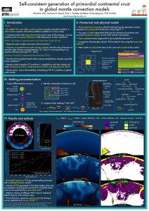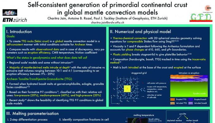
Being a scientist is more than just doing research and science. You also need to be able to communicate your findings to your peers and/or the general public (outreach). At conferences, you usually have two options for presenting your work: a talk or a poster (although at EGU, you also have the PICO sessions). A poster is often preferred if you would like to start a discussion and get lots of feedback on your work. So how do you ensure that people will come to your poster, stay to read it, and take the most important messages home? Charitra Jain, PhD student at ETH Zurich, Switzerland and winner of the Outstanding Student Poster Award at NetherMod 2017, gives some tips.
Some things I consider important while making posters:
• Break down the text in concise bullet points
• Use a non-white background to make your poster stand out among hundreds of posters
• Find the right balance between text and figures (depending on if you are planning to stay at your poster)
• Make sure your poster is easy to navigate
• Highlight the keywords
• Use 2-3 font sizes to represent hierarchy
• Think about “breathability”: don’t overcrowd your poster
• Demarcate different sections clearly
• Use perpetually-uniform color scales (also see this post by Fabio Crameri. I am trying to integrate these colour scales in my future plots/figures)
• Zoom 100% in on your poster on your screen and try to read it from 2 meters away to get an impression of what the poster will look like eventually
Besides tips from Charitra Jain, it is also useful to know what the jury deems important in a poster. Therefore, the list of criteria that Susanne Buiter presented at the Outstanding Student Poster Award Ceremony at NetherMod 2017 is reproduced here:
Poster design
• Clarity
• Aim and motivation
• Key findings
• Large figures
• Readable text
• More figures than text
Presentation and knowledge of the subject
• The story
• Figures supportive of the story
• Discussion/ability to answers questions

