This week’s “Wit and Wisdom” post is a guest entry by researcher Fabio Crameri from the Centre for Earth Evolution of Dynamics (CEED), University of Oslo. Many of us are guilty of creating figures using the colours of the rainbow in their full glory – it’s bold, exciting, and justifies the golden data contained within, right? Wrong! As Fabio explains, the rainbow scheme is misleading and should be abandoned – unless you are a unicorn, of course.

Fabio Crameri – in a near rainbow jumper?
Visualization is, together with problem description, data production and data post-processing, one of the four supporting pillars of science. If new findings cannot be shared with the community through some sort of visualization technique, the knowledge is lost; science becomes useless. The same happens, if the chosen means of visualization is not good enough. In fact, poor vizualisation can even alter your data and mislead readers. To the contrary, good visualization is making your knowledge accessible and comprehensible to the broader community in an unperturbed and hence scientifically valid way. And that is how it should be.
Now, the following statement is terribly difficult to digest for a scientist’s belly: There is not one single right way of visualizing your data and consequently, no simple one-to-one instruction to follow to create the next figure or movie.
But, there is an easier approach. There are easy-to-follow, crystal-clear rules to prevent the most dangerous of visualization pitfalls (see, for example, Rougier et al., 2014). Here, I am writing about the most-basic, most-broken, most-stated, Rule #1.
The first rule of the science club is:
do not use the rainbow colour map!
The easiest thing to start with, is to prevent the one and only, most terribly-persisting pitfall: The rainbow colour map. The rainbow colour map is also known as ‘jet’ and, be aware, it comes in various forms and mutations.
The human eye
In contrast to its other, social meaning of equality matters, the scientific rainbow colour map is not equal at all. Even when ordered in a physically-consistent manner by the wavelength of the individual colours, the rainbow colour sequence appears highly unequal. The reason for this inequality lies within the human visual apparatus: Our eyes (see example in Figure 1).

Figure 1. Can we scientifically trust our eyes? Can you see all the twelve black dots? (From Imgur)
The human eye has evolved to facilitate our very survival in the dynamic and ever-changing environment we live in. This is like filling your backpack for the next field trip: To still be able to move and carry out our science, we pack the important, relevant things (e.g., laptops, geologic hammers), but leave the unnecessary things at home (e.g., ties).
I don’t see trees of green, but red roses I do.
During our evolution, our environment was mostly green; green trees with green leaves on top of green grass. Different shades of green, but that did not really matter. What mattered then – and still does now – were those tasty but scarce red berries. Individuals that developed eyes with a strong contrast for the orange-red part of the light had a better chance to survive, as they had this little extra help in hunting out the good stuff more clearly. Long story short, the 21st-Century human eye now features a stronger contrast for the yellow-orange-red part of the colour spectrum than for the blue-green part. Therefore, we wear a yellow jacket when we bike on streets, we wear orange vests on construction sites, and we paint all important warning signs in red and the less important in blue.
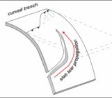
When viewing scientific figures that use the rainbow colour map, we tend to only see where the tasty yellow-orange-red part of the plot starts and ends, and ignore everything in the comparatively boring blue-green areas (see example in Figure 2). It is therefore why some Geodynamicists may start to see imaginary gaps in observed slabs, miss seismic reflectors, and interpret large topographic gradients to occur in the wrong areas (see example in Figure 3).
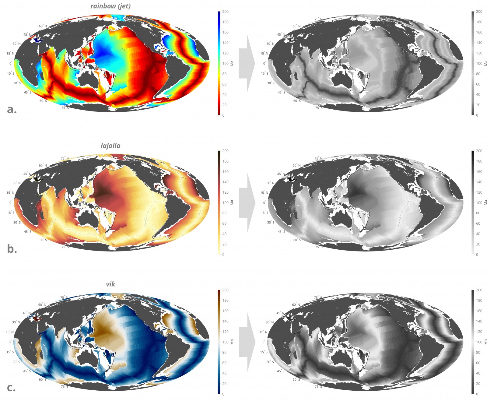
Figure 2. Have you ever seen the ocean seafloor age map in non-rainbow colours? (a) The rainbow colour scheme adds randomly (at least) two strong artificial boundaries to the data: One along the red-yellow transition (at 0.4 of the colour bar range) and one along the blue-cyan transition (at 0.7 of the colour bar range). At the same time, it hides the local data gradients in the greenish parts of the colour map making it impossible to spot, for example, the large area of same age just north of the Tonga subduction zone. Moreover, it is unreadable for people with most forms of colour blindness, and when printed in black and white. The perceptually-uniform colour maps (b) lajolla and (c) vik prevent all of these problems, where the latter is so-called zero-centred and can be used to specifically highlight the old (brownish) and young (blueish) parts of the ocean floor with a boundary (white) occurring naturally in the middle of the data range.

Figure 3. The same simulations but with a slight shift of the lower colour bar limit for (a,b) the non-uniform rainbow and (c,d) the perceptually-uniform davos colour map. Significant visual manipulation of the data results when using the rainbow colour map, while the simulation looks, for both cases, factually the same with the davos colour map. (a) The upper-mantle transition zone (enlarged in the square magnifier) and upper-mantle convection appear to be absent, while an artificial, globe-spanning pile of high-viscosity material seems to exist in the lower mantle reaching up to about mid-mantle depth. (b) The upper-mantle transition zone is strongly highlighted and convection appears to be only taking place in the upper mantle, while the mid-mantle appears to be uniformly viscous, with no small-scale structures.
Finding the end of the Rainbow
This is probably not the first time you have heard about it, and is certainly not the first time someone has written about it. Finding the end of the rainbow can be illustrated with a short journey through a long time-period…
At the end of the 19th Century, a German scientist named Arthur König pointed out that the human ability to differentiate between different wavelengths in the blue-green region of the colour spectrum was impaired (König and Dieterici 1983; König 1894). Later, in the mid 20th Century, studies like the one of Thomson and Wright (1947) confirmed this finding and followed up with refined investigations on the colour sensitivity of the retina. Then, along with the rise of coloured figures in scientific publications, more and more studies were published investigating the influence of our impaired colour perception on various scientific colour schemes (Pizer and Zimmerman 1983; Ware 1988; Rheingans 1992). At first, these studies had objective, how-to-do titles like “Choosing Effective Colors for Data Visualization” (Healey 1996).
Obviously, not everyone followed this guidance and so later studies became more subjective to the more and more common, misleading use of colours. These studies were then published under predominantly how-not-to-do titles like “How Not to Lie with Visualization” (Rogowitz and Treinish 1996). However, it became quickly clear that the main culprit in scientific visualization was the rainbow colour map. Titles therefore became more specific, like “Data Visualization: The End of the Rainbow” (Rogowitz and Treinish 1998).
One would think that after the latter publication, with its clear title and content, scientific authors, reviewers, and editors would step up and put an end to the rainbow colour scheme. They did not. At least not the majority.
Six years later, some scientists felt the need to reiterate on the problems of the rainbow colour map with an EOS article titled: “The End of the Rainbow? Color Schemes for Improved Data Graphics” (Light and Bartlein 2004). But the picture did not change even another three years later: “Rainbow Color Map (still) considered harmful” (Borland and Tailor 2007).
Another 5 years later, after all this immense effort over more than a century, the author of this EGU blog entry publishes a scientific study (Crameri et al., 2012) – using the rainbow colour map…
Unfortunately, it is not the only recent study using the still-harmful, repeatedly-ended and steadily-reincarnated rainbow colour map. In fact, it is the most common colour scheme used in present-day geoscience publications; it is omnipresent in presentations during major international conferences, often features in the broken pillar of published high-impact journals, and even mocks us as “featured figures” on various journal homepages. The rainbow keeps arching in all its glory above all the informative and somewhat alerting publications outlined above; its end is seemingly impossible to find.
And anyway, what does the current blog author have to add to this discussion that has not already been said? – Well, nothing really. He just kind of feels bad about publishing with the rainbow colour map and thought that ending it is, in the name of science, well worth another try.
Sleep, try-to-end-rainbow, repeat!
Why is Rainbow used at all?
It might be a good idea to try and understand why the rainbow colour map is so common still. There are multiple reasons that make the rainbow colour map appear attractive for scientists.
First of all, the rainbow colour map looks kind of peppy: with the varying contrasts and multiple colours, it appears to create the most interesting, lively look. The multiple strong and varying contrasting parts along the rainbow colour map seem to highlight the large but also the smaller variations in our data very well. Given that the rainbow colour map contains all standard colours, it consequently provides the highest contrast between neighbouring data values. Another reason comes from the fact that a scientist naturally tends to adjust his or her way of working to his or her teacher, supervisor, mentor, and peer. And finally, it is always the most convenient way to simply take the default colour map provided by the applied software. And the rainbow colour map was and, in some unfortunate cases, still is the default in many scientific computer programs and codes, and even appears in the logo of a widely-used visualisation software.
One would think that these points are all good things, but here are the problems related to each of the above points:
The locally-strong contrast of the rainbow colour map is not uniform all along the colour bar, meaning that some parts of the data are highlighted, while other parts are masked (see Figure 4). The final effect is factually equal to manipulating the numbers of the data by hand – something that cannot be considered the scientific way, can it?

Figure 4. Scientific colour map comparison. Continuous ripples on top of each colour bar indicate the appearance of low-contrast data variations in different parts of the colour bar. The graph indicates the (CIE76) lightness difference (dE) along a colour map: The flatter the curve, the lesser the data distortion, the better the colour map. Diagnostics after Kovesi 2015. The perceptually-uniform colour maps devon, davos, oslo and broc produce nearly-flat curves and are available from www.fabiocrameri.ch/visualisation.
Also, scientific methodologies often become outdated quickly, and there is therefore no validity in continuing applying a tool – or a colour map – against better reasoning. And finally, the reason for the rainbow colour map to be the default of a software is not due to the fact that the developers have thought carefully about scientific visualisation. In fact, they almost certainly did not: MatLab has, for example, only recently changed their default from Rainbow (i.e., jet) to Parula in version 2014b (see Figure 4). Using the default is, even though convenient, therefore never an excuse.
So, in conclusion, there is, from a scientific point of view, no good reason left over supporting the use of the rainbow colour map. But despair not: There are plenty of other colour schemes waiting in the ranks.
What are the Alternatives?
For scientific figures, the best choice is always perceptually-uniform colour maps. Or let’s call them hero colour maps to be in line with the naming convention of a previous blog entry.
In perceptual-uniformity we trust!
Perceptually-uniform, hero colour maps handle local data variations equally all along the colour bar. Hero colour maps can be read even after being printed in black and white. As such, hero colour maps are also readable by people with a form of colour vision deficiency.
Viridis, Magma, and Inferno (https://bids.github.io/colormap/) are examples of perceptually-uniform, hero colour maps that have been recently picked up and used more-widely. However, they are predominantly adopted only within python programs. A novel set of perceptually-uniform, hero colour maps including Devon, Davos, Oslo and Broc (see Figure 4), are now available freely on www.fabiocrameri.ch/visualisation: Each of these colour maps are conveniently provided in .mat, .py, .xml, .cpt, and .svg formats. This means, they are all ready to be used with the most-common scientific visualisation software applied in the field of Geodynamics, including MatLab, Python, Paraview, GMT, GPlates, and QGIS. Unlike other colour maps to date, they are all provided together with the corresponding scientific tests (e.g., for the CIE76 lightness differences along the colour map) to ensure their quality (see e.g., Figure 4). This allows for a confident statement about a careful, scientifically-proofed choice of colours in upcoming scientific publications.
Can we reach the end of the rainbow?
Changing the colour scheme for a figure does not seem to be such a huge deal.
Advising authors not to submit figures using the rainbow colour scheme does not seem to be such a huge deal. Pointing out bad colour schemes in a review does not seem to be such a huge deal. So, let’s deal with it!
What do you plot with, my lovely?
#endrainbow
REFERENCES

Crameri, F., P. J. Tackley, I. Meilick, T. V. Gerya, and B. J. P. Kaus (2012b), A free plate surface and weak oceanic crust produce single-sided subduction on Earth, Geophys. Res. Lett., 39, L03306, doi:10.1029/2011GL050046.


Borland, D. and R.M. Tailor (2007), “Rainbow Color Map (still) considered harmful,” IEEE Computer Society, vol. 07, 2007, p. 14-17.

Festinger, L. (1956), When prophecy fails, University of Minnesota Press, https://books.google.no/books?id=L700AAAAMAAJ

Healey, C.G. (1996), “Choosing Effective Colors for Data Visualization”, Proc. IEEE Visualization, IEEE CS Press, 1996, pp. 263-270.

König, A., & Dieterici, C. (1893). Die Grundempfindungen in normalen und anomalen Farbensystemen und ihre Intensitätsverteilung im Spektrum. Zeitschrift für Psychologie und Physiologie der Sinnesorgane, 4, 241–347.

König, A. (1894). S.B. Akad. Wiss. Berlin, 21 June, p. 577.

Kovesi, P. Good Colour Maps: How to Design Them. arXiv:1509.03700 [cs.GR] 2015

Light, A. and P.J. Bartlein (2004), “The End of the Rainbow? Color Schemes for Improved Data Graphics,” EOS Trans. Amer. Geophysical Union, vol. 85, no. 40, 2004, p. 385.

Pizer, S.M. and J.B. Zimmerman (1983), “Color Display in Ultrasonography,” Ultrasound in Medicine and Biology, vol. 9, no. 4, 1983, pp. 331-345.

Rogowitz, B.E. and L.A. Treinish (1998), “Data Visualization: The End of the Rainbow,” IEEE Spectrum, vol. 35, no. 12, 1998, pp. 52-59.

Rogowitz, B.E. and L.A. Treinish (1996), “How Not to Lie with Visualization,” Computers in Physics, vol. 10, no. 3, 1996, pp. 268-273.

Rougier, NP, Droettboom M, Bourne PE (2014) Ten Simple Rules for Better Figures. PLoS Comput Biol 10(9): e1003833. https://doi.org/10.1371/journal.pcbi.1003833

Rheingans, P. (1992), “Color, Change, and Control for Quantitative Data Display,” Proc. IEEE Visualization, IEEE CS Press, 1992, pp. 252-259.

Thomson, L. C., Wright, W. D., (1947), The colour sensitivity of the retina within the central fovea of man. The Journal of Physiology, 105 doi: 10.1113/jphysiol.1947.sp004173.

Ware, C. (1988), “Color Sequences for Univariate Maps: Theory, Experiments, and Principles,” IEEE Computer Graphics and Applications, vol. 8, no.5, 1988, pp. 41-49.

Watson, A.B., H.B. Barlow, and J.G. Robson (1983). What does the eye see best? Nature, 302:419–422.
FURTHER READING

#endrainbow

https://earthobservatory.nasa.gov/blogs/elegantfigures/2013/08/05/subtleties-of-color-part-1-of-6/

https://www.mathworks.com/tagteam/81137_92238v00_RainbowColorMap_57312.pdf

https://www.climate-lab-book.ac.uk/2014/end-of-the-rainbow/

http://colorbrewer2.org

Mark Doidge
Dear Fabio: I am a migraine researcher. I do brain EEG research. I need to either find or to make a high definition image of of colour bars with the colours of the rainbow in proper order. Do you have such a thing? Do you see any issue of flashing it on a screen repeatedly to create a visual evoked potential? Would it be better to have patients look at the light from a prism than to look at colour bars? Regards, Mark Doidge MD tel 647 207 2504
Fabio
Thanks, Mark, for the question. I am by no means an expert who could discuss with you what happens when one looks at a screen flashing the rainbow colours. But I can direct you to a high-resolution image of an approximated light spectrum: https://s-ink.org/light-spectrum-approximation . – See if that could work for you.
All the best, Fabio
Ufas Webmaster
Nice article. Thank you very much