

Professor Clint Conrad
The Geodynamics 101 series serves to showcase the diversity of research topics and methods in the geodynamics community in an understandable manner. We welcome all researchers – PhD students to Professors – to introduce their area of expertise in a lighthearted, entertaining manner and touch upon some of the outstanding questions and problems related to their fields. Our latest entry for the series is by Clinton P. Conrad, Professor of Geodynamics at the Centre for Earth Evolution and Dynamics (CEED), University of Oslo. Clint’s post reflects on the predictions of sea level rise since the first Intergovernmental Panel on Climate Change (IPCC) report in 1990 and the near three decades of observations and IPCC projections that have been made since then. Do you want to talk about your research area? Contact us!
This past week I flew over the North Atlantic with a direct flight to California from Europe. From the plane we had a beautiful view of glaciers on the western edge of the Greenland ice sheet, where the ice seems to be disintegrating into the ocean. We’ve been hearing lately that the ice sheets are slowly disintegrating – is this what that looks like? Using my mobile phone’s camera, I took a photo of the glacier that happened to be visible from my seat and compared it to images of the same glacier saved in Google Earth (Figure 1). This is an interesting exercise if you like looking at glaciers, but I can’t tell about the overall dynamics of the ice sheet this way.
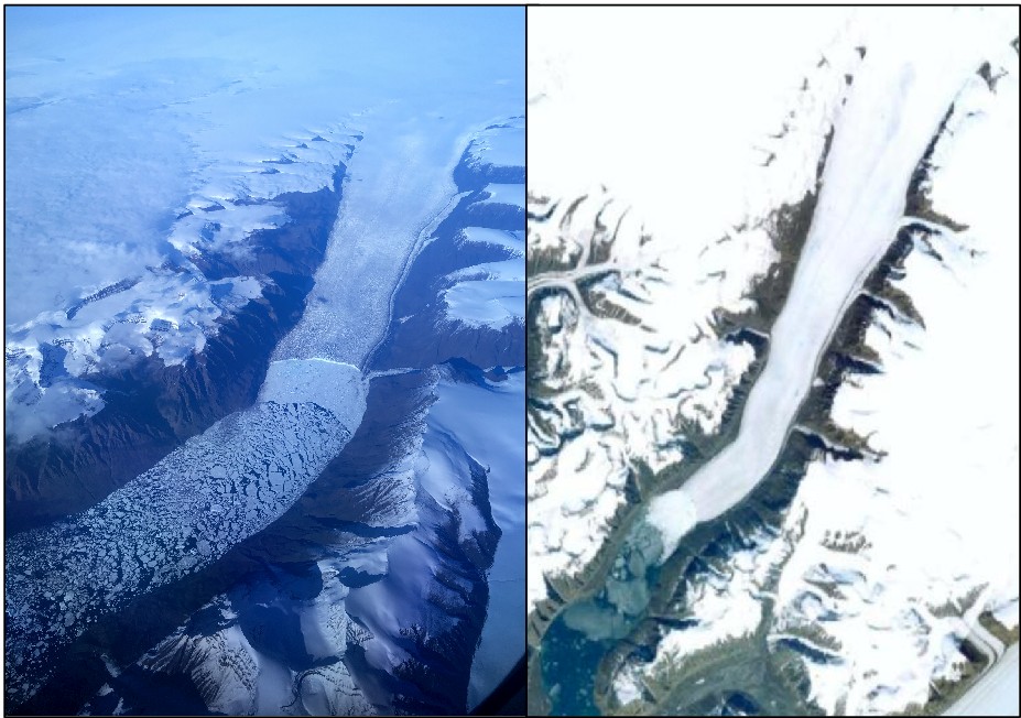
Figure 1. A glacier on the west coast of Greenland on September 2, 2017 (left) taken with my iPhone. From my plane’s in-flight entertainment system, it seems that this glacier is between the villages of Upernavik and Niaqornat. For comparison, the image on the right is a screenshot of the same glacier from Google Maps.
Actually, we’ve been worried about ice sheet melting – and the sea level rise with it – for decades. I re-realized this during this past summer, as I finally started unpacking the boxes that we shipped to Oslo one year ago from Hawaii. Some of these boxes probably didn’t need to be unpacked, like the one labeled “High School Junk”, but it turns out there is interesting stuff in there! Here was my diploma, a baseball glove, some varsity letters, and a pile of old schoolwork – most of which I have no recollection of creating. But I did remember one of the items – a report on global warming that I wrote for Social Science class in 1989. In particular, I remember being fascinated by the prediction that human activity would eventually cause enough sea level rise to flood land areas around the world. For years, I have been personally crediting that particular high school report as being my first real introduction to the geosciences – but until this past summer I had never revisited that report to see what I actually wrote at the time. Now here it is – twelve yellowed pages of dot-matrix type, with side perforations still remaining from the printer feed strips that I tore off 28 years ago.
My report is entitled “Global Warming – What Must Government Do?” and now I can see that it is mostly a rehashing of reporting from a bunch of newspaper articles written in 1989. It was a bit disappointing that my younger self wasn’t more creative or inspirational, but the content of the report – really the content of the newspaper articles from 1989 – is fascinating because much of the material could have been written today. There is discussion of how the warmest years in recorded history have happened only recently, that climate skeptics were unwilling to attribute recent changes to human activity, and that a few obstinate countries (then, it was Japan, the USSR, and the USA) were standing in the way of international agreements to curb CO2 emissions. Another statement is also familiar: that “oceans could rise from 1.5 to 6.5 feet”. For those of you not familiar with that measurement system, that is about 0.5 to 2.0 meters! I know that recent predictions are not quite as dire as 2 m of rise (at least in the 2100 timeframe), although sea level acceleration has been getting more attention lately. Did people in 1989 consider 2 m of sea level rise a possibility? I checked the cited New York Times article from 1989, and indeed it seems that I dutifully reported the estimate correctly. The article says that 1.5 to 6.5 feet of sea level rise is expected “to occur gradually over the next century affecting coastal areas where a billion people, a quarter of the world’s population, now live”.

Figure 2. Projections of sea level in 2100 (relative to 1990 sea level) for the five IPCC reports between 1990 and 2013, plotted as a function of IPCC report date. Shown are the minimum and maximum projections (range of red bars), and the mean of estimates (black circles).
I have contributed a little to sea level research in the intervening years, and am somewhat familiar with the current predictions. I know that the most recent (2013) report of the Intergovernmental Panel on Climate Change (IPCC) predicts up to about a meter of sea level rise by 2100, which was a large increase over the 2007 report that predicted up to about 0.6 meters. Thus, meter-scale sea level rise predictions seemed like a relatively recent development, and yet here was a prediction just as large from nearly 30 years ago. What did the IPCC have to say about sea level at the time?
I plotted the sea level projections of the five reports that the IPCC has released between 1990 and 2013 (Figure 2). Indeed, the 1990 report predicted slightly higher sea level for the year 2100 (31-110 cm higher) than did the most recent report from 2013 (28-98 cm higher). In fact, the IPCC projections for 2100 sea level declined from 1990 through 2007, until they increased again in the most recent report in 2013 (Figure 2). Why is this? Well, we have nearly 3 decades of observations that could help us to answer this question!
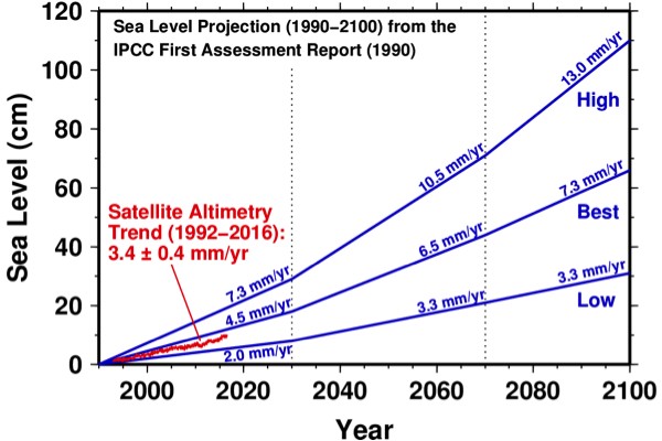
Figure 3. Sea level projection from the IPCC’s first assessment report (1990), showing that report’s low, best, and high estimates (blue lines) and predicted rates in mm/yr. Also shown is the University of Colorado sea level time series (red line), which is based on satellite altimetry observations from 1992-2016 and records a sea level rise rate of 3.4 ± 0.4 mm/yr.
First, let’s evaluate the initial predictions of the first IPCC report from 1990. Since 27 years have passed since the publication of that report, we can actually compare a sizeable fraction of those 1990 predictions to actual sea level observations. Left, I have plotted (Figure 3) the 1990 report’s sea level projection from 1990-2100 (Fig. 9.6 of that report) along with actual sea level observations made using satellite altimetry between 1992 and 2016, which have been nicely compiled by the University of Colorado’s Sea Level Research Group. The comparison shows (Figure 3) that the actual sea level change for the past 24 years has fallen slightly below the “best” estimate of the 1990 report, and well above the “low” estimate.
In retrospect, the 1990 predictions of future sea level change seem rather bold, because the 1990 IPCC report also concludes that “the average rate of rise over the last 100 years has been 1.0-2.0 mm/yr” and that “there is no firm evidence of accelerations in sea level rise during this century”. Yet, the 1990 report’s projection of 2.0-7.3 mm/yr of average sea level rise from 1990-2030 (Figure 2), represents a prediction that sea level rise would accelerate almost immediately – and this acceleration actually happened! Indeed, three recent studies (Hay et al., 2015; Dangendorf et al., 2017; Chen et al., 2017) have confirmed sea level acceleration after about 1990.
Thus, the IPCC’s 1990 sea level projection did a remarkably good job for the first three decades of its prediction timetable, and the next 8 decades don’t seem so unreasonable as a result. What did the 1990 report do right? Here the 1990 IPCC report helps us again, by breaking down its projection into contributions from four factors: thermal expansion of the seawater due to warming, the melting of mountain glaciers, and changes in the mass of the great ice sheets in Greenland and Antarctica. The 1990 report makes predictions for the changes in sea level caused by these factors for a 45-year timeframe of 1985-2030, and I have plotted these predictions as a rate (in mm/yr) in Figure 4. Thermal expansion and deglaciation in mountainous areas were predicted to be the largest contributors. Greenland was predicted to contribute only slightly, and Antarctica was predicted to gain ice, resulting in a drop in sea level.
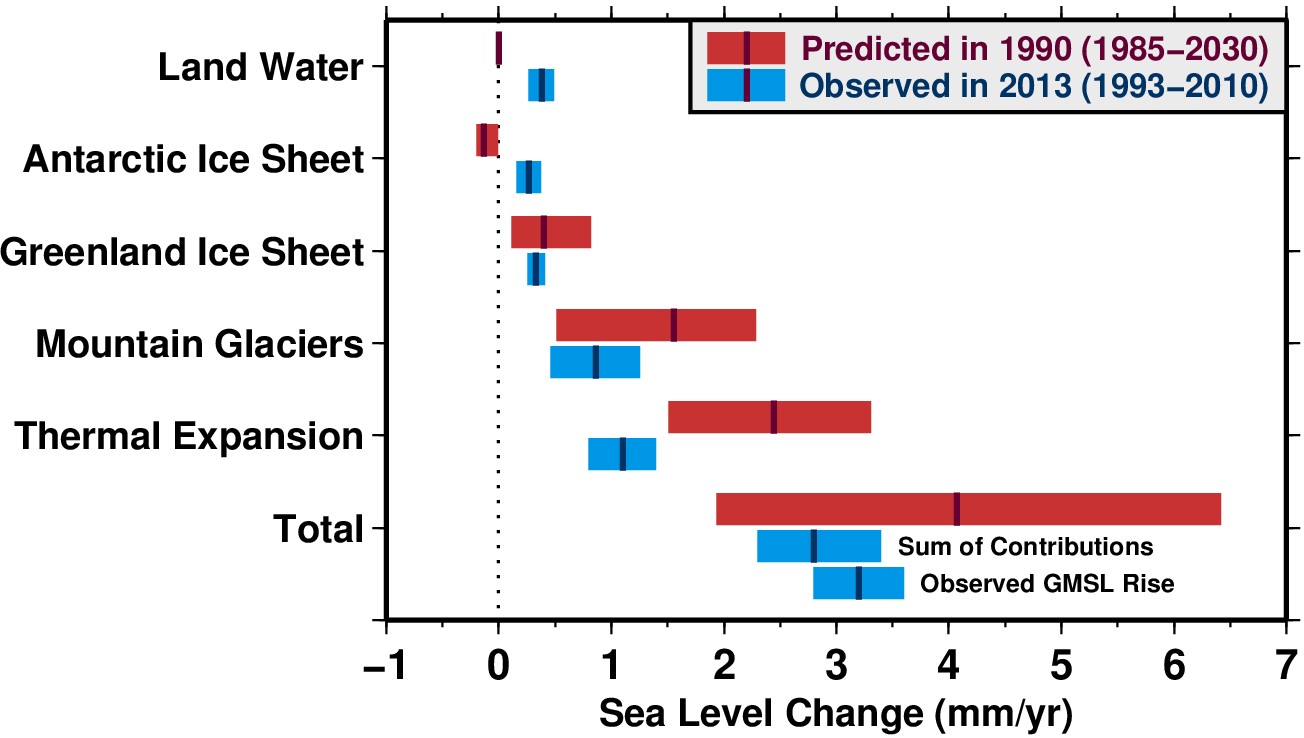
Figure 4. Comparison of projections and observations of the various factors contributing to global mean sea level rise (GMSL, in mm/yr). Red bars show predictions that were made in 1990 (table 9.10 of the 1990 IPCC report) for the 45-year period 1985-2030 (range is given by red bars and best estimate is shown with a dark line). Blue bars show the actual contribution from each factor for the 17-year period 1993-2010, as detailed in table 13.1 of the 2013 IPCC report. Note both the sum of observed contributions and the direct observation of sea level change from satellite altimetry (bottom two blue bars) are consistent with recent analyses of tide gauge data (Hay et al., 2015; Dangendorf et al., 2017), within uncertainty.
Now 27 years later, we have actual observations of the world’s oceans, glaciers, and ice sheets that we can use to evaluate the predictions of 1990 report. Many of these observations are based on measurements made using satellites, which can now remotely measure ocean temperatures, changes in the mass of land ice (mountain glaciers and ice sheets) and even changes in groundwater volumes, over time. The IPCC report from 2013 (the most recent report) shows these contributions in the timeframe of 1993-2010, which are 17 years during the 45-year outlook predicted by the IPCC’s 1990 report. I have plotted these observations in Figure 4, and we can see how the 1990 predictions compare so far – remembering that the prediction and observation timescales do not exactly align.
First, we see that 1990 report overpredicted the contribution from thermal expansion, and slightly overpredicted the contribution from mountain glaciers. Of course, there is still time before 2030 for these factors to increase some more toward the predictions made in 1990. However, we also see that Greenland melting has already matched the 1990 report’s prediction for 2030, and that the prediction of a sea level drop from Antarctica did not materialize – Antarctica contributed almost as much sea level rise as Greenland did by 2010 (Figure 4). Furthermore, there is another significant contributor to sea level rise – land water, which represents the transfer of liquid water from the continents into the oceans. This occurs because groundwater that is mined for human activities eventually ends up in the ocean. According to the 2013 report, land water caused more sea level rise than ice sheet melting from Antarctica.
Thus, in 2010 the predicted rates of sea level rise from two factors (thermal expansion and mountain glaciers) had not yet reached the 2030 predictions of the 1990 report, but the contributions from Greenland, Antarctica, and land water loss have already nearly met or exceeded the predictions of 1990. Indeed, recent satellite observations between 2002 and 2014 show an acceleration of melting in Antarctica (Harig et al., 2015) and especially in Greenland (Harig et al., 2016). The recognition that Antarctica and Greenland may contribute significantly more to sea level rise in the future compared to earlier estimates is reflected in the 2013 IPCC report (Figure 2).

Figure 5. A dike near the town of Putten in the Netherlands, where the recent EGU-sponsored “Nethermod” meeting was held in late August 2017. This dike is one of many in the Netherlands that protect negative-elevation land (left) from a higher water level (right).
So far, it seems that the IPCC’s 1990 sea level projection has stood the test of 27 years remarkably well (Figure 3). It is rather disheartening to realize that we are on track for the ~60 cm of sea level rise that the 1990 report predicted for the year 2100, or more if the early underestimates of ice sheet contributions prove to be more significant than any overestimates of thermal expansion (Figure 4). Looking at my own high school report from the same time, it is also disappointing that to realize that the warmest years in recorded history have again happened only recently, that climate change skeptics are still unwilling to attribute recent changes to human activity, and that there are still obstinate countries (well, one country) standing in the way of international agreements to curb CO2 emissions. On the other hand, high school students writing reports on this topic today will likely find discussions of dropping beachfront real estate prices, governmental planning for future sea level rise, and engineering techniques for managing future sea level rise (Figure 5). I hope that these students save copies of their reports in a format that they can examine decades later, because it is interesting to consider how predictions of future sea level rise have changed over time, and how society has been responding to the challenges of this geodynamic phenomenon that is operating on the timescale of a human lifetime. One day in the 2040s these students may want to scrutinize another quarter century of data against the projections of the next IPCC report, to be completed by 2022. I wonder what they will find?


Aswin Sekhar
Very interesting article!
Roelof Rietbroek
Excellent piece on sea level rise projections and the increasing certainty we have on it. It’s sad to see the US federal government is currently running backwards on this, both in terms of adaption and mitigation, and that those who are living in flood-prone areas are going to pay for their digression.
Rob
Excellent analysis. Can you keep this updated yearly? would be a great service to all of us.
I would love to bookmark this updated site and spread word if you are able.
Specifically figures 2 , 3 and 4 are excellent summaries.
Any link to a site that keeps these be updated?
Last: could you clarify your figure 3 also? 2 clarifications i would find helpful:
1. it is strange to mix mm/yr and mm of absolute rise since 1990 on same graph. Maybe separate into 2 graphs… just a suggestion.
2. please use 1800 or 1900 as start date. The longer the better. Maritime data was accurate given known rising/sinking per tide gauge based interpolation with known land mass rise/sinking levels… and i think there has been a 1mm-3mm rise during almost every decade of this time (but there may have been a negative at the end of the little ice age/maunder/dalton mins until 1850 and maybe a small fall in sea level between 1945 and 1975.
Andre
Excellent? So many misleading points! It shows acceleration! What acceleration?
If you don’t give it an acceleration module, well, it’s just fallacy.
Rick
Interesting. But you start with 1990 IPCC report. Is there another method to look back further into history? For instance, I’ve seen National Geographic shows on ancient cities that are now under water. So how long has ocean rise been occurring? Since the retreat of the glaciers during the last ice age?
John Kihl
If there existed any evidence that man made CO2 had anything to do with it, the people in power certainly would have considered some action.
ravi
Apex Weather is a new weather app from the developers of Apex Launcher, one of the best Android launchers. This weather app is above average. You get your basic stuff like the current, daily, and hourly forecasts. It also includes a weather map, severe weather alerts, and some of the better clock and weather widgets we’ve seen in a while. It even shows less common stuff like sunrise and sunset times, air pressure, UV index, and more. You can get weather forecasts in the U.S., U.K., Canada, and Australia along with a rather bland news blog if you want one. The ads can be a tad annoying, but otherwise this weather app checks all of the boxes. You can also remove the ads with a single $5.99 payment.
Ufas Webmaster
Nice article. Thank you very much