
Credit: Pixabay
We’ve all attended conferences with those dreaded 15-minute talks and we have no problem picking out which talks were amazing and which talks were abysmal. However, when it comes to our own talks, it’s hard to judge them, find out how they can be improved or break away from long-established habits (such as our layout or talking pace). This week, Matthew Herman, postdoc at the Tectonophysics research group at Utrecht University in the Netherlands, guides you towards your best 15-minute talk yet!
 At some point in your career as an Earth Scientist, you will hopefully have a chance to give a 15-minute talk at a meeting, a colloquium series, or simply in your lab group. This provides a great opportunity to advertise your hard work to your colleagues in an amount of time that is well within a human attention span. Ultimately, your goal in this talk is to effectively communicate your discovery to your audience. In the process, you get to explain the importance of your field, pose a crucial research question in that field, demonstrate cutting-edge analyses and applications, and, finally, provide an answer to that initial research question, sometimes for the very first time.
Despite all the latent potential for a 15-minute talk to captivate and teach the audience, many of these presentations end up being uninformative. I do not intend this as a judgment regarding the significance or quality of the science. I have seen incomprehensible talks from people whose research is crucial to our understanding of the Earth system. Alternatively, I have seen talks presenting incremental scientific advancements that were truly enlightening. But from all the diverse presentations I have seen, there are common elements that either dramatically improved or reduced my understanding of the subject matter. My aim here is to provide what I think are some of these key characteristics that make up a really excellent talk, so that next time you have the opportunity to present, you will inspire your audience.
I think there are two general things to keep in mind for your 15-minute talk: (a) you have limited time with your audience, and (b) the expertise of your audience can vary a lot. This means that you should design a presentation that fits your extensive understanding into a brief window and tailor the details for the particular audience that will be attending. If this makes it seem like it will take time and effort to construct an effective talk, that is because it is true! Even if you have a well-received publication, simply transferring figures, analyses, and interpretations from the paper into your talk is almost guaranteed to lead to an ineffective presentation – it will probably be too long, too technical, and too difficult to see from the back of the room. If you really want your audience to concentrate on your work for the full 15 minutes, take the time (potentially up to a few weeks) to craft a great talk. And one more thing: you really should practice your talk ahead of time. Actually, I cannot emphasize this point enough: PRACTICE.
Note: If you are short on time right now, I have included a checklist at the end to summarize the main points.
How long?
Imagine: you are in the audience and the end of the talk is not in sight. You shift in your seat uncomfortably as you glance at your watch. The speaker does not appear to notice the amount of time since they started, but you definitely do: 14:30… 15:00… 15:30. Finally, two full minutes after the end of the scheduled time slot, the speaker asks if there are any questions, but of course there is no time for that. Many otherwise good talks have been ruined for me by the presenters going into overtime. All I can now remember about them is by how much they exceeded the final bell. As a speaker, you have 15 minutes – choose a topic and present it in the allotted time frame. In fact, target your talk for 12-13 minutes so your audience can ask questions at the end.
This, and that, and these…
The detailed structure of the talk is flexible, but should probably contain the following items: background/motivation (Why should we, the audience, care?); a research question or hypothesis (What is being tested?); observations, models, and analysis (How is the research question being answered?); and interpretations and conclusions (GIVE US THE ANSWERS!).
i. Background
Try to avoid dwelling on the background for too long. I know many of us (myself included) enjoy pedantically explaining the rich history of our field leading up to the present day. But you do not have the time in a 15-minute talk. As you are constructing your presentation, you should budget no more than 2-3 minutes at the start to establish the context for your research problem. At that point, your audience should be oriented and ready to be amazed by your results.

Example of an introduction/background slide
ii. Research Question
Do not assume that your research question or hypothesis is obvious to everyone. People come to talks for a lot of different reasons; sometimes they are experts in the field, but other times they saw a keyword in your title or abstract, or maybe there were no other interesting sessions. In any case, it is likely that a good percentage of your audience does not know what specifically you are testing if you do not tell them. After setting up the background, verbally or on the screen state your research question or hypothesis.
iii. Observations, Models, and Analysis
This will be the bulk of your presentation. Tailoring your 15-minute talk for your specific audience means you will want to use just the right amount of technical terminology. You should assume some foundational level of knowledge because there is no way to define every term and present the complete theory for your research. But for the most part, I think you should try to minimize technical jargon (particularly uncommon acronyms) in talks. If and when you need to use a term repeatedly, then take 15-30 of your precious seconds to concisely explain the concept, ideally without patronizing or condescending. [Did I mention this was a difficult balance?] Incidentally, explaining a concept has the added benefit of forcing you to understand the concept sufficiently that you can distill its definition into a compact form for your listeners.
The precise minimum level of knowledge you assume for your audience depends on the setting. In the large lecture hall of an international meeting like the EGU General Assembly, the audience may be weighted towards less experience in your field, whereas a special meeting focused on your subject area will likely have a higher percentage of experts.
A related point is that you should avoid all but the most straightforward equations. The reality is that any audience member who does not already understand the equation is not going to understand it from your talk. There is not enough time, and the medium is not amenable to higher level math. Simple equations with a couple variables are okay, but anything with multiple terms, powers, derivatives, etc. are a waste of time.
iv. Interpretations and Conclusions
Honestly, most people are pretty good at this part. This is the most fun and exciting aspect of the talk, plus it means the end is near. A couple minor pieces of advice: (a) make sure you have drawn a clear path from the background through the analyses and into the interpretations, with the common thread being answering your research question; and (b) I think it is best to limit the number of conclusions to 3-4 (consider this in the preliminary design stage of the talk as well!).
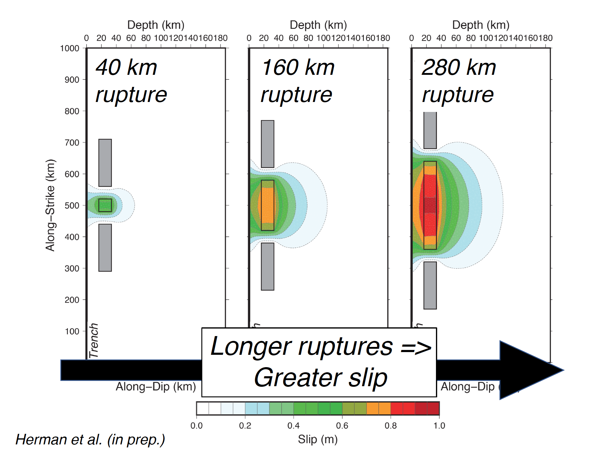
Example of a results slide
Good looks matter
I try to follow the advice of the great Jim Henson when it comes to designing the look for my talks: “Simple is good.” I will not harp on making figures, because many other people have discussed how to design good ones. In a nutshell: make them big, use good color schemes and large fonts, and keep them uncluttered. Resist the urge to copy figures straight from papers to your talk. You will probably need to simplify a figure from the published version in order to make it optimal for your talk. Sometimes you just need to design and produce a totally new figure. In fact, making figures is where I spend at least 65% of my time when I am preparing a talk.
In terms of slide layout, use the whole slide. Borders, icons, and backgrounds can be pretty flourishes, but they take up valuable real estate. Every centimeter you use for a border is a centimeter you can no longer use for a making a figure nice and big. And remember there will be people, some with poor eyesight, in the back of the room. As on figures, limit the amount of text. When you do need labels or bullet points, use a classic, simple font (I will scream if I see Comic Sans one more time…) in a large size – I typically use no smaller than 24-point font Helvetica.
Closing remarks
Many of my suggestions are more like guidelines than hard rules. I enjoy seeing creative and innovative presentations. As long as you give yourself enough time to craft an excellent presentation, then take time to practice it in front of friends, it will turn out well. Hopefully we will all see a large collection of great talks in the next few meetings. See you there!
Checklist
Remember: the goal of the talk is for your audience to understand your science!
Preparation
• Take time (up to several weeks) to construct your presentation
• Practice before the date of your talk, if possible in front of a test audience
Structure
• Target talk length for 12-13 minutes (do not go over 14!)
• Limit background or introductory information to 2-3 minutes
• Explicitly state research question
• Link background, analysis, and interpretations to research question
• Limit conclusions to ≤ 4
Scientific Content
• Choose technical jargon at level appropriate for audience
• Define critical terminology in 30 seconds or less
• Limit acronyms
• Avoid complex equations
• Avoid tables
Visual Content
• Fill space on slide, especially with figures
• Make thin frames to not waste precious room
• Choose large font sizes (≥ 24 pt) in a standard font
• Adjust figures from published version
• Check figure color contrasts (avoid blue/black, yellow/white)
• Use perceptually linear color palettes (no rainbow!)
• Avoid cartoons, animations, and sounds
General Life Advice
• Use common sense (e.g., do not include pictures from the bar in your talk)