This week inaugurates a new series of posts: Geekology, fusion of geek and geology. In this section, we will try to unravel tips and tricks of programming applied to geodynamics, from new innovative libraries to good programming practices, interviews with geologists who code and more!
To kick off the series, this week’s article is written in collaboration with Baptiste Bordet, doctoral researcher at the Interdisciplinary Laboratory of Physics in Grenoble, France.
In this post, we present a tutorial for the Python library Matplotlib, applied to geoscience data. We have tried to condense all the tips and tricks that we ourselves wished we had when learning to plot our data, and that we continue to use as advanced programmers.
1 – Matplotlib library : 2 usage modes
Data visualisation is one of the essential skills to effectively present your interesting geological results. The goal is always to maintain a balance between emphasising the results shown in relation to a hypothesis, and remaining as neutral as possible in relation to the raw data, in order to avoid as much as possible biases such as cherry picking, confirmation bias, to name but a few.
Matplotlib has been designed to create scientific plots in a few clicks. However, because data visualisation can take many forms (in terms of shape, colours of plots, types of markers, or layout of different plots), the library is very extensive and quite hard to understand at first. Instead of jumping to a graphic design app, we will give you some shortcuts and tips for creating good-looking plots using programming.
Matplotlib has been designed with two different philosophies, leading to two ways of using the library:
- plt.plot () the implicit style: you ask Matplotlib to plot and the library takes care of many settings such as setting the limits, the scale, the axis titles, etc. This approach is best used as a first plot to quickly visualise results or the effect of changes.
- fig, ax.subplots() the explicit style : you can basically customise every part of the figure. This is the mode we are exploring in this blog, as it is less known and less used, although it is really powerful for making ready for publishing figures.
Let’s take a look at some examples of both modes and see the differences in programming. The key difference between the two codes is the definition of the figure. In the explicit way you have a fig and ax variable returned and these two variables contains all the parameters you will be able to modify (see anatomy of a figure, from Matplotlib quick start).
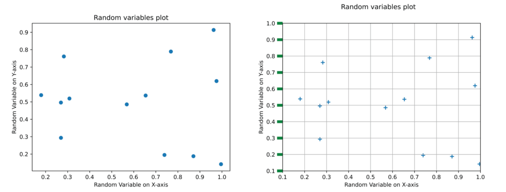
Left: implicit method. Right: explicit method. Both with the same random dataset.
# implicit style
plt.figure()
plt.scatter(data[:,0],data[:,1])
plt.xlabel("Random Variable on X-axis")
plt.ylabel("Random Variable on Y-axis")
plt.title("Random variables plot")

#explicit style
fig, ax = plt.subplots()
ax.grid(True)
ax.set_xlim(0.1,1) #limits of the axis
ax.set_ylim(0.1,1)
ax.tick_params(right=False, left=True, axis="y", color="g", length=10,width=5) #axis ticks
ax.scatter(data[:,0],data[:,1],marker="+",s=50) #data plot itself
ax.set_xlabel("Random Variable on X-axis")
ax.set_ylabel("Random Variable on Y-axis")
fig.suptitle("Random variables plot") #title above the figure
2 – Classic geosciences plots: raster and scatter
Topographic data
Let’s start by looking at one of the most common pieces of data in geology: the digital elevation model. Such data are often provided by satellite agencies and show the topography of the surface. Let’s take a closer look by processing the GLO 30 DEMs (30m pixels resolution). PS: Would you recognise where this area is? (Answer at the end of the article)
We extract the elevation data from the geotiff and we obtain a numpy raster. The raster can be plotted using the imshow function. We add a multidirectional hillshade to see better the relief, and a colormap for the elevation. By playing on the transparency (alpha parameters = between 0 (transparent) and 1 (opaque)), the two layers blend perfectly. The colorbar can also be customised. In our example the hillshade enhances the normal faults of the area.
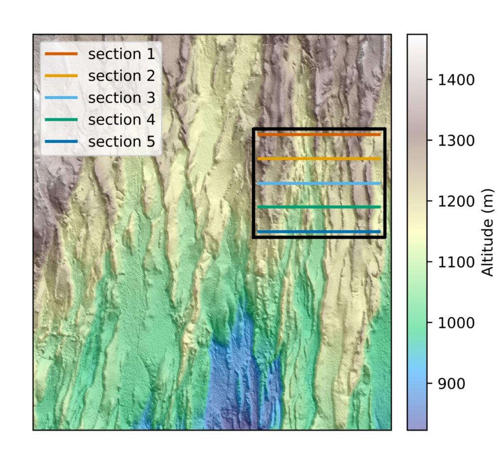
Topography raster (GLO 30), with relief enhanced by hillshading. The cross sections used later are also visible in the black rectangle on the right. The whole area is 20km wide.
# Plot raster figure
fig, axs = plt.subplots(1, 1)

#plot hillshade and DEM
hillshade = earthpy.spatial.hillshade(altitude) #the hillshade highlight the relief
earthpy.plot.plot_bands(
    hillshade, cbar=False, ax=axs)
image=axs.imshow(altitude,cmap=cm.terrain, alpha=0.5)
cbar=plt.colorbar(image,fraction=0.04, pad=0.03,label="Altitude (m)") #color bar of the topography

#plot cross section
axs.plot([west_pix,east_pix],[latitude_section_1[0][0],latitude_section_1[0][0]],c="#D55E00",label="section 1",linewidth=2)
axs.plot([west_pix,east_pix],[latitude_section_2[0][0],latitude_section_2[0][0]],c="#E69F00",label="section 2",linewidth=2)
axs.plot([west_pix,east_pix],[latitude_section_3[0][0],latitude_section_3[0][0]],c="#56B4E9",label="section 3",linewidth=2)
axs.plot([west_pix,east_pix],[latitude_section_4[0][0],latitude_section_4[0][0]],c="#009E73",label="section 4",linewidth=2)
axs.plot([west_pix,east_pix],[latitude_section_5[0][0],latitude_section_5[0][0]],c="#0072B2",label="section 5",linewidth=2)

#plot black frame
x1, x2, y2, y1 = west_pix-10, east_pix+10, latitude_section_1[0][0]-10, latitude_section_5[0][0]+10  # subregion of the original image

# Coordinate for the black rectangle
xs = [x1,x1,x2,x2,x1]
ys = [y1,y2,y2,y1,y1]
axs.plot(xs, ys, color="k", linewidth=2.2)

axs.legend(loc="best") #plot legend where there is the more space
Topographic cross-sections
To look at the area in more detail, we can plot some topographical cross sections. We got the data using the profile tool in QGIS and then copy-paste the data in a .txt file.
Using Matplotlib we can change the colours to differentiate the sections or different types of lines. The different lines are particularly adapted for printing in black and white. The legend is also customisable, you can choose to let the code decide where to place it (on a free space if available) with the argument loc=’best’. The different lines highlight the normal fault profiles from north to south. You can also choose progressive colours to show the connections between the lines. For accessibility, it is important to check the contrast ratio between colours. This will ensure that the colours are easy to distinguish. It is also advisable to use colour-blind friendly colour maps so that everyone can enjoy your plots. Adobe tools for contrast ratio and colour blind safety.
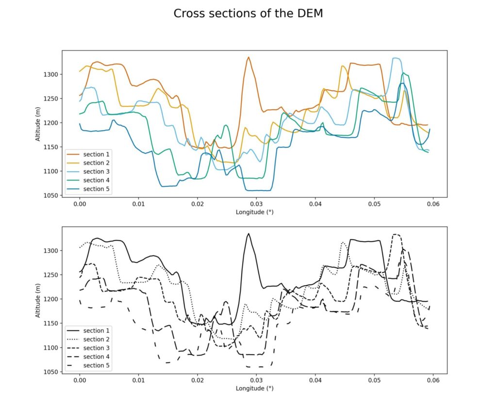
Topographic cross section over the area. Each section is about 6,6km long. As the sections are almost parallel to the fault axis, we see the structure of horst-graben typical of the area. The section ID are organised from 1 = most north, to 5 = most south.
#Plot with different colors
# Colors are extracted color blind safe and from here : https://www.nature.com/articles/nmeth.1618
fig, axs = plt.subplots(2, 1, figsize=(12,12))
axs[0].plot(section_1[:,0],section_1[:,3],c="#D55E00",label="section 1")
axs[0].plot(section_2[:,0],section_2[:,3],c="#E69F00",label="section 2")
axs[0].plot(section_3[:,0],section_3[:,3],c="#56B4E9",label="section 3")
axs[0].plot(section_4[:,0],section_4[:,3],c="#009E73",label="section 4")
axs[0].plot(section_5[:,0],section_5[:,3],c="#0072B2",label="section 5")
axs[0].legend(loc="best")
axs[0].set_xlabel("Longitude (°)") # set the title of the x-axis
axs[0].set_ylabel("Altitude (m)") # set the title of the y-axis

# Plot with different line styles
axs[1].plot(section_1[:,0],section_1[:,3],linestyle="solid",label="section 1",c="k")
axs[1].plot(section_2[:,0],section_2[:,3],linestyle="dotted",label="section 2",c="k")
axs[1].plot(section_3[:,0],section_3[:,3],linestyle="dashed",label="section 3",c="k")
axs[1].plot(section_4[:,0],section_4[:,3],linestyle=(5, (10, 3)),label="section 4",c="k")
axs[1].plot(section_5[:,0],section_5[:,3],linestyle=(0, (5, 10)),label="section 5",c="k")
axs[1].legend(loc="best")
axs[1].set_xlabel("Longitude (°)")
axs[1].set_ylabel("Altitude (m)")

fig.suptitle("Cross sections of the topography",fontsize=20)
Scatter plots
In this example, we want to show that complex datasets can be easily plotted by breaking them down into smaller datasets and then looping over them. We show a dataset of measures of length vs maximum displacement from various sources, from the paper of Lathrop et al. 2022.
To break down the complex dataset, we first group by data type, which gives us a dictionary containing 20 numpy arrays. The second step is to merge the arrays with a common type (seismic or outcrop). Finally, we loop over this last dictionary to plot each array with a different colour.
#Group the data by types of sources
grouped_df_lathrop = data_frame_lathrop.groupby("Data Type") #df: dataframe

grouped_arrays = {data_type: data_frame_lathrop[["Displacement max (m)","Length (m)","LogD","LogL"]].iloc[indices].values for data_type, indices in grouped_df_lathrop.groups.items()}

#Assemble the different groups identified by Lathrop et al under more general terms.
#We use combination of conditions on the dict keys to acheive it
#Group all the Seismic type together, group all the Outcrop types together.
for i,indices in enumerate(grouped_arrays.keys()):
    if "seismic" in indices or "Seismic" in indices and not "Outcrop" in indices:
        if "Seismic" in new_sorted_array.keys():
            new_sorted_array["Seismic"]=np.concatenate((new_sorted_array["Seismic"],grouped_arrays[indices]),axis=0)
        else:
            new_sorted_array["Seismic"]=grouped_arrays[indices]
    elif "outcrop" in indices or "Outcrop" in indices:
        if "Outcrop" in new_sorted_array.keys():
           new_sorted_array["Outcrop"]=np.concatenate((new_sorted_array["Outcrop"],grouped_arrays[indices]),axis=0)
        else:
           new_sorted_array["Outcrop"]=grouped_arrays[indices]
    else:
        new_sorted_array[indices]=grouped_arrays[indices]
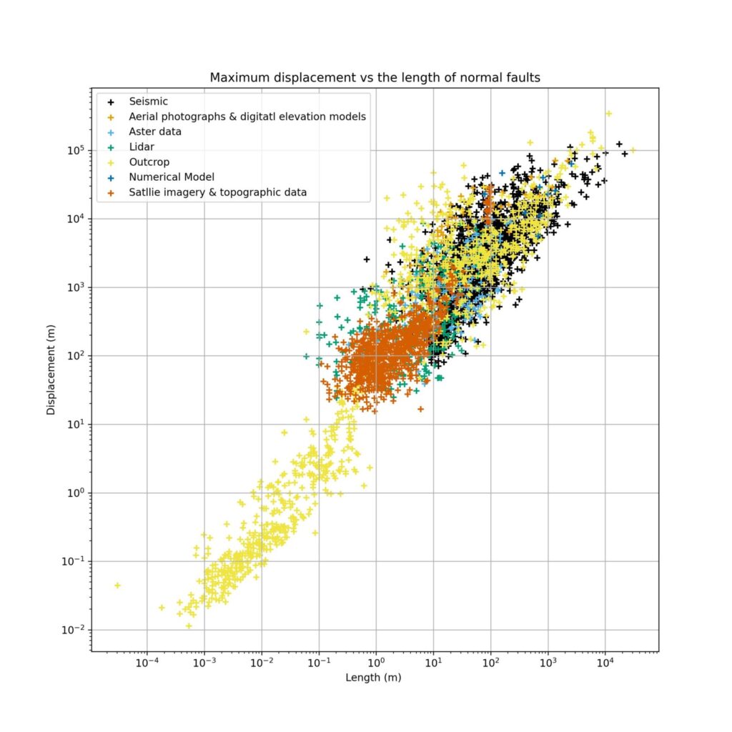
Scatter plot normal faults Displacement over length. We see each group of data in a given colour. This plot is a subset from the data of Lathrop et al. 2022.
#Scatter plots data from Lathrop et al, 2022

fig, axs = plt.subplots(1, 1)
axs.set_xscale("log")
axs.set_yscale("log")
axs.grid(True)

colorblind_safe_colors=["#000000","#E69F00","#56B4E9","#009E73","#F0E442","#0072B2","#D55E00","#CC79A7"]

for i, indices in enumerate(new_sorted_array.keys()):
    axs.scatter(new_sorted_array[indices][:,0],new_sorted_array[indices][:,1],label=indices,marker="+",s=35,c=colorblind_safe_colors[i])

axs.legend(loc="best")
3 – Interactive plots
a) Matplotlib backends : Interactive vs non interactive backends
Another aspect of Matplotlib is the push towards interoperability between OS and IDE. As someone who often works with GUIs in Python, Baptiste knows that this is a challenge and you often end up with apparent complexity for your project.
Fortunately, Matplotlib provides different backends (i.e. the code that draws the figure and the window) to work with, which can be divided into two categories: interactive and non-interactive backends.
The non-interactive backends are used to provide static images of the plots. This is what we saw earlier in this tutorial. It can be triggered with the %matplotlib.inline command at the beginning of a Python script.
On the other hand, interactive backends provide the user with the ability to play around by using libraries that create a GUI. Matplotlib allows you to use the library of your choice to render plots, the two most common being Tkinter and PyQt (but that may be for a future episode…). The choice of backend library doesn’t change much visually. With that little explanation out of the way, let’s dive into some code.
b) Animations
A common way to use animation, i.e. a sequence of plots, is to define an animation function that draws the plot corresponding to the frame. Let’s look at an example to make this clearer. We use the DEM from the analog models made by Nicolas Molnar in 2017 (see paper). At each time step, the normal faults grow, orthogonal to the extension direction. We start by generating a function that draws a different plot at each frame.
def animate(time):
    mydem = dems["dem"+str(time)] #get the dem values for each timestep
    hillshade = earthpy.spatial.hillshade(mydem, azimuth=az, altitude=alt) #create hillshade
    ax.set_title("DEM")
    im=ax.imshow(mydem, cmap="gist_earth", vmin=-8, vmax=2)
    ax.imshow(hillshade, cmap="Greys", alpha=0.3)
We then use Matplotlib’s animation module to render the animation in a window. The slider add some control over the frames. All we need to do is define a slider from the widgets module.
Now we can navigate through time steps with the mouse. This code is particularly useful for tracking the evolution of features and visualising all the evolution in one window.
fig, ax = plt.subplots()
# Here we adjust the position of the slider since the plot is not a square it will create some
# weird looking placement and we adjust below the position of the slide according to it
# This has been done by trial and errors.
fig.subplots_adjust(left=-0.5)

# show first plot at creation of the figure
mydem = dems["dem1"]
hillshade = earthpy.spatial.hillshade(mydem, azimuth=az, altitude=alt)
ax.set_title("DEM")
im=ax.imshow(mydem, cmap="gist_earth", vmin=-8, vmax=2,aspect="equal")

ax_slide=plt.axes([.3,.04,.5,.03]) #position slider
# link color bar to im and the colorbar will be updated automatically when im limits change (not here since the limits are sets at each animatin see above)
colobar=fig.colorbar(im,ax=ax)
ax.imshow(hillshade, cmap="Greys", alpha=0.3,label="Altitude (mm)")

slide = Slider(ax_slide,"Time step", 1, 16,valstep=1) #interactive slide

slide.on_changed(animate) #update of the image with the slider
We hope this article has helped you and that you have discovered some useful tricks. You can download all the code and data we used in this Gitlab.
PS: This area is in the Magadi Natron Basin, at the southern end of the Kenya Rift.
PS2: If you have any questions please leave a comment below
– References –
Matplotlib cheatsheets to keep, print, use as reminders https://matplotlib.org/cheatsheets/ A. Lathrop, C. a.-L. Jackson, R. E. Bell, et A. Rotevatn, « Displacement/Length Scaling Relationships for Normal Faults; a Review, Critique, and Revised Compilation », Front. Earth Sci., vol. 10, août 2022, doi: 10.3389/feart.2022.907543. , , and (2017), Interactions between propagating rotational rifts and linear rheological heterogeneities: Insights from three-dimensional laboratory experiments, Tectonics, 36, 420–443, doi:10.1002/2016TC004447. GLO 30 DEM European Space Agency (2024). <i>Copernicus Global Digital Elevation Model</i>. https://doi.org/10.5270/ESA-c5d3d65


Jonathon Leonard
Great idea for a series!