Communicating research to a broad audience is always difficult for scientists. Because of their ability to translate ideas into visuals that can be used to communicate information to a wide range of audiences, scientific illustrators are critical to the communication of scientific information. In this week’s blog, we are introducing Trud Antzée, one of our blog illustrator.
Trud Antzée
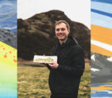
Trud Antzée is a former musician and piano teacher who has made a career change into information design. She enjoys creating data visualisations and visuals that explain facts and tell a story. She has also been dancing Argentine social tango since 2004, and she is the designer, developer, and author of TANGO NOTES, a website dedicated to traditional Argentine tango music. Trud and her partner enjoy urban gardening, biking, and travelling to social tango events when they are not designing. She also DJs for tango events and currently resides in Oslo, Norway. She joined Geodynamic Division of EGU blogs as an illustrator in 2020. Let us hear from Trud how her journey with EGU GD has been so far.
Through Twitter in the spring of 2020, I came across an enthusiastic appeal by Iris van Zelst, Editor-in-Chief of the EGU’s GD Division blog. She decided to attempt something new: blog illustrators, in addition to upgrading the blog team with new blog authors for the next period. Instead of using a cover image from Unsplash, the authors might have one created just for their blog post. This seems like a fun thing to be a part of. For many years, I have drawn my own writing. It might be intriguing, however, to try to depict someone else’s work. So I emailed Iris, who decided to add me to the blog team.
Confession Time
I’m not a geoscientist. I’m a classically educated pianist and piano instructor who is transitioning into data visualisation design/data art. This arose from the surprising discovery (at the age of 47!) that I enjoy coding. I encountered the work of some fantastic data visualisation designers while learning web development and recognised right away that this was my thing. A data-driven graph/visual is certainly not the same as a piece of freehand art/illustration (albeit the lines between the two are blurred), but they do share the concept of turning some information into a drawing. An illustration’s purpose is to supplement the text. It becomes a technique for me to channel an idea or maybe a feeling that I acquire from the text/topic.
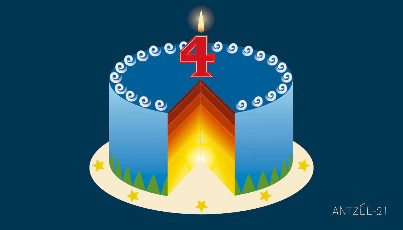
Happy blog birthday!
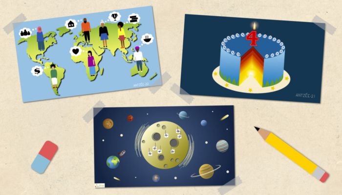
I created my first illustration for the blog for Iris’ fourth “Happy blog birthday!” post in 2021. For the first three years’ birthday posts, she used an image of the Earth with a number-shaped candle on top, so we wanted to keep that theme going. But then I got to thinking about how cake layers may look like geological strata, and thus the cake Earth illustration was formed. Prachi Kar and Michal Pons took the idea to the next level with this year’s blog birthday illustration, so I’m looking forwards to seeing what happens next year!
Continental drift in adademia
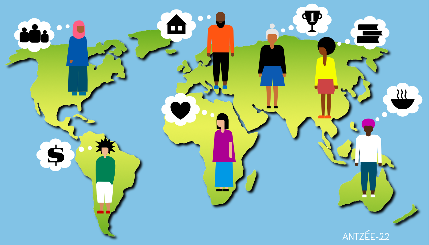
My second graphic was for Jyotirmoy Paul’s ingeniously titled post “Continental drift in academia.” This is a nice collection of anecdotes from seven persons studying for a postgraduate degree/PhD/postdoctoral position abroad. The concept of this image is straightforward: What are some of the most common concerns that students have when studying abroad? What is it like to study so far away from home? I felt it was necessary for this issue to make the portrayal of the individuals inclusive and diverse—even if the fact that a large portion of the blog audience would be viewing this on mobile meant that adding tiny details wouldn’t work. Choosing colours was also difficult because I want my illustrations to be accessible to people who are colorblind.

Where are the far-side deep moonquakes?
The most recent blog illustration I did, was for the “Where are the far-side deep moonquakes?” post by Alice Turner, edited by Antoniette G. Grima. I had so much fun reading up for this post! Before this, I hadn’t heard about moonquakes, but I got some useful links so I could learn a little bit about them. Here, I played with the idea of the moon being shaken by moonquakes all by itself, without anybody being there to notice! Fun fact: the tiny rocket is an old CSS code drawing I made for my partner, who deals with space stuff at the university.
Everything in the illustrations has been created from scratch in Affinity Designer. All three illustrations have been created in collaboration with the blog authors/editors, although I’ve been given free reins to come up with the ideas and style.
Check out the blog posts here:
- Happy blog birthday!
https://blogs.egu.eu/divisions/gd/2021/06/30/happy-blog-birthday-3-2/ - Continental drift in adademia
https://blogs.egu.eu/divisions/gd/2022/01/19/continental-drift-in-academia/ - Where are the far-side deep moonquakes?
https://blogs.egu.eu/divisions/gd/2022/05/11/where-are-the-far-side-deep-moonquakes/ - More of Trud’s work can be found at https://studioantzee.com