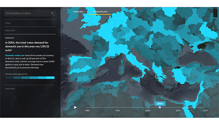
Back in 2022, two hydrologists and water resources specialists from University of Utrecht launched the World Water Map in collaboration with the National Geographic Society and ESRI. Based on the outputs of their global hydrological model PCR-GLOBWB, the team of Marc Bierkens and Niko Wanders map global water resources and identify the regions most at risk of water scarcity.
The maps combine state-of-the-art hydrological modelling, local information, and satellite data to tell the story of the causes behind water scarcity and help shape sustainable water conservation strategies worldwide. Curious about this innovative and exciting science communication and water literacy project, we interviewed one of the lead researchers, Niko Wanders, to obtain some additional insights. Niko is an Associate Professor of Hydrology at Utrecht University, specialising in large-scale hydrological modelling for water resources assessments, with currently a special focus on droughts.

Niko Wanders is associate professor in Hydrology at Utrecht University, working on large-scale hydrological modelling of drought and climate change.
What inspired you and your team to start the collaboration with National Geographic, and what do you hope to achieve by the end of the five-year initiative?
It started with the National Geographic Society being interested in some of our open science products and earlier work, where we developed output for a broader audience. They reached out to us, and during our conversations, we really got excited about the opportunity to combine science with storytelling. While I really enjoy blue sky research and looking into more fundamental problems, there is also a beauty to having your scientific outcomes being validated by people on the ground who experience the impact of the water problems we identify. By collaborating with National Geographic Society, we can really have a wider reach and make those local connections.
At the end of the five-year Initiative, we aim to have several open-access products aimed at the general public, policy makers and researchers, as well as insights into the effectiveness of mitigation options. Last year we launched the World Water Map and we are currently working on two more versions. One of them will focus on policy makers and researchers, allowing them to quickly analyze specific regions and obtain timeseries and model outcomes for their region of interest. The other version is aimed towards students aged 12-18, to let them explore how people are using water, and how water issues are affecting everyday life. Both will be launched in late 2024.
At the same time, we are working on improving the global hydrological model and making an online hybrid version of the model that allows people to perform their own simulations. This will enable everyone to inspect and assess the effect of different mitigation strategies to reduce water scarcity impacts.

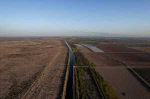
A canal outside of Phoenix. The aqueduct diverts water from the Colorado River to allow for more development in one of the fastest-growing cities in the United States. Picture by Caitlin Ochs
This project brings an emphasis on storytelling. How do you see the role of science in storytelling to raise awareness around global water issues?
I think the combination of storytelling with scientific output is really powerful. As scientists we are used to making figures and graphs, but telling a good story is a different job. By bringing the scientific data to life with interviews, photos and movies we can really bring something extra to science. For example the work by National Geographic Explorer and visual journalist Caitlin Ochs shows the human impact of the water issues in the Colorado River Basin in a way no scientific number can. By having the data and numbers to support the story in combination with imagery we can shed light on all elements of the global water issues.
Personally, I also learn a lot from talking to storytellers and it motivates us to also provide more accessible scientific output so our insights can support others as well.
What were the most exciting challenges that you faced working on these maps?
The biggest challenge by far is to make sure you can explain the content of the maps in simple terms. In a way that the science is still relevant but also insightful for a broader audience. Explain what we do, how we do it and think about how we can communicate complicated topics. We have done many brainstorm sessions on how to produce the best maps and discuss what to include and what to leave out. But in the end, simplicity is key in getting the message across.

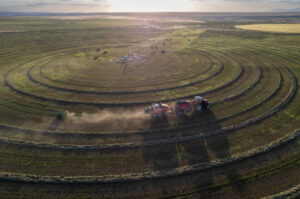
Farming in the Colorado river basin. Pictury by Caitlin Ochs
With the maps, you’re focusing on the reasons behind water scarcity hotspots. Could you share some of the most surprising factors you’ve identified so far?
I think one of the more surprising find we had, was the work done by Myrthe Leijnse. In her recently published article she used a literature review to validate our modelling framework, and she found there are seven main reasons behind water scarcity hotspots. More known causes include: hydroclimatic change, agricultural water use and population growth. But there are also lesser known causes, like water treatment and desalination, surface and groundwater depletion, land subsidence and virtual water trade. Interestingly, the responses to this increased pressure on the water system are multi-pronged and it is really regionally dependent on how effective the mitigation options are. This also means we need to include these elements in our hydrological modelling frameworks to make them useful, something we are currently working on.
Anything else you would like to share with our readers?
If anything I’m more and more excited about collaborating with storytellers and organisations like National Geographic Society. I learnt a lot from looking at day-to-day science from a different perspective and it becomes increasingly evident to me that it is key that we try to make our science accessible and understandable for a broader audience. Clearly that’s easier for some topics, but we should all try.
Questions by B. Schaefli
