Having spent most of my life in places where the temperature hardly ever falls below zero, my first winter in Sweden was painful. Especially for my bum, who met the ice quite unexpectedly. Reading the news this week, from reports of emergency services overwhelmed after so many people had slipped to a scientific study on how no shoes have a good enough grip, via advice on how to walk like a penguin ...[Read More]
Image of the Week – What’s Hot in the Cryosphere? A 2018 review
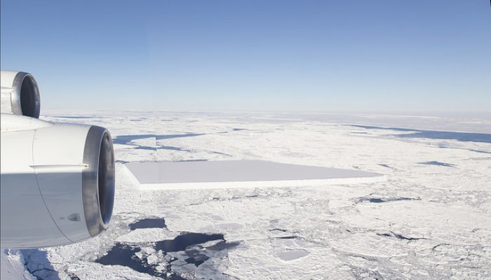
Every year, humanity understands more and more about a remote and unforgiving component of the Earth system – the cryosphere. 2018 has been no exception, and in this blog post we’ll take a look at some of the biggest scientific findings of cryospheric science in 2018. We will then look forward to 2019 and beyond, to see what the future holds for these rapidly changing climate component ...[Read More]
Image of the Week – Will Santa have to move because of Climate Change?
Because of global warming and polar amplification, temperature rises twice as fast at the North Pole than anywhere else on the planet. Could that be a problem for our beloved Santa Claus, who, according to the legend, lives there? It appears that Santa could very well have to move to one of its second residences before the end of this century. But even if he moves to another place, the smooth runn ...[Read More]
Image of the Week – Permafrost features disappearing from subarctic peatlands
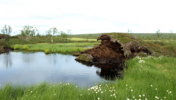
Some of the most remarkable, marginal features of permafrost – palsas – are degrading and disappearing metre by metre from North European peatlands, and are driven close to extinction by the climate change. What are these permafrost features? A palsa is a peat mound with an icy core, which stays frozen throughout summer due to the insulating property of dry peat. These mounds can rise up to 10 met ...[Read More]
Image of the Week – Ice-Spy: the launch of ICESat-2
On September 15th, 2018, at 18:02 local time, NASA launched its newest satellite – the second generation Ice, Cloud and land Elevation Satellite (ICESat-2). ICESat-2 only contains one instrument – a space laser that fires 10,000 pulses per second to Earth to measure elevation. Its primary purpose is for monitoring the ever changing cryosphere, so naturally there are plenty of ice enthusiasts ...[Read More]
Ice-hot news: The cryosphere and the 1.5°C target
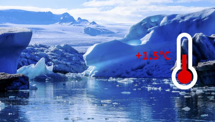
Every year again, the Conference of Parties takes place, an event where politicians and activists from all over the world meet for two weeks to discuss further actions concerning climate change. In the context the COP24, which started this Monday in Katowice (Poland), let’s revisit an important decision made three years ago, during the COP21 in Paris, and its consequences for the state of the cryo ...[Read More]
Image of the Week – (Un)boxing the melting under the ice shelves
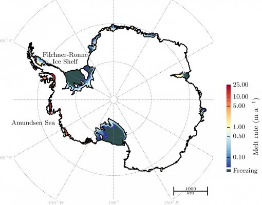
The Antarctic ice sheet stores a large amount of water that could potentially add to sea level rise in a warming world (see this post and this post). It is currently losing ice, and the ice loss has been accelerating in the past decades. All this is linked to the melting of ice – not at the surface but at the base, underneath the so-called ice shelves which form the continuation of the Antarctic i ...[Read More]
Image of the Week – Breaking the ice: river ice as a marker of climate change
Common images associated with climate change include sad baby polar bears, a small Arctic sea ice extent, retreating glaciers, and increasing severe weather. Though slightly less well-known, river ice is a hydrological system which is directly influenced by air temperature and the amount and type of precipitation, both of which are changing under a warming climate. Ice impacts approximately 60 % o ...[Read More]
Image of the Week – Karthaus Summer School 2018
Nearly every year since the late 90s, during the summer, the picturesque Karthaus has hosted 10-day glaciology course. This school is a platform for glaciologists to explore, learn and expand their knowledge base. This helps researchers become multi-faceted: to view glaciology from the perspective of those specializing in other backgrounds such as hydrology, geomorphology, oceanography, etc. which ...[Read More]
Image of the Week – Promoting interdisciplinary science in the Arctic: what is IASC?
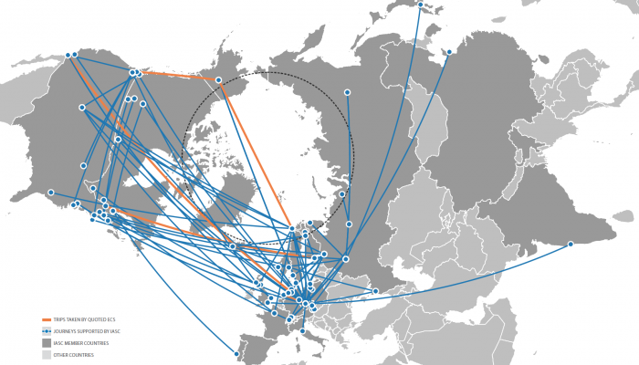
The Arctic is one of the fastest changing regions on the Earth, where climate change impacts are felt both earlier and more strongly than elsewhere in the world. As an integral part of the Earth system, the Arctic is shaped by global processes, and in turn, Arctic processes influence the living conditions of hundreds of millions of people at lower latitudes. No one country or community can underst ...[Read More]

