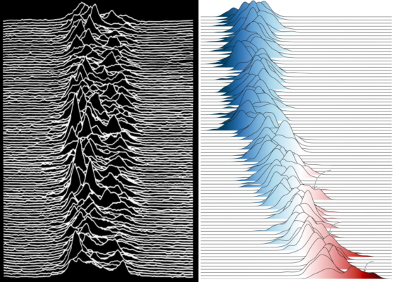
We are visual learners after all and for many of us, creating visual content is far more out of our comfort zone than the already hard earned skills of writing itself. Still, creating an accessible image can be pivotal to not only the success of your paper, but also the reach of your science in general. Today’s post started with a climate figure that went viral because of its similarity to the iconic Joy Division album cover ‘Unknown Pleasures’, and dives deeper into why the “how” of our scientific figures matters more than we might think.
Iconic climate change (info)graphics
The original Joy Division plot from 1979 mystically depicted radio emissions of a pulsar (read more in this post), and since then is seen on fancy wall art and T-shirts. This popularity helped a more recent BBC post go viral as it contained a “Joy Division plot” (Figure 1) showing annual temperature anomalies.
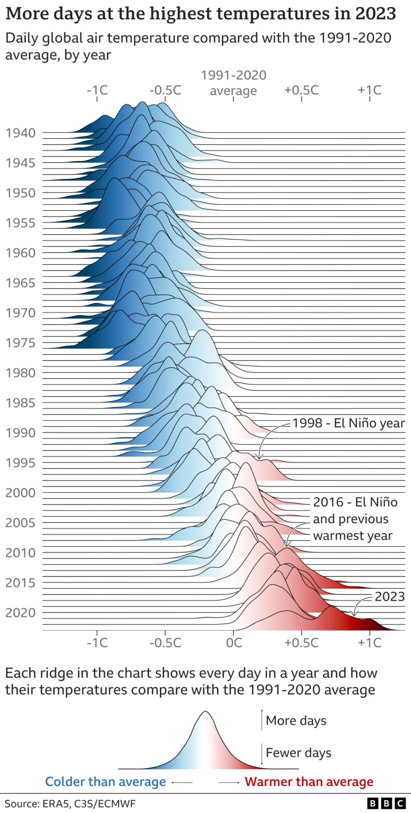
Figure 1: The “Joy Division plot” of the BBC post from 09 January 2024 depicts the deviation from the 1991-2020 average from 1940-2023, stacking the temperature anomalies per day similarly to the iconic Joy Division album cover (see feature image). While we have seen the increasing global temperatures many times before in other scientific plots, the familiarity of this figure allowed it to reach a wider audience [Credit: ERA5, C3S/ECMWF via BBC].
1. The hockey stick
Who of you remembers the “hockey stick” by Michael Mann and colleagues, published first 1998 in Nature (Figure 2)? It became a key tool to depict the speed at which the global climate changes under anthropogenic pressure. Since then, (in my humble perception), such characteristic visuals became more and more important (almost more than the actual facts sadly) to our perception of the emergency state of the climate.
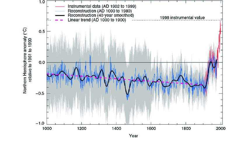
Figure 2: The iconic “hockey stick” figure by Michael Mann et al. 1998 was one of the first figures reaching far into the public awareness to depict how quickly the global climate is warming [Credit: Mann et al. 1998, IPCC 2001].
2. RCP scenarios
Speaking of recognisable IPCC graphics, we all think of the funnel-shaped Representative Concentration Pathways (RCP) scenarios graphs from the IPCC AR5 findings in 2014 (Figure 3) that became beacons not of historic climate developments but a clearer pressure on our responsibility in future anthropogenic impacts.
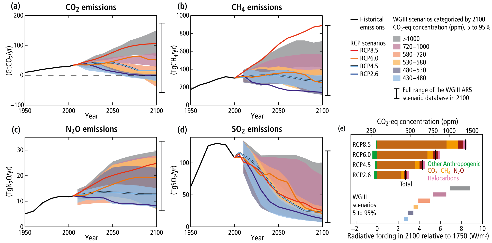
Figure 3: The AR5 IPCC assessment introduced us to the RCP scenario figure, which managed to depict the options we have as humanity and their impact on a potential future climate. [Credit: IPCC 2014, Science, UoR. Data: Berkeley Earth, NOAA, UK Met Office, MeteoSwiss, DWD, SMHI, UoR & ZAMG].
3. Show your stripes
The blue to red gradient became almost a symbol for the warming climate. And which figure gave us more access to that than “Show your strips” did (Figure 4), whether as a twitter background or knitted scarves. The power of making it personal, seeing the differences from one to another location and the daunting similarity of needing a lot of dark red thread at the end of the scarf.

Figure 4. “My” home country strips. A concept many of us especially picked up during the pandemic, when knitting your stripes became both a hobby and act of rebellion. [Credit: Show Your Stripes, Graphics and lead scientist: Ed Hawkins, National Centre for Atmospheric].
A final thought on accessibility
Besides iconic shapes, we are more and more thinking of our colour choices. Many of us became more aware of different visual perception since the Covid pandemic and its forced focus on virtual and visual learning, e.g among neuro-diverse and colourblind audiences. A certain level of consideration and literacy in not choosing your average blue-red-green colours helps so many people more than you think. In preparation for your #EGU24 posters and presentation, I wanted to share this helpful EGU webinar and blog post on stylistic and colour choices in science graphics (including colour alternatives).
Further reading (Your turn to become creative!)
As scientists, our ways of creating scientific figures and our resistance to invest time into creating graphic abstracts, is a real thing. But being the visual creatures we are, the magic lies (also) in our hands and those of professional content creators (see list below), to make our research be… SEEN! So let’s get creative with our graphic abstracts, and new ways to depict our data. Here, you can find tools, courses and professionals with visual science content:
- For more info on scientific graphics and their range from public to elite use, check out Jen Christiansen’s amazing blog post in the Scientific American or her recent book Building Science Graphics
- Courses on creating better science visuals
- Creating better graphic abstracts (and potentially posters)
- Sites and professionals that help to create scientific and appealing figures: BioRender (free to use!), Animate your Science, Simplified Science Publishing, Mind The Graph, Sci-Illustrate, Science Graphic Design and many more
- Good post summarising eight tools to depict global climate change
Edited by Lina Madaj
 Maria Scheel is a Postdoc at Aarhus University in Denmark, working in the Netherlands. During her PhD, her research explored how permafrost microorganisms adapt to the ongoing thaw and erosion in Northeast Greenland permafrost. She uses genetic tools to discover how Arctic life responds to climate change related stressors. She is also one of our chief editors and is happy to get back at you via maria.scheel@envs.au.dk.