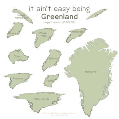
As a reader of the Cryosphere blog, you may have spent a lot of time looking at the Greenland Ice Sheet, but do you really know what Greenland looks like? This “It Ain’t Easy Being Greenland” map is something I made for fun during the #30DayMapChallenge (an international project to complete one map a day during the month of November) and highlights how different the island country appears depending on the map projection it is depicted with. Because Greenland is located near the north pole, it can be significantly more distorted by some map projections compared to places near the equator.
It’s Kinda Easy Being Greenland
You are likely most familiar with Greenland in the pervasive Mercator projection (see figure 1) – elongated and large, with the northern portion expanded more than the narrow south, kind of like a piece of pizza. The Mercator projection is one of the most pervasive map projections mainly for two good reasons: 1. preserving distance was so important to early navigation (and Mercator preserves angles meaning there’s accurate compass bearings), and 2. it is also the projection Google Maps uses.
But, depending on the map projection used, Greenland might be absolutely unrecognizable to you! For example, in the Cube and the Fuller projections, Greenland looks more recognizable as a dog’s head (check out the featured image at the beginning of this post). If you’re using the Goode Homolsine projection, Greenland even gets split into two butterfly wing-like parts. So what does Greenland really look like? Well, this seemingly simple question may be harder to answer than it appears.
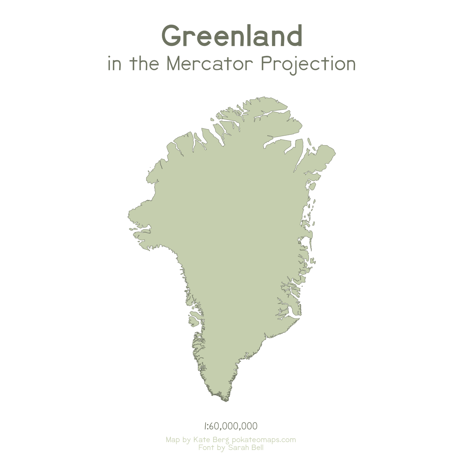
Figure 1: The shape of Greenland in the Mercator map projection. [Credit: Kate Berg]
It Ain’t Easy Going From 3D to 2D
In reality, the world is approximately a sphere. So how do you perfectly translate a 3D object like that onto a 2D surface as a map? The answer is: you don’t. There’s no perfect way to get the sphere to lay flat and there will always be some kind of distortion when you try to “project” the sphere onto a rectangular surface (hence the term map projection). See Gauss’s Theorema Egregium for a deep dive into the related math proof. Now what you choose to preserve and what to distort is up to the cartographer.
One such distortion tradeoff is choosing to preserve shape and angles as is done in the Mercator projection, but that comes at the cost of distorting the size of continents, especially at the poles. This is why the arctic Greenland appears to be so massive; it appears to be about the same size as Africa (that’s a really large ice sheet if that was true!) (figure 2). In reality, Greenland is approximately 800,000 square miles (2 million square kilometers) in area, so about 15 times smaller than Africa, which is 12 million square miles (30 million square kilometers). A fun (and educational) way to compare the true size of countries is to check out www.thetruesize.com.
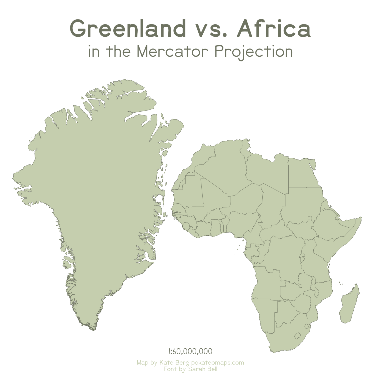
Figure 2: Greenland’s size compared to the size of Africa in the Mercator map projection. [Credit: Kate Berg]
If you wanted to preserve land size, you could use an equal-area map such as the Mollweide projection (figure 3). This projection better translates the actual area, but the shape and angles are quite distorted. This means that two countries that have the same area on the 3D Earth will have the same area on the 2D map and, as such, this projection is great for comparing relative sizes of surfaces globally. Another equal-area projection, the Gall-Peters, is infamous in the cartography realm because it was featured in a classic West Wing TV show scene. That linked video has 2.1 million views and I wouldn’t be surprised if the majority of views are from GIS (geographic information system) professors showing the clip in class.
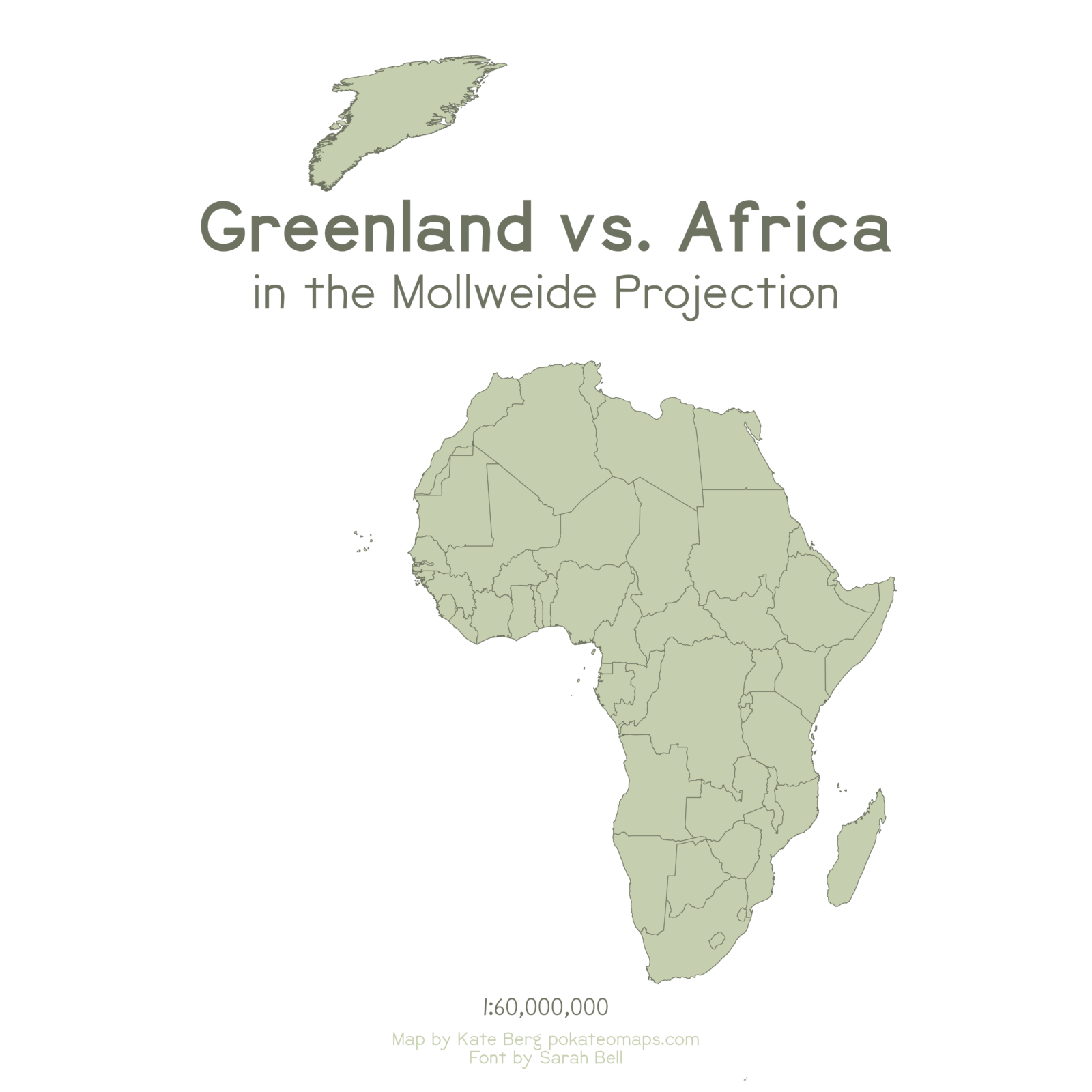
Figure 3: Greenland’s size compared to the size of Africa in the Mollweide map projection. [Credit: Kate Berg]
So what if you wanted to minimize as much distortion as possible in a sort of compromise projection? The National Geographic Society has adopted the Winkel-Tripel projection, so called because it does its best to reduce distance, area, and direction distortions – a triple threat!
It Ain’t Easy Picking the Perfect Projection
At the end of the day, there isn’t a perfect projection. “Right” and “wrong” projections depend on the purpose and audience of the map and what tradeoffs the cartographer wants to make. You can find a more thorough list of map projections (and the option to compare them) at Map-Projections.net. Once you’ve explored all the projections, head over to one of my favorite comics by XKCD, “What your favorite map projection says about you” to see what it means. Perhaps you’ll find that it also ain’t easy picking a favorite projection!
Further reading
- For more about this map creation
- For more from me, Kate
- If you’re interested in learning more about Geographic Information Systems (GIS) communities, I’ve listed them in my Maptastic Resources collection.
Previous blog posts about Greenland:
- A post “For Dummies: Radar altimetry for measuring ice sheet elevation changes”
- A post on ice caps: “Image of the week – The gaze of the ice cap”
- A post on “Cryo Adventures – Installing a weather station on the Greenland Ice Sheet”
Edited by Loeka Jongejans and Lina Madaj
 Kate Berg is the Geographic Information Systems (GIS) Lead at the Michigan Department of Environment, Great Lakes, and Energy (EGLE) where she coordinates environmental mapping and data projects. You can find Kate on Twitter and Instagram as @pokateo_maps where she shares her cartographic creations, hosts the weekly #GISchat conversations, and posts her original map-related memes (#mappymeme) as ways to unite and uplift the geospatial community. Contact: pokatomaps@gmail.com.
Simon Allison
Great Post about Projections , written and simplified with good examples to break it down for the average layperson .
As a GIS / Spatial professional this subject has often been one of the hardest to lay out for students and new comers to the profession .