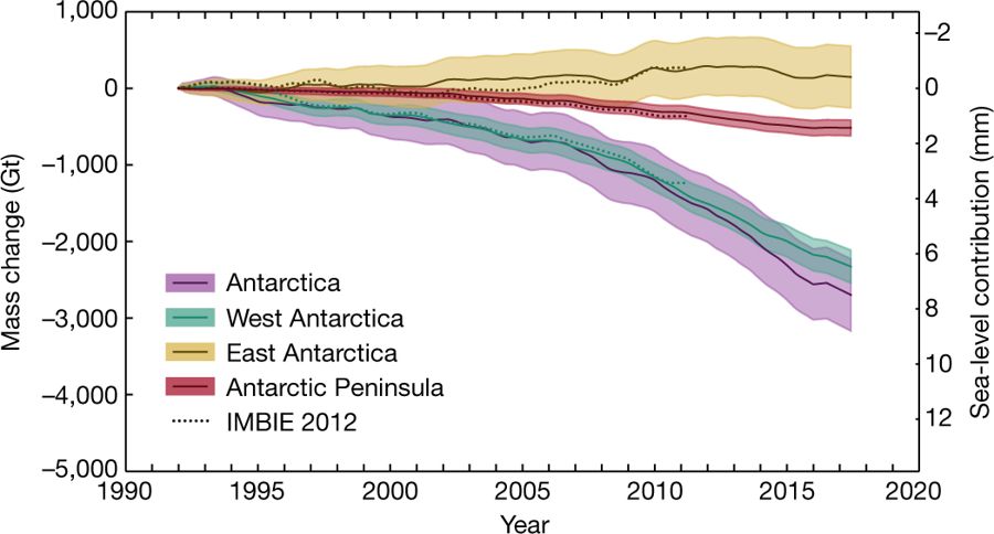
Fig. 1 Cumulative Antarctic Ice Sheet mass change since 1992. [Credit: Fig 2. from The IMBIE team (2018), reprinted with permission from Nature]
It is this time of the year, where any news outlet is full of tips on how to lose weight rapidly to become beach-body ready. According to the media avalanche following the publication of the ice sheet mass balance inter-comparison exercise (IMBIE) team’s Nature paper, Antarctica is the biggest loser out there. In this Image of the Week, we explain how the international team managed to weight Antarctica’s ice sheet and what they found.
Estimating the Antarctic ice sheet’s mass change
There are many ways to quantify Antarctica’s mass and mass change and most of them rely on satellites. In fact, the IMBIE team notes that there are more than 150 papers published on the topic. Their paper that we highlight this week is remarkable in that it combines all the methods in order to produce just one, easy to follow, time series of Antarctica’s mass change. But what are these methods? The IMBIE team used estimates from three types of methods:
- altimetry: tracking changes in elevation of the ice sheet, e.g. to detect a thinning;
- gravimetry: tracking changes in the gravitational pull caused by a change in mass;
- input-output: comparing changes in snow accumulation and solid ice discharge.
To simplify, let’s imagine that you’re trying to keep track of how much weight you’re losing/gaining. Then altimetry would be like looking at yourself in a mirror, gravimetry would be stepping on a scale, and input-output would be counting all the calories you’re taking in and burning out. None of these methods will tell you directly whether you have lost belly fat, but combining them will.
The actual details of each methods are rather complex and cover more pages than the core of the paper, so I invite you to read them by yourself (from page 5 onwards). But long story short, all estimates were turned into one unique time series of ice sheet mass balance (purple line on Fig. 1). Furthermore, to understand how each region of Antarctica contributed to the time series, the scientists also produced one time series per main Antarctic region (Fig. 2): the West Antarctic Ice Sheet (green line), the East Antarctic Ice Sheet (yellow line), and the Antarctic Peninsula (red line) .
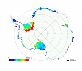
Antarctica overview map. [Credit: NASA]
Antarctica is losing ice
The results are clear: the Antarctic ice sheet as a whole is losing mass, and this mass loss is accelerating. Nearly 3000 Giga tonnes since 1992. That is 400 billion elephants in 25 years, or on average 500 elephants per second.
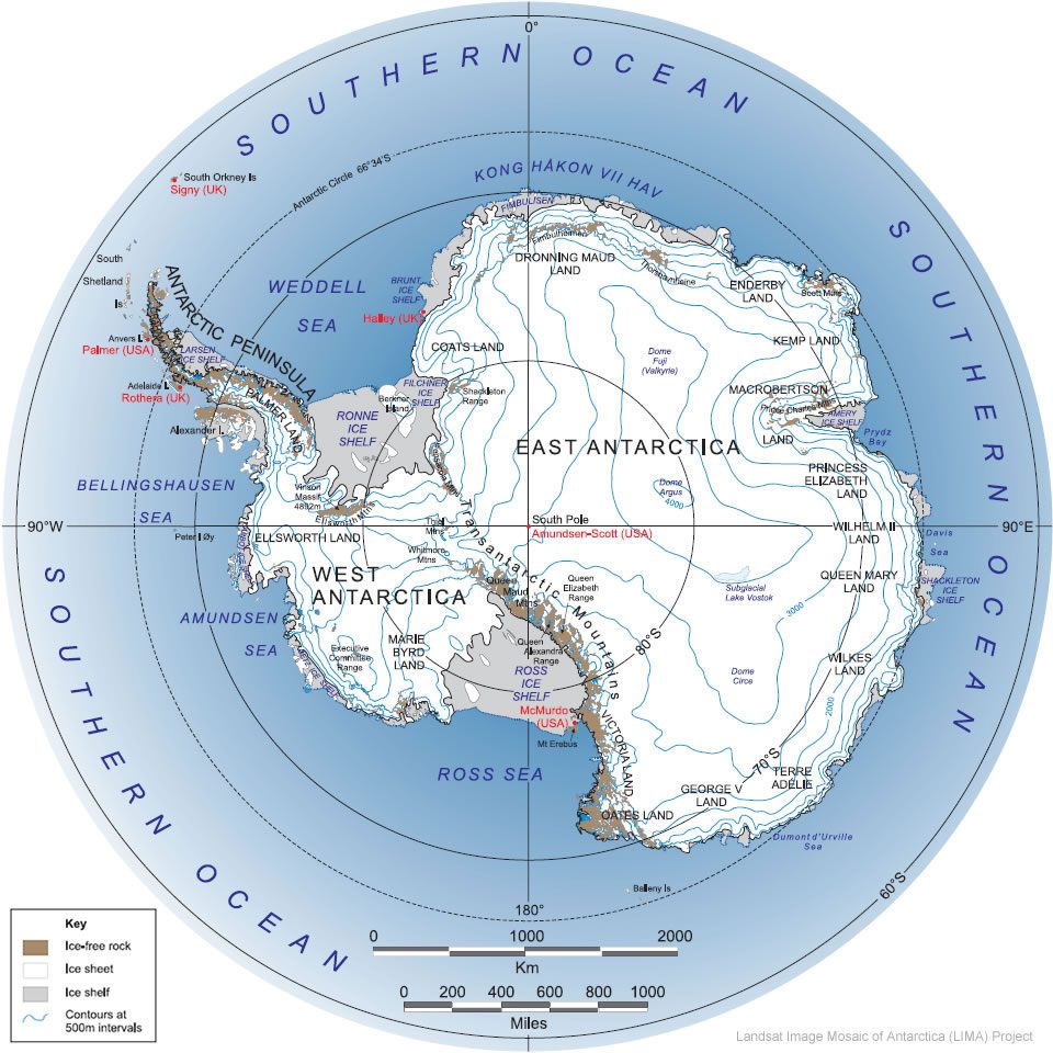
Most of this signal originates from West Antarctica, with a current trend of 159 Gt (22 billion elephants) per year. And most of this West Antarctic signal comes from the Amundsen Sea sector, host notably to the infamous Pine Island and Thwaites Glaciers.
The Antarctic ice sheet has lost “400 billion elephants in 25 years”
But how is the ice disappearing? Rather, is the ice really disappearing, or is there simply less ice added to Antarctica than ice naturally removed, i.e. a change in surface mass balance? The IMBIE team studied this as well. And they found that there is no Antarctic ice sheet wide trend in surface mass balance; in other words Antarctica is shrinking because more and more ice is discharged into the ocean, not because it receives less snow from the atmosphere.
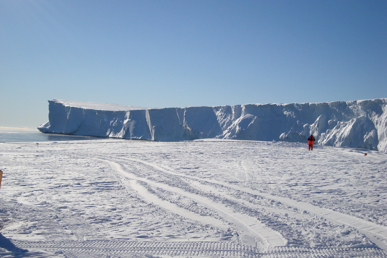
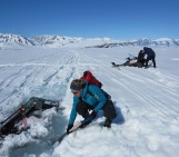
Floating ice shelf in the Halley embayment, East Antarctica [Credit: Céline Heuzé]
What is happening in East Antarctica?
Yet another issue with determining Antarctica’s weight loss is Glacial Isostatic Adjustment. In a nutshell, ice is heavy, and its weight pushes the ground down. When the ice disappears, the ground goes back up, but much more slowly than the rate of ice melting . This process has been ongoing in Scandinavia notably since the end of the last ice age 21 000 years ago, but it is also happening in East Antarctica by about 5 to 7 mm per year (more information here). Except that there are very few on site GPS measurements in Antarctica to determine how much land is rising, and the many estimations of this uplifting disagree.
So as summarised by the IMBIE team, we do not know yet what the change in ice thickness is where glacial isostatic adjustment is strong, because we are unsure how strong this adjustment is there. As a result in East Antarctica, we do not know whether there is ice loss or not, because it is unclear what the ground is doing.
What do we do now?
The IMBIE team concludes their paper with a list of required actions to improve the ice loss time series: more in-situ observations using airborne radars and GPS, and uninterrupted satellite observations (which we already insisted on earlier).
What about sea level rise, you may think. Or worse, looking at our image of the week, you see the tiny +6mm trend in 10 years and think that it is not much. No, it is not. But note that the trend is far from linear and has been actually accelerating in the last decades…
Reference/Further reading
The IMBIE Team, 2018. Mass balance of the Antarctic Ice Sheet from 1992-2017. Nature 558, 219–222.
Edited by Sophie Berger