Who is dreaming of a white spring?
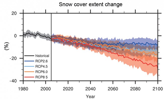
In daily life we might be more interested in the chances of a white Christmas, but the amount of snow-covered ground in the spring is a very good indicator of climate change. The figure above shows the projected change in snow cover extent in the Northern hemisphere in March-April according to different future scenarios (i.e. Representative Concentration Pathways or RCPs of the IPCC). All the scenarios predict a decrease in spring snow, and the reduction goes up to 30% by 2100, for the most pessimistic scenario.
Below is shown the changes in snow cover in historical times for the Northern hemisphere, the grey line is the change in snow cover in the spring. The red crosses are based on satellite data and show the snow cover in June. Undoubtedly, we are heading for a warmer climate but it would also seem that springtime skiing holidays could become a thing of the past.
The COP21 meeting will determine what steps will be taken in the future and which scenario path we will follow. Regardless of whether you worry about the future of our planet or the future of your skiing holiday – you should take an interest.
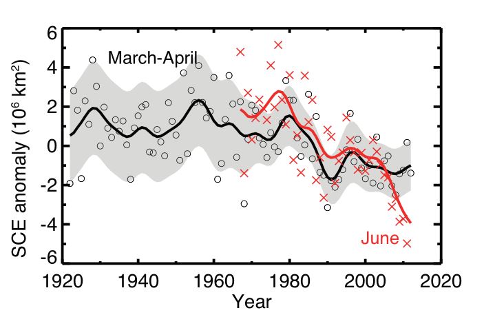
March–April NH snow cover extent (circles) over the period of available data, filtered with a 13-term smoother and with shading indicating the 95% confidence interval; and June (red crosses, from satellite data alone), also filtered with a 13-term smoother. The width of the smoothed 95% confidence interval is influenced by the interannual variability in SCE. For both time series the anomalies are calculated relative to the 1971–2000 mean.
The figures in this blog post are taken from the IPCC report (Fig. TS-18 and Fig. 4.19 respectively). You can read more here:


Pingback: Cryospheric Sciences | Image of the Week – Climate Change and the Cryosphere