Applied mathematics is often seen as an obscure field, which the general public has no hope of ever understanding. In the context of climate science, this is far from the truth. In fact, many mathematical concepts and ideas applied to the study of the climate system stem from intuitive arguments. While their implementation can be very complex, understanding the basic ideas behind them does not require a PhD in Science.

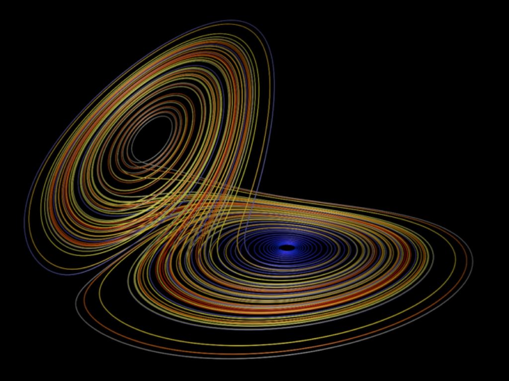
The Lorenz 1963 attractor, often known as the “Lorenz Butterfly”. Author: Paul Bourke (http://paulbourke.net/fractals/lorenz/)
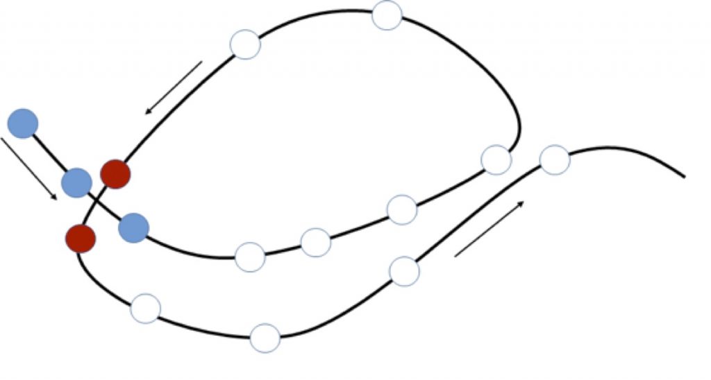
For example, this is the case of some recent developments in the field of dynamical systems analysis applied to atmospheric data. The atmosphere changes continuously and in many ways: for example, winds become stronger or die down, temperatures rise or fall and rain comes and goes. Understanding this evolution is important in many domains, from weather forecasting to air traffic management to catastrophe response services. The basic idea of the dynamical systems approach is to visualize the evolution of the atmosphere as a series of points connected with a line, which form a trajectory. The figure above shows a well-known example of such a trajectory: the so-called “Lorenz butterfly” (Lorenz, 1963). Now imagine focusing on a specific variable – for example daily surface temperature – and a specific region – let’s say Europe. We can build a trajectory, similar to the one shown above, describing the day-by-day properties of this two-dimensional (latitude by longitude, just as in a geographical map) temperature field. From day to day, the temperature varies therefore each day corresponds to a different point along the trajectory. In the case where two days are very similar to each other, they will correspond to two points very close together. On the contrary, if they show very different temperatures, the points will be further apart. If the similar days are well separated in time, for example occurring during different years, the trajectory representing surface temperature over our chosen region will therefore return close to a point it had previously visited, meaning that the closeness of the points and their distance in time do not always correlate. In the figure below, for example, the three turquoise dots are close to each other and also correspond to successive days along the atmospheric trajectory. The two red dots correspond to temperature configurations similar to those of the turquoise dots, but are separated from the latter by several days.

The continuous black line represents an idealized trajectory, while the circles correspond to successive days along the trajectory. The arrows indicate the direction the time goes.
This way of visualizing the atmosphere might seem bizarre, but it can give us some very powerful insights on how the climate system works. Consider, for example, summer heatwaves in Europe. The most severe ones can persist for several days and can have major impacts on human health, the environment and the economy. As can be intuitively understood, their persistence is due to the fact that the large-scale atmospheric conditions causing them are also persistent. If we return to our atmospheric trajectory, this will mean that we have a large number of points which are close to each other and successive in time – such as is the case for the three turquoise dots in the figure above. Namely, the trajectory moves very slowly and for several days the large-scale circulation only changes very slightly. In mathematical terms, this is a “sticky” state, and again the name is very intuitive! Analyzing the stickiness of the atmospheric states help us to predict how long a given circulation configuration is likely to last, thus providing useful information for weather forecasts.
The next natural step is to try to predict what the atmosphere will do once it has left a sticky state. Dynamical systems theory can again help us. It is in fact possible to define another quantity called “local dimension”, which tells us how complex the state of the atmosphere is. Once again the word “complex” here means exactly what you imagine: a complex temperature state will be one with lots of small, complicated spatial patterns. A simple state will be one with only a small number of large-scale features: for example, a day with high temperatures across the Mediterranean region and cold temperatures over most of Continental and Eastern Europe. Returning to our trajectory, these complex (or high-dimensional) and simple (or low-dimensional) states can be interpreted as follows. In the simple case, it is easy to predict the direction the trajectory will take in the future. This is the same as saying that all similar states evolve in a similar way. So if we want to forecast tomorrow’s temperature and we know that today is a “simple” state, we can look for states similar to today in the past years and we know the evolution of today’s state will be similar to that of these past states. In the complex case, on the contrary, it is very difficult to predict what the trajectory will do in the future. This means that similar atmospheric states will evolve in very different ways, and looking at past days with similar temperatures to today will not help us to forecast tomorrow’s temperature. A complex, high-dimensional state will therefore be more challenging for weather forecasters than a simple, low-dimensional one.
Now imagine looking at a very long climate dataset, for example covering the last century. If the climate system is always the same, one would expect the trajectories for the first and second half of the century to be indistinguishable. If, however, the climate is changing, then one would expect the trajectories representing it to also change. To make an analogy, imagine taking your heart rate. If you measure it on two different days while you are at rest, the number of heart beats per minute will probably be equal. In this case the system – which is here your body – is always in the same state. However, if one day you take your heart rate at rest and the following day you take it while you are running, the results will be very different. In this case something in the system has changed. In just the same way, if the climate system is changing, its “pulse” – namely the trajectory – will change with it. The trajectories of the two half-centuries in the dataset will therefore look different, and their local dimensions and stickiness will display different properties – for example a different mean value. The same two indicators that can help us improve weather predictions at daily to weekly timescales can therefore also help us to understand how climate varies across the centuries.
The dynamical systems approach can be applied to a wide range of scientific problems beyond the examples discussed above. These range from turbulence in fluids to the analysis of financial datasets. Picturing such a complex system as the atmosphere as a “spaghetti plot” is therefore an excellent example of an intuitive mathematical approach that can help us advance our knowledge of the world around us.
Edited by Célia J. Sapart.
Reference: Lorenz, E. N. (1963). Deterministic nonperiodic flow. J. Atmos. Sci., 20(2), 130-141.


