Perhaps you have stumbled upon the word ‘hysteresis’ before, for example in connection with the stability behavior of our Earth’s large ice sheets and their long-term effect on global sea-level rise, or the long-term stability of the Atlantic Meridional Overturning Circulation, or even in another context outside earth/climate science. Or you might have come across this term during your studies, but your memory of it is slowly fading. That was the case with me: when I started to study the hysteresis behavior of the Antarctic Ice Sheet, I had long forgotten that lecture from my studies where I first got to know the term. But very soon, I realized why the concept is so important.
If you want to understand more about the concept of hysteresis, what it has to do with history, why it is important for the Antarctic Ice Sheet (and ultimately for us), and how it is connected to the concept of tipping points, this blog post is just the right thing. Let’s dive in.
Easy start: Feeling comfortable in your living room
Simply put, hysteresis occurs when the state of a system depends on its history. In other words, hysteresis occurs when the change in the system’s response occurs with a time delay to the change of the driving force causing it (‘hysteresis’ comes from Greek hysteros meaning ‘later’). Confused? A classic and nice example that illustrates this rather technical definition involves the thermostats that control the temperature inside your home.
Imagine that you have just set your heating at your preferred room temperature, which we’ll refer to as T_comfy. If the room temperature rises (red curve in Figure 1) and eventually passes a certain threshold (T_high) above your set-point temperature T_comfy, the thermostat shuts off the heating. Conversely, if the room temperature then falls (blue curve) and passes a certain threshold temperature below your set-point temperature (T_low), the thermostat turns the heating back on. Therefore, for any given temperature within the range of this hysteresis gap between T_low and T_high, the thermostat can have two states – on or off – depending on the direction of the curve, i.e., your heating’s history. If the hysteresis gap between the on and off operation did not exist, the thermostat would be flapping between the two states rapidly and most probably break quite quickly.
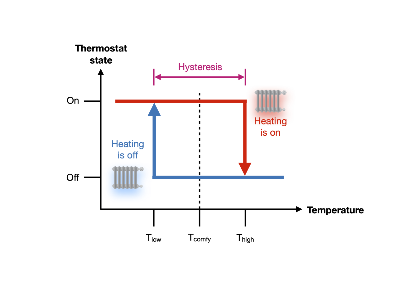
Figure 1: Simple hysteresis diagram of a residential thermostat. Figure credit: J. Garbe.
A bit more complex: The toy ice sheet
Let’s now leave our cozy homes and move to the bone-chilling cold realm of the so-called eternal ice cover resting on the Antarctic continent. Here, the picture looks a bit more complex compared to the binary on/off example of the thermostat. From theory and model experiments, we know that large ice masses like the Earth’s ice sheets exhibit hysteresis-like behavior with regard to their long-term stability. This hypothesis of the coexistence of multiple stable ice-sheet states is based on the presence of strong positive climate feedbacks which lead, once triggered by global warming, to self-reinforcing ice loss until a new equilibrium state is reached. These feedback processes are associated with tipping points, as illustrated in Figure 2 below.
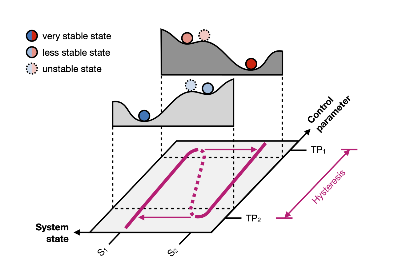
Figure 2: A slightly more complex schematic of a hysteresis diagram (purple curve) and its stability landscape (examples shown for two different values of the control parameter), also showing the two tipping points involved (TP1, TP2). Unstable states are depicted using dashed lines. Figure credit: J. Garbe, based on Scheffer et al. (Nature, 2001).
In our new case, the system (as of now, think of a simplified toy Antarctic ice sheet) can take two different states: S1, the ‘normal state’, and S2, the ‘tipped state’. The control parameter is the temperature. During an ice age, for example, the ice sheet is large and the system is far away from the tipping point TP1, it is very stable (S1, left branch of the purple curve). It can easily be seen that the dark blue ball, representing the stability of our system, rests relatively stable in the deep valley of the stability landscape.
But as global temperatures rise, the climatic stresses acting upon the ice sheet grow, the stability landscape deforms (the landscape with the blue balls evolves into the one with the red balls), and the left-hand valley becomes shallower and shallower. The position of the ball becomes progressively more unstable, until eventually TP1 is reached. At this point, even a small perturbation can kick the (now red-colored) ball out of its equilibrium state and inevitably send it tumbling down into the right-hand valley. The new stable state (S2, right branch of the purple curve) is what we can call the ‘tipped state’, it is associated with a much smaller ice-sheet volume.
It is important to understand that this transition is irreversible: to go back to the original state of the large ‘ice age’ ice-sheet configuration, it is not sufficient to just cool the temperature to its pre-tipping value; instead, the temperature must descend all the way down to the system’s second tipping point TP2 for the stability landscape to regain the form where the ball can roll down-hill back into the deep left-hand valley (the blue version of the stability landscape).
Similar to our simple thermostat example, between TP1 and TP2, the ice sheet can have two stable states for any given value of the control parameter – large ice sheet or small ice sheet – and only history decides which one is adopted.
The intricate case: the Antarctic Ice Sheet
Unfortunately, as always, reality turns out to never be so simple. The Antarctic Ice Sheet is a complex system that not only encodes the history of past climate within the ice itself, but also dynamically responds to present-day perturbations at its boundaries, such as from the atmosphere, the oceans, the biosphere, and the solid Earth (the ground and plate tectonics below). Its fate is determined by a complex interplay between a number of strong positive (amplifying) and negative (dampening) feedback mechanisms. Prominent examples of such positive feedbacks are the ice–albedo feedback, the marine ice-sheet instability (read more about it in this post), or the surface-melt–elevation feedback. Negative feedbacks acting in Antarctica include, for example, the isostatic solid-Earth rebound effect (more in this post).
In general, each of these feedbacks can be associated with a critical threshold – or tipping point – which delays or accelerates the ice mass loss upon transgression – independent of changes in the driving force. As in the previous example, only a minor nudge is needed to inevitably push the ball down-hill into the valley if its situated close to the hilltop.
To figure out how the hysteresis of the Antarctic Ice Sheet looks like, where its tipping points are located, and to map out its stability landscape, we need a sophisticated computer model – the system is too complex to solve it using just our brain, a pen and paper as in the other examples above. The hysteresis diagram resulting from such computer simulations is shown in Figure 3.
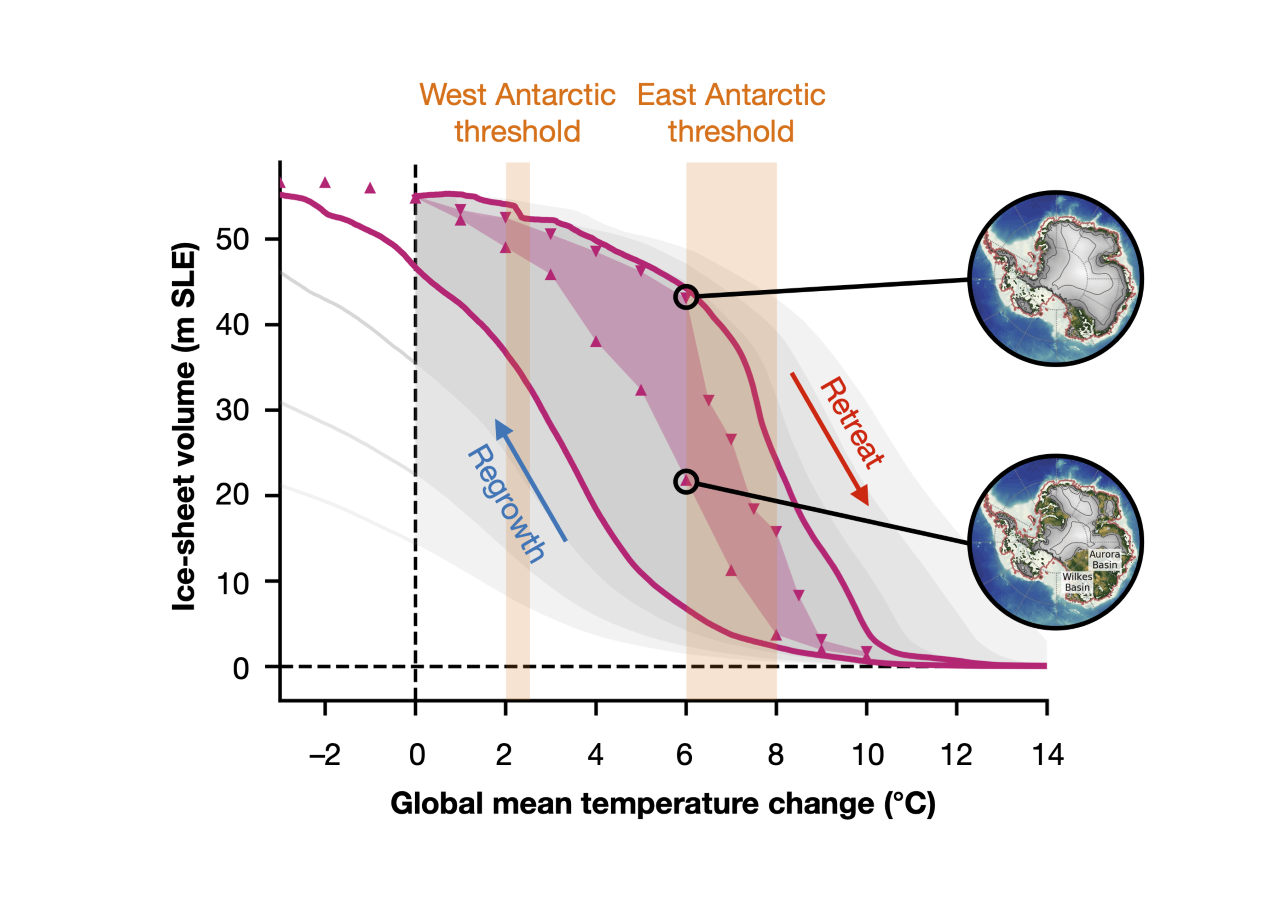
Figure 3: Hysteresis of the Antarctic Ice Sheet: the purple curve shows the ice-sheet volume (expressed in meters of equivalent sea-level rise, m SLE) for the quasi-static simulations; the purple triangles mark the corresponding equilibrium states at discrete temperature levels. The purple filled area marks the ‘real’ hysteresis gap (see text for details). Grey shaded hysteresis loops correspond to different rates of applied temperature change. Figure credit: J. Garbe, based on Garbe et al. (Nature, 2020).
The hysteresis of the Antarctic Ice Sheet describes the evolution of the stable ice-sheet volume with respect to temperature change above the pre-industrial level (in the figure, the ice volume is expressed in terms of how many meters it would lift sea levels globally if instantly converted into water; m SLE = meters sea-level equivalent). In order to track the stable hysteresis branches, the system is required to remain as close as possible to equilibrium at all times during the entire simulation. Therefore, any change in temperature used to drive the model has to be applied as gently as possible in attempt to preserve this delicate equilibrium. To give an example of how sensitive these changes are, the purple curves in Figure 3 were produced by running simulations that perturbed the model temperature at a rate of 0.0001 °C per year (referred to as ‘quasi-static’ simulations). At distinct levels, the simulations are extended at fixed temperatures until the model reaches a ‘real’ steady state (purple triangles in Figure 3; referred to as ‘equilibrium’ simulations).
If we look at these quasi-static simulations for now, it becomes immediately apparent that the shape of the hysteresis* looks much more ‘blurred’ compared to the simpler examples above. This is because the real world is much more complex than the toy ice sheet above, and instead of two tipping points, the Antarctic Ice Sheet exhibits a multitude of critical thresholds. However, two major thresholds are clearly visible: the first, at around 2 °C of warming, precipitates the large-scale disintegration of the West Antarctic Ice Sheet, driven mainly by the marine ice-sheet instability; and the second, at around 6 to 8 °C of warming, initiates a strong decline of the East Antarctic Ice Sheet, mainly driven by the surface-melt–elevation feedback.
As in the simpler examples above, crossing these thresholds implies irreversible changes to the ice, and returning to lower temperatures does not lead to a recovery of the lost ice-sheet volume. Instead, temperatures need to be much lower in order for the ice to grow back. In other words: at any given temperature level within the hysteresis window, the ice sheet can be in two different states depending on whether this point is approached by a climatic warming (coming from an ‘ice age’) or by cooling (coming from a ‘warm age’), with a resulting volume difference up to several tens of meters of equivalent sea-level change.
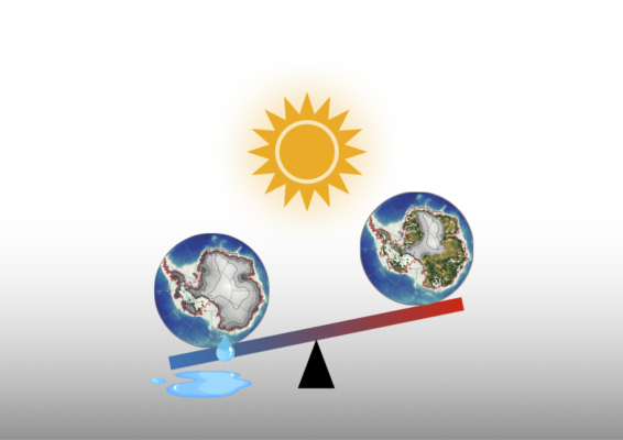
The fact that any temperature level inside the hysteresis allows for (at least) two different ice-sheet states to exist implies a risk of irreversibly switching from one state to the other if the corresponding tipping points are exceeded. Considering the gigantic size of the ice sheet (it comprises an ice mass equivalent to 58 m of global sea-level rise), this could mean irreversibly raising global ocean levels by several meters in the long term if global warming continues unabated.
–––––––
*NB: For simplicity’s sake, I talk about the quasi-static simulations here. Note that the ‘true’ hysteresis of the ice sheet is represented by the equilibrium triangles.
Further reading
- Garbe, J., Albrecht, T., Levermann, A., Donges, J.F. and Winkelmann, R. The hysteresis of the Antarctic Ice Sheet. Nature 585, 538–544 (2020). https://doi.org/10.1038/s41586-020-2727-5.
- Abe-Ouchi, A., Saito, F., Kawamura, K. et al. Insolation-driven 100,000-year glacial cycles and hysteresis of ice-sheet volume. Nature 500, 190–193 (2013). https://doi.org/10.1038/nature12374
- Robinson, A., Calov, R. & Ganopolski, A. Multistability and critical thresholds of the Greenland ice sheet. Nature Climate Change 2, 429–432 (2012). http://dx.doi.org/10.1038/nclimate1449
- Pollard, D. & DeConto, R. M. Hysteresis in Cenozoic Antarctic ice-sheet variations. Global and Planetary Change 45, 9–21 (2005). https://doi.org/10.1016/j.gloplacha.2004.09.011
Edited by TJ Young and Marie Cavitte
 Julius Garbe is a PhD candidate and member of the Ice Dynamics working group at the Potsdam Institute for Climate Impact Research, Germany. His research focuses on the long-term stability behavior and potential tipping points of the Antarctic Ice Sheet and their consequences for future sea-level change. Julius is actively contributing to the development of the open-source ice-sheet model PISM. He tweets as @juliusgarbe. Contact Email: julius.garbe@pik-potsdam.de.