Effective scientific communication of geodetic research often relies on clear visualizations, and colours are needed to make complex data much easier to understand. However, traditional colormaps don’t always provide the needed clarity and can be especially challenging for people with colour-vision deficiencies (CVD). In this post, we will first describe what CVD is and how it is present in academia. We will then turn to examples from different areas of Geodesy – such as GNSS time series, elevation data, the geoid, and InSAR data – that highlight issues with commonly used visualization and show how you can make your figures more accessible and effective.
What is a colour-vision deficiency (CVD)?
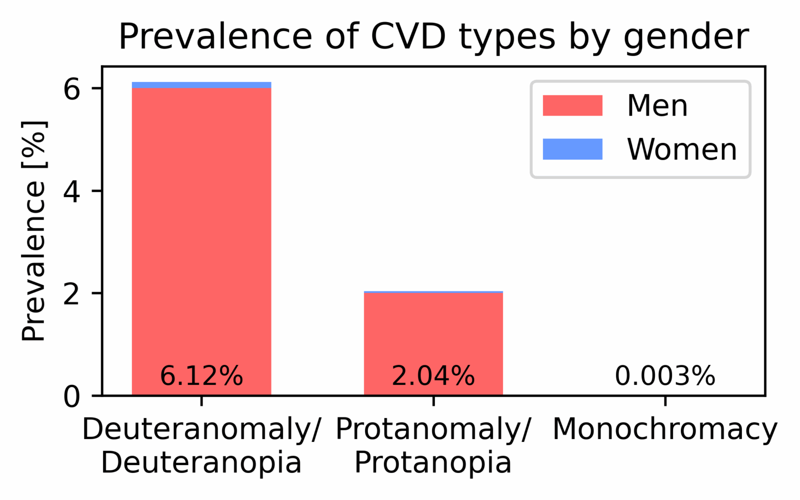
Prevalence of different types of colour vision deficiency (CVD) in men and women based on Deeb (2005).
A person with CVD has difficulties distinguishing certain colours due to differences in, or absence of, the cone cells of the eye responsible for detecting the different wavelengths of light (i.e., colour). There are several types of CVD, including red-green, blue-yellow, and complete colour blindness, each affecting colour perception in different ways. CVD can be inherited from birth or acquired later in life as a result of aging, eye disease, injury, and/or certain medications. Typically, more men are affected by CVD when it is inherited from birth. Several studies (e.g., Deeb, 2005) have shown that Caucasian people are more likely to have CVD, while it is not so likely to meet someone from sub-Saharan Africa with a CVD. In general, about 8% of men and 0.5% of women have CVD, which means that at a geodetic conference with about 500 scientists, around 42 people (40 men and 2 women) would have some form of CVD. While most of them would have deuteranopia/deuteranomaly (green-blindness), only a few would have other types of CVD, such as protanopia/protanomaly (red-blindness), tritanopia/tritanomaly (blue-blindness), or monochromacy (total colour blindness).
Are you wondering if you might have some form of CVD? Then have a first glimpse at the figure below and check if you can see the numbers and forms in the Ishihara colour test plates. More of these test plates can be found, for example, here.
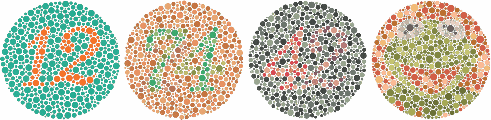
Four Ishihara colour test plates to check for CVD. Please be aware that this is not a medical test and that computer-based colour blindness tests do not give the same results as the original tests. Ishihara colour test plates are obtained from here and here.
Variable colour vision in academia
Coming back to the academic field – how often have you met someone with CVD at a conference or in academia in general? Most likely not many, as entering the field of science is challenging for them. Plus, those who made it in academia anyway often do not talk about it much, in order to avoid unnecessary attention, bias, or being treated differently. People with CVD often struggle to read scientific figures because scientists tend to use the default colours in plotting tools (like Matlab, Python, GMT). Many tools had, or still have, “jet” and “rainbow” as their default colour maps for contour plots. These colour maps are not only problematic for people with CVD, but they can also introduce visual artifacts and misinterpretations (Crameri et al., 2020). This reduces the effectiveness of communicating scientific results. Red and green are also very commonly used together in line plots. Since most people with CVD have difficulty distinguishing between these colours, they often cannot tell such lines apart (e.g., Wong, 2011). Let’s have a look at how geodetic data are typically visualized, how these figures are perceived by people with CVD, and, more importantly, how we can improve visualization to make it more effective and inclusive.
Examples in geodesy – visualization of GNSS data
A typical figure of geodetic data involves plotting GNSS (Global Navigation Satellite Systems) time series. The difference from the reference position (the displacement) is shown as lines or symbols (usually points) over time. With full colour vision (no CVD), it is easy to distinguish the different displacement components (upper left): red for the EW (east-west) component, blue for the NS (north-south) component, and green for the UP (vertical) component. Transforming this figure into a version as seen by people with CVD already reveals problems with these standard colours. For people with green blindness (upper center), the EW and UP components appear very similar and may be hard to tell apart. People with total colour blindness, on the other hand, struggle with the EW and NS components, which both appear as nearly identical shades of grey (upper right). The problem here is that the perceived lightness of red and blue is very similar, which converts to almost identical grey tones.
Lightness also plays a role in how people with full colour vision perceive the data. The UP component (green) has the highest lightness and therefore draws the most attention, regardless of whether the green lines/points are below the red and blue ones. This can be useful if you want to highlight something (e.g., in a presentation), but in this case all components have the same weights and should thus be perceived equally.
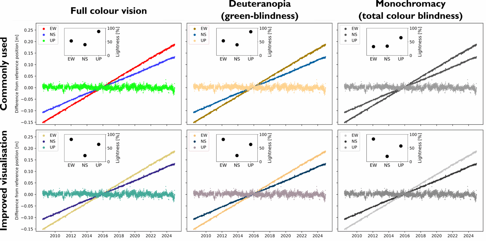
GNSS timeseries for a station in Europe. The upper row shows the GNSS data with commonly used colours and the lower row presents an improved visualization. Graphs in the middle and right column are simulated based on the graph in the left column for deuteranopia and monochromacy, respectively, using Pilestone. Each sub-figure includes a graph showing the lightnesses of the colours.
Hopefully we have convinced you that using red, green and blue in one figure is not suitable. Instead, we propose a different set of colours that vary in lightness but do not unintentionally emphasize one component. You can see in the lower row of the upper figure how the improved visualization is perceived for those with a CVD (lower center and lower right). People with a green blindness can clearly distinguish between the three different GNSS components, since red and green together are avoided in the full-colour vision diagram. The improved set also varies strongly in lightness, producing clearly distinct grey tones in a total-colour-blind simulation. With this visualization, not only can people with all types of CVD see and understand the figure, but those with full colour vision are also not distracted by one colour standing out. And such figures are still readable when printed in black and white.
Here are a few websites where you can find suitable colours and check how they are perceived by people with CVD: one, two, three (and many more if you search for colour-blind-friendly palettes/schemes).
Examples in geodesy – visualization of elevation data
Looking now at another typical geodetic dataset – elevation! Surface elevation is plotted with blues for oceanic areas and green to brownish shades, with some yellow for areas above sea level. Various colour maps can be used to plot elevation as a contour map. Again, we show the lightness of the entire colour map and convert the full-colour-vision figure into versions as seen by people with green blindness and total colour blindness. A standard colour map for elevation data (“terrain” in Python) clearly shows the difference between land and sea for those with full colour vision. However, people with total colour blindness (upper right) cannot distinguish these areas clearly. In addition, people with green blindness have difficulty discriminating between areas around 1500 m and areas around 3500 m in height, as the colours become nearly equivalent.
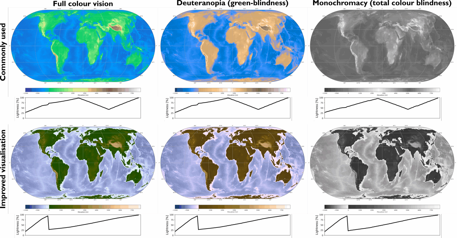
Surface elevation data from GDEMM2024. The upper row shows the elevation data using a commonly used colour map (“terrain”) and the lower row presents an improved visualization using the “oleron” colour map. Maps in the middle and right column are simulated based on the map in the left column for deuteranopia and monochromacy, respectively, using Pilestone. Each sub-figure shows the lightness distribution of the colour map below.
The lightness plots below the colourbars illustrate the problem with this type of colour map: 1) no clear change in lightness occurs at 0 m, resulting in no visual difference in the monochromatic case, and 2) maximum lightness is reached twice for regions on land. In contrast, when using the “oleron” colour map from Scientific colour maps, a clear change in lightness occurs at the interface of sea and land (0 m). This leads to clear visualization for people with total colour blindness, as the land area becomes easily distinguishable. The gradually increasing lightness on land in the “oleron” colour map is also better perceived by people with green blindness, as different heights are represented with clearly distinguishable colours. “oleron” is a multi-sequential gradient colour map, and other colour maps are available via Scientific colour maps (these are available for most plotting tools and are easy to implement).
Examples in geodesy – visualization of the geoid
Let’s move to our favourite colour map: jet – the standard in most plotting tools. “jet” is also typically used to plot the geoid; which geodesist doesn’t know the “Potsdam potato” in blue-green-yellow-red? The lightness of “jet” is neither sequential nor diverging, and its maximum occurs over nearly half of the colorbar. However, the geoid displacement contains values both below and above 0 m, making it a diverging dataset. It is impossible to see the 0 m geoid contours when using “jet,” even for those with full colour vision. The geoid displacement exhibits several significant anomalies, but “jet” highlights only three of them (North Atlantic, Indian Ocean, Oceania). Other anomalies are not visible, regardless of whether the viewer has CVD or not. When an explicit diverging colour map is used (e.g., “vik,” as shown here), more anomalies become visible. Additionally, converting the full-colour-vision figure to simulate red-blindness and total colour blindness gives the reader a clear idea of where the 0 m displacement occurs. The good thing with “vik” and other diverging colour maps by Scientific colour maps is that the lightness increases/decreases gradually and is the same on both sides of the maximum, thus being symmetric. Plus, the lightness variation doesn’t change when simulating the figure to a colour-blind version. Other diverging colour maps (e.g. “bwr” and “seismic” in Python) have non-symmetric lightness distributions, which highlights the values corresponding to higher lightness and are thus not suitable either. You can check the lightness variation of various colour maps here (click on any colour map and see more details, e.g., the lightness distribution).
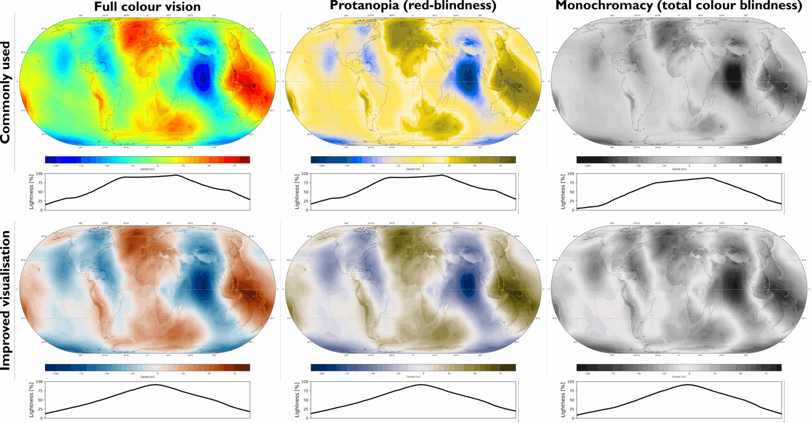
Geoid displacement based on EIGEN-6C4. The upper row shows the geoid displacement using a commonly used colour map (“jet”) and the lower row presents an improved visualization using the “vik” colour map. Maps in the middle and right column are simulated based on the map in the left column for protanopia and monochromacy, respectively, using Pilestone. Each sub-figure shows the lightness distribution of the colour map below.
Examples in geodesy – visualization of InSAR data
In some cases, a cyclic colour map is needed, for example, when plotting InSAR interferograms. “romaO” can be very useful here, as it has a symmetric lightness distribution similar to “vik”. However, a colour map more commonly used for InSAR interferograms is “hsv” (which is similar to “jet” and “rainbow”). The lightness profile of “hsv” highlights its perceptual issues: it has an extended lightness maximum that is difficult to distinguish in red-blind and total colour-blind versions. In addition, the maximum is not centered at the zero value, which gives the reader the wrong impression where no movement occurs. By contrast, the improved visualization with “romaO” features a single lightness maximum that coincides with zero, making areas without deformation easy to spot – even for readers with CVD.
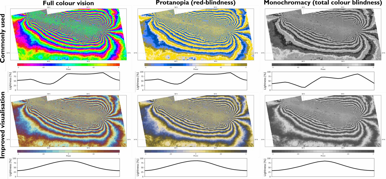
InSAR interferogram from the Tibet earthquake 2021. The upper row shows the InSAR interferogram using a commonly used colour map (“hsv”) and the lower row presents an improved visualization using the “romaO” colour map. Maps in the middle and right column are simulated based on the map in the left column for protanopia and monochromacy, respectively, using Pilestone. Each sub-figure shows the lightness distribution of the colour map below.
What’s next?
We create figures showing our research results almost every day. Next time you prepare one, maybe you could consider using colour maps and colour schemes that not only represent data fairly, but are also colour-blind friendly. This will not only make your graphs look better, but it will also make it easier for you to explain your results. At the same time, you will help make academia become inclusive and accessible.
References:
Deeb et al. (2005): https://onlinelibrary.wiley.com/doi/10.1111/j.1399-0004.2004.00343.x
Crameri et al. (2020): https://doi.org/10.1038/s41467-020-19160-7
Wong (2011): https://doi.org/10.1038/nmeth.1618.