Martijn van den Ende, a Postdoctoral research fellow at Université Côte d’Azur, takes us through his seismoArt project – a new and colourful way of visualising the ground motions of earthquakes!
First of all: how does it work?
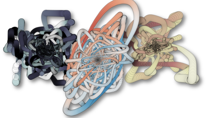
Imagine that you have an incredibly steady hand, holding a pen, and a piece of paper on a table. Once you put your pen on the paper, an earthquake happens, shaking the table (and the paper) in various directions. Since your hand is so steady, the pen basically traces out the motion that the paper makes, relative to your hand. That is essentially what you see in the seismoArt renderings: each dot represents a measurement of the horizontal components of a seismogram (N pointing up, E pointing right). The vertical component is represented by the colours. Lastly, the sizes of the dots scale with the distance from the origin, to highlight the strongest motions.
How did you come up with these representations?
Credits for the inspiration go to Anthony Lomax, who tweeted a picture of an old seismogram from the 1906 San Francisco earthquake, generated by an Ewing Duplex Pendulum (Ewing, 1886; doi:10.1038/034195a0). The recording mechanism of this device is essentially the same as the thought experiment I described above, with a table that moves underneath a relatively stable pendulum holding a stylus on a sheet of smoked glass. After seeing this I started to play around with some more recent three-component recordings. There was a lot of aesthetic fine-tuning involved to get to the final renderings; selecting the right seismic station, choosing a suitable scaling of the vertical component and marker sizes, etc. But in the end I converged onto a few selected earthquake recordings that I liked, and put them on Twitter for public consumption.

From: https://twitter.com/ALomaxNet/status/722106064368504832, taken from the Lawson report
How did you choose these particular four events?
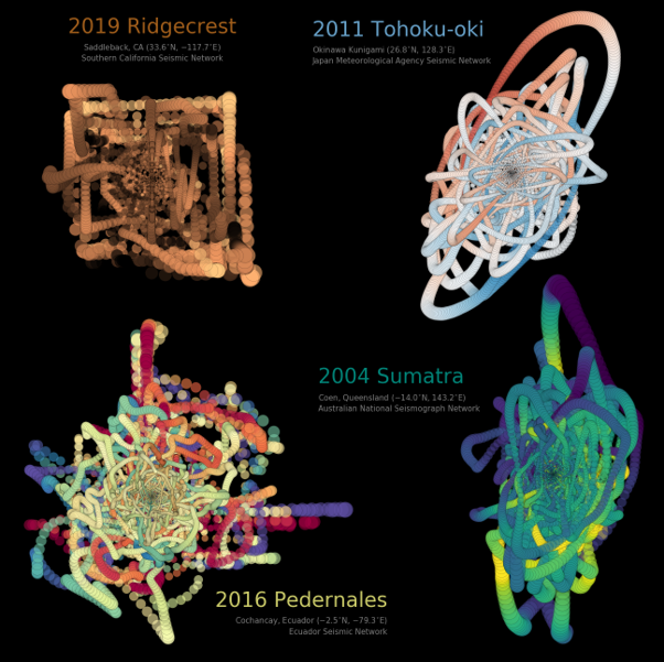
I didn’t have to think hard when picking the two youngest Mw 9 events (2004 Sumatra and 2011 Tohoku), and for each of these events I picked a station quasi-randomly within a suitable distance range. When a station is too close to the source, the recordings saturate and the seismogram gets clipped. This is the case for the 2019 Ridgecrest event; I deliberately picked a clipped seismograph to produce a rectangular pattern, which aesthetically matches well the orthogonal fault system in the source region. In hindsight I should have mentioned the clipping right away, because it did puzzle some seasoned wiggle-watchers at first. Lastly, I picked the 2016 Pedernales event, which is not a hugely notorious event to most people, but it is one that my colleagues at Géoazur have studied in great detail.
And now the M€ question: what can we do with seismoArt (other than looking at it)?
While I had no direct application in mind while working on the seismoArt, it turns out that people find them interesting to communicate information abouton seismic events on Twitter (and possibly elsewhere). There are various people who incorporate seismoArt in their infographics, and I believe that Mark Vanstone (@wmvanstone on Twitter) also uses some seismoArt examples in his education efforts. One could also consider separating different seismic phases to highlight the different kinds of ground motions they produce, or look at radiation patterns. While the scientific value of seismoArt is limited, it could help to visualise and communicate certain concepts to a broader audience. And of course, you could print out a poster of your favourite earthquake to put in your office.
Speaking of that: how do I make my own seismoArt renderings?
All you need to do is head to my GitHub repository (https://github.com/martijnende/seismoArt). There you will find a Jupyter notebook with a step-by-step example of the Tohoku event, including the necessary formatting of the generated Matplotlib figures.