The schedule of the annual EGU general assembly has just been published and if you submitted and abstract you do now know whether or not you will be able to give a poster presentation. Maybe this is the first time you will need to present a scientific poster or are wondering how to make your poster for this year’s conference. Look no further, we have compiled some thoughts for you in this blog post. There is also a small gallery of anonymized posters to look for inspiration!
The Purpose of a Scientific Poster
To make a good poster starts with identifying its purpose. A scientific poster is a tool for sharing research with peers in a concise, visually engaging manner. The goal is to communicate key findings effectively and encourage interaction. Think of your poster as an invitation for discussion rather than a dense collection of information or a published paper. This is particularly helpful if you are still in the middle of a project! One thing to note is that at EGU there are literally thousands of poster on display every day a good poster catches the attention of the audience nonetheless.
Key Principles:
- Engagement: Attract viewers with a clear layout and engaging visuals.
- Simplicity: Focus on a few key points—less is more.
- Interactivity: Encourage dialogue by making it easy for others to understand your work quickly.
What a Poster Is Not
A poster is not a paper, thesis, or slideshow. It should not be overloaded with text or complex equations and tables. Instead, extract the essential points and present them in an easily digestible format.
Designing an Effective Layout
The layout is critical to a poster’s readability. Before adding content, sketch a rough draft of your design on paper to organize sections logically.
Key Layout Tips:
- Know Your Dimensions: EGU allows for larger than A0 posters. Make use of it if you can! Check the details here: https://www.egu25.eu/guidelines/presenters/poster_presenter_guidelines.html
- Orientation: Landscape is generally preferred, as it is easier for the human eye to process.
- Visual Hierarchy: Use headings, subheadings, and clear section divisions to guide the reader.
- White Space Matters: Aim for a balance of 40% visuals, 40% text, and 20% empty space. Yes, 20 % empty space! And 40% text is already the very much upper limit!
Typography and Readability
Your text should be easily readable from at least 1.5 meters away. There may be several people trying to look at your poster at the same time, enable them all!
- Title: 96pt or larger
- Subheadings: 40pt
- Body text: 24pt minimum
- Font choice: Stick to 1-2 professional fonts. Maybe use Open Sans, its the official EGU font.
- Spacing: Use 1.5 or double spacing to enhance readability
Do the A4 test: If you print out your poster on a A4 sheet of paper and hold it at arms length you should be able to read everything well.
The Role of Color and Graphics
Figures are maybe THE most important part of a poster. As geoscientists we can make amazing figures (think maps, cross-sections, 3D models, satellite imagery, …). Make use of that to draw people to your poster! Colors are great and can enhance clarity and engagement—but should be used wisely.
- Choose a cohesive color scheme: Avoid too many colors; stick to 2-3 complementary colors.
- Use high-contrast colors: Ensure readability, especially for color-blind viewers. There are many cool tools out there: https://www.fabiocrameri.ch/colourmaps/, https://cran.r-project.org/web/packages/viridis/vignettes/intro-to-viridis.html, https://www.color-blindness.com/coblis-color-blindness-simulator/
- Graphics over text: Replace lengthy text with well-labeled diagrams, maps, or photos!
- Captions: Every image should have a concise caption explaining its relevance.
-
- A poster needs not a lot of text to start a discussion!
-
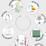
- Posters do not need to have a white background.
-
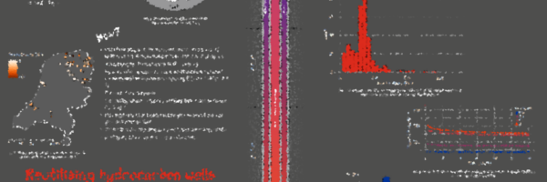
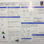
- A lot of big figures and photos – but a bit too much text?
-
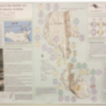
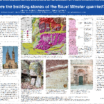
- Great use of maps!
-
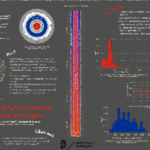
- Good use of several small graphs and a good text-graph balance!
Content That Works
Your poster should tell a clear story from introduction to conclusion. Here’s a simple structure:
- Title: Make it engaging and, if possible, phrase it as a question.
- Introduction: A short, jargon-free summary (120 words max) answering What, Why, Where, When, Who, and How.
- Methods & Results: Use visuals to explain key processes and findings.
- Conclusion: Summarize the key takeaway in a few sentences.
- Contact Info: Include an email address, social media handle, or QR code linking to your poster, or any published material.
Common Mistakes to Avoid
- Overcrowded posters: Avoid excessive text and unnecessary details.
- Small fonts: Ensure readability from a distance.
- Poor image quality: Use high-resolution graphics (at least 300 dpi).
- Lack of structure: Organize content logically so it flows naturally.
Printing Your Poster
- File format: Save your poster as a high-quality PDF for printing.
- Resolution: Print at 300-600 dpi for best results.
- Size setting: Ensure your design software is set to the correct dimensions before you begin.
- Printing options: University services are often cost-effective, but local print shops can be a great alternative. I always print my poster in Vienna for less than 20 Euros, this means I do not have to carry it both ways!
Final Thoughts
A well-designed poster is a powerful communication tool. It doesn’t just present research; it starts conversations. Be not afraid to highlight issues you currently have in your project, it may well be that someone walking by has an idea that could really help you. Last year one of the best posters I have seen had post-its next to it and asked people to fill in some blanks!