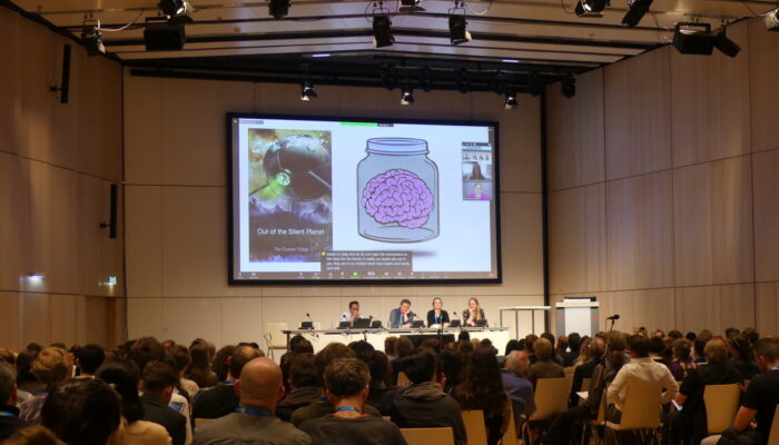
Most people spend a lot of time and effort making their presentation engaging and impactful, but how much time do you spend making sure it is accessible!? An accessible presentation takes into account the diverse backgrounds and abilities of the audience, to support a better understanding of the message and information you are trying to share. This is particularly important for scientific research ...[Read More]
How to make your EGU24 presentation accessible!
Most people spend a lot of time and effort making their presentation engaging and impactful, but how much time to you spend making sure it is accessible!? An accessible presentation takes into account the diverse backgrounds and abilities of the audience, to support a better understanding and of the message and information you are trying to share. This is particularly important for scientific rese ...[Read More]
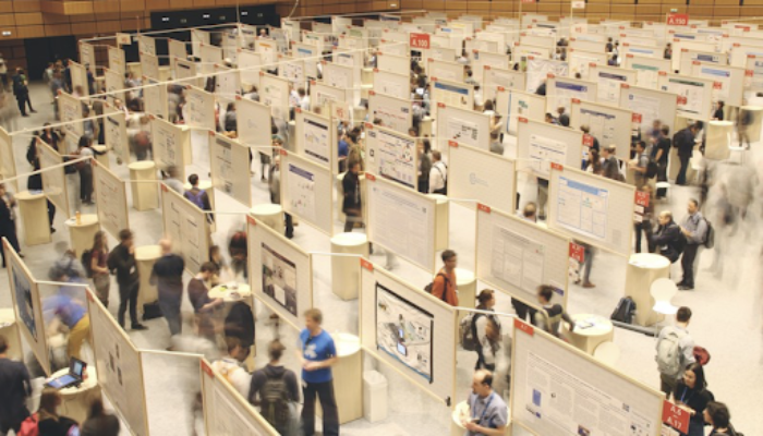
Honest observations about EGU23 poster designs: from geophysicist and graphic designer Fabio Crameri

Science tells us: more is more, and less is less. As geoscientists, we therefore intuitively conceive paragraphs of text as a lot of information, and a generous selection of colours as strongly eye-catching. But text-filled, rainbow-coloured poster presentations communicate neither effectively nor in an accessible manner. After working for months or even years on a geoscience project, we have a lo ...[Read More]
How to make your EGU23 presentation accessible to all
Most people spend their time and effort making their presentation engaging and impactful, but what about accessibility? An accessible presentation takes into account the diverse backgrounds and abilities of the audience, to enable better understanding and recall of the content shared. This is also true for the way we share scientific research: presenters would do well to communicate their research ...[Read More]


