We’ve all been there at some point: being nervous, stuttering, or losing our train of thought because somebody looks so incredibly bored that you are afraid they might actually collapse. Then there’s saying something stupid or just plain wrong, or talking so fast and quietly that nobody understands what your results are.
These are certainly my lowest moments giving talks and I’ll save myself the embarrassment of referring to the time and place they happened.
Recently, I attended a conference and once again I witnessed the Good, the Bad and the Ugly. After a few short years in science I’ve already gathered a (substantial) list of faux pas that occurred during talks I’ve seen. Here are my absolute top 10 unsuccessful presentations in recent years:
- Having the slide full of text (font size 8), reading directly from the slide, mumbling and not once looking at the audience.
- All text written in bold and CAPITAL LETTERS. EVERYTHING THIS PERSON DID WAS TOO IMPORTANT FOR NORMAL FONT.
- Figures directly drag and dropped from obspy, without labels (or font size 4) and then assuming everybody miraculously knows what the x and y axis are.
- Animated animations with 10 figures on top of each other.
- For the whole presentation not speaking into the microphone because the person is actually looking at the slide, explaining the important information without anybody hearing it.
- Talking for 90% of the presentation about only one slide (which is not even relevant), realizing that time is running out and rushing through the rest of the slides which might have been interesting.
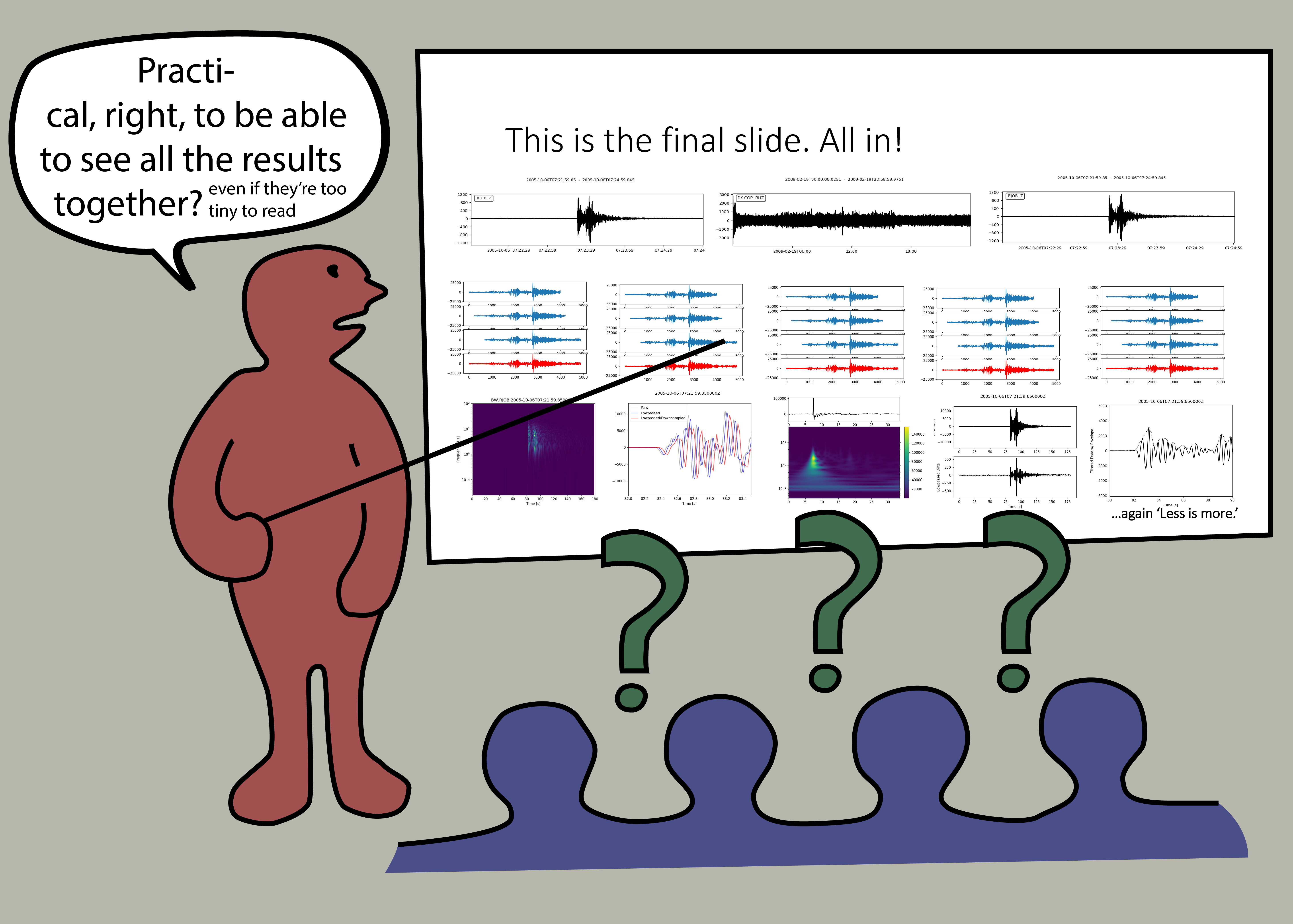
- Squeezing 20 tiny figures very tightly into the final slide and only spending 15 seconds explaining them before time is up.
- Generally coming unprepared.
- A bright yellow background with pink colored font and green boxes for important information.
- Comic sans. See this article for detailed information why comic sans should never be used.

…So, what makes a good talk?
Whenever I prepare a presentation, I try to follow the suggestions of my professor during my Masters. He had 5 golden rules for preparing a talk (here slightly modified):
- Keep the structure simple! Don’t try to squeeze in all the results of your project, unless they are important. Example: Introduction – Motivation – Methods – Results – Discussion. Done.
- Keep the slides simple! Not too cluttered with figures or text. Only put what you want to talk about, everything else that you will not talk about…Kick out! Text is there to support your argument, not to replace your talking.
- Remember the ‘1-slide, 1-minute’ rule: people don’t want to stare at the same slide for 5 minutes. Each slide needs to have some meaning, if you don’t talk about the slide, it goes in the bin.
- To check if a text or a figure is visually large enough, stand 60-100cm far from your desktop screen and see if you still can read the smallest font, if not make it bigger.
- Describe every figure you show and make sure to mention units and axis, even if the font is big enough – not everybody has a good eyesight. Make only very important statements or words bold, it will stick in people’s minds better.

© Nienke Blom
These are the five basic rules of preparing the slides for a presentation. Now I want to add another, very important point.
After a recent week of talks at a conference the bulk of unsuccessful presentations were given by those who came unprepared, having dumped their latest research into one power-point presentation and made up their talks as they went along. On the other hand, often the best talks were from young researchers who might not have extensive results, but did have well-prepared, clean slides which were thought through and interesting even though some studies were at a preliminary stage. I enjoyed listening to those, because there were clearly some efforts put into these presentations.
Hence, my last point is: Prepare and practice your talk!
© Nienke Blom
This post was written by Maria Tsekhmistrenko, with revisions from Nienke Blom and Andrea Berbellini
Maria Tsekhmistrenko is a PhD student at the University of Oxford. She works on the velocity structures beneath the La Reunion Island from the surface to the core mantle boundary. You can reach her at mariat[at]earth.ox.ac.uk
Nienke Blom is a postdoctoral research associate at the University of Cambridge and works on seismic waveform tomography, developing methods to image density. She is the EGU point of contact for the ECS rep team. You can reach her at nienke.blom[at]esc.cam.ac.uk.
Andrea Berbellini is an Italian Post Doc at the University College London. He works on the source characterization from second-order moments and crustal tomography from ellipticity of Rayeligh waves. You can reach him at: a.berbellini[at]ucl.ac.uk