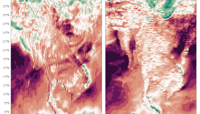
This isn’t a new fashion trend in meteorology. For model developers, these unexpected stripes are a sign that something has gone wrong in the complex digital engine that powers our forecasts.
Recently, our team at CMA Earth System Modeling and Prediction Centre (CEMC) encountered these very stripes in wind forecasts produced by an operational global model. We played the role of scientific detectives to diagnose the issue, and our findings have just been published in Geoscientific Model Development. So, what was causing this peculiar pattern?
The Clue: A Miscommunication inside the Model
Think of a forecasting model not as a single unit, but as a team of specialists working together inside a supercomputer. Two of the most crucial team members are:
- The Wind’s “Speed Manager” (The Physics): This module calculates how wind slows down due to friction with the Earth’s surface—a process called damping or dissipation.
- The Wind’s “Navigator” (The Dynamics): This module calculates how wind is transported from one place to another—a process known as advection.
For the model to work correctly, these two specialists need to talk to each other constantly. However, they don’t sit at the same desk. To keep things stable and efficient, they work at adjacent but separate desks (a setup known as a staggered grid).
And therein lays the problem.
We discovered that when the Wind’s “Speed Manager” (physics) passed its information about slowing the wind to the Wind’s “Navigator” (dynamics), a tiny “miscommunication” occurred at their handoff point. This miscommunication acted like a subtle, repetitive error. Just as a small glitch in a digital audio signal can create a constant buzzing sound, this small error in the model’s calculations generated the false, repeating pattern of stripes in the wind .
The Cure: An Alternative Communication Protocol
Identifying the cause was the first step. The next was to find a cure. We proposed a simple but effective fix: altering “communication protocol”.
Instead of relying on staggered exchanges, we rewrote the rules to let the Wind’s “Speed Manager” and the Wind’s “Navigator” work at the same location—as if seated at the same desk. This eliminated the need for interpolation and allowed them to exchange information directly at the point.
The result? The striped sweater vanished from the forecast maps:
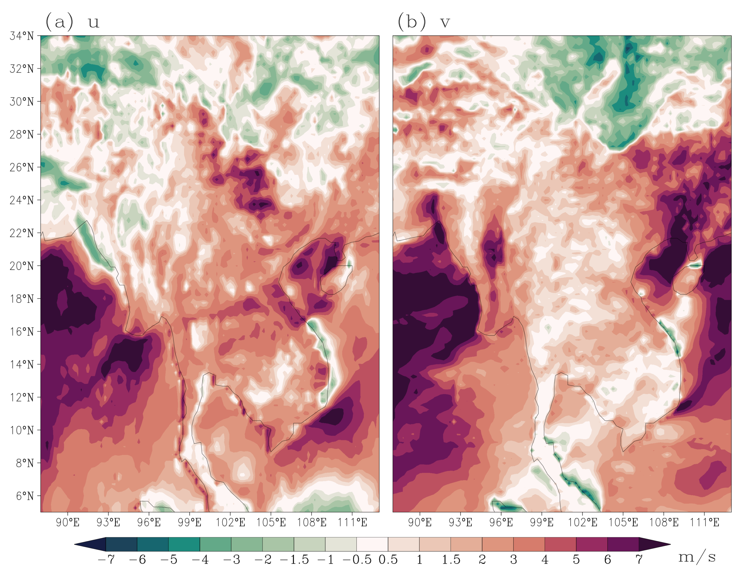
The stripe patterns have been fixed.
Why This Matters for Better Forecasts
Fixing a striped map is about more than just aesthetics. These false patterns are a form of noise that can contaminate the forecast, potentially affecting the prediction of real weather systems. By eliminating this source of error, we make the model’s wind forecasts more accurate and reliable.
This is especially important for applications that depend heavily on precise wind information, such as aviation safety, wind energy production, and predicting the paths of storms.
Our work is a great example of how continuous, detailed diagnostics help us refine the powerful tools that forecast our weather. By ensuring all the parts of the model “talk” to each other correctly, we help build a clearer picture of our atmospheric future.
To read the full story on this work, read our paper.