EGU Blogs

Air pollution

Sand gets everywhere

Saharan dust is currently escaping the confines of the desert and making a break for it over the Atlantic Ocean towards South America.

Below is a true colour image from the MODIS instrument on the TERRA satellite from this morning (6th June). You can see the dust from the desert over the ocean; note the constrast between the darker blue ocean surface and the lighter shade where the dust resides.

Blah.

Image of the dust plume on 6th June 2014 from the Moderate Resolution Imaging Spectroradiometer (MODIS) instrument on the TERRA satellite. Image courtesy of NASA. The strip of bright light across the image is due to sun glint, where sunlight reflects off the ocean surface. Click on the image for a larger view.

Below is the same image but with Aerosol Optical Depth (AOD) overlaid. This provides a measure of the total amount of aerosol particles in the atmosphere. The red portions are values above 0.7, which is quite elevated (anything above 0.3 would be fairly polluted).

Such incidences aren’t particularly unusual and the dust actually acts as a natural fertiliser for the ocean! Dust from the Sahara has also been observed to reach the Amazon rainforest. There are some more satellite images here on the OMPS blog.

Blah.

Image of the dust plume on 6th June 2014 from the Moderate Resolution Imaging Spectroradiometer (MODIS) instrument on the TERRA satellite. Aerosol optical depth from MODIS is overlaid to highlight the location of the dust. Image courtesy of NASA. Click on the image for a larger view.

Dust from the Sahara is also moving across western Europe heading for the UK based on this forecast from the University of Athens, which was highlighted by the Defra Twitter account.

https://twitter.com/DefraUKAir/status/474884744514375680/photo/1

This follows the pollution episode that struck the UK in early April, where Saharan dust combined with pollution from continental Europe and the UK. On this occasion though, thunderstorms are expected during Saturday, which will likely reduce any build-up of pollution and also wash out the dust from the atmosphere.

A sprinkling of dust might be found on cars in the south-east should the forecasts pan out. Dust gets around.

EGU 2014: Measuring aerosol climate impacts from Space

In order to understand past climate change and to better project future changes, we need to understand how humans disturbed the radiative balance of our planet. Aerosols are one component of this disruption. The final report from the Intergovernmental Panel on Climate Change (IPCC) physical science basis concluded that aerosols dominate the uncertainty in the total anthropogenic radiative forcing.

Radiative forcing refers to the change in the energy balance of the climate system; carbon dioxide traps energy within our atmosphere, which leads to a warming effect. Aerosols on the other hand stop sunlight from reaching the surface of the Earth, which leads to less energy being retained by the atmosphere and leads to cooling.

I summarised what the IPCC report said about aerosols here, with some further analysis here.

There were several talks at the EGU on Friday that looked to better constrain the important climate relevant properties of aerosol particles in the atmosphere by observing them from space.

Layer cake

Ralph Kahn from NASA’s Goddard Space Center presented measurements of aerosol properties from the Multi-angle Imaging SpectroRadiometer (MISR) instrument, which flies on the TERRA satellite. His abstract is available here.

The MISR instrument views the Earth from nine different angles as it orbits, which allows it to identify 3-D properties of aerosol particles in the atmosphere. One such example that was presented was from Iceland’s Eyjafjallajökull volcano, which famously closed large swathes of European airspace (disrupting EGU 2010 in the process). Such an eruption is an ideal natural laboratory for assessing aerosol properties from satellites with several of the talks during the day making use of it.

The image below shows how MISR was able to measure the height of the plume of ash thrown into the atmosphere by the eruption. The colouring on the left of the image shows the height of the plume; notice how the plume starts out higher (from 4-6km) and then sinks lower (below 3km).

Blah.

Satellite image of the plume of volcanic ash from the Eyjafjallajökull eruption from 7 May 2010. The image on the left is the natural colour image, while the version on the left has the plume height measured by MISR overlaid. Source: NASA/GSFC/LaRC/JPL MISR Team, retrieved from here.

In terms of volcanic ash, such information is useful for aircraft safety. From a climate perspective, the height of aerosol layers in the atmosphere can strongly influence the strength of the radiative forcing and the vertical distribution of aerosol is something that is represented poorly in climate models.

Cloudy with a chance of aerosols

Jens Redemann from the Bay Area Environmental Research Institute and the NASA AMES research center in the USA presented work that took advantage of a collection of satellites that fly in formation high above the Earth. His abstract is available here.

The satellites are known as the ‘A-Train’ and by combining the data from multiple instruments operating in quick succession, he was able to extract more detailed and valuable information than could be achieved with any one single instrument. Their calculations for clear-sky conditions agreed well with model-based results used in the 2007 IPCC report, with more work planned to compare with more recent model estimates.

However, there were more significant differences when looking at so called all-sky conditions i.e. when clouds are added to the mix. Several of the other talks in the session considered methods to improve retrievals of aerosol properties in the vicinity of clouds, with some encouraging results. The famous image of the Earth taken from Apollo 17 is known as the ‘Blue Marble’ but as an atmospheric scientist, I’m often more struck by how white the globe is when observing it from space. This is an important consideration for assessing the role of aerosols when it comes to climate change.

Anthropogenic, vegetable or mineral

Both Kahn and Redemann presented work aimed at categorising aerosol particles into different types e.g. urban pollution, biomass burning smoke, desert dust. Different types of pollution tend to have differing properties, so distinguishing between them can improve estimates of aerosol climate effects.

Another important distinction is separation into natural and human-caused components, so that the anthropogenic influence can be characterised. This is complicated though by human sourced pollution interacting with natural emissions; such aerosol particles are dazed and confused about their origins.

Such information would be particularly valuable as there is a large degree of diversity in climate model estimates of the various aerosol types, even though their estimate of the overall aerosol burden in the atmosphere is quite similar. Such discrepancies are troubling for future projections of climate change as they will introduce significant errors.

I love it when a plan comes together

Ralph Kahn ended his talk with a call for renewed focus to combine satellite and measurements made more directly (known as in-situ) in order to determine aerosol radiative effects independently of climate models. 

Bringing all of this information together is a big opportunity to better constrain the aerosol radiative forcing, which will greatly improve our ability to project future climate changes at both the global and regional scale.

EGU 2014 Day 1: A day in the life of an aerosol particle

My first day at EGU 2014 in Vienna was principally spent listening to various speakers describe the life and death of tiny particles in the atmosphere, known as aerosols. These aerosol particles come from a variety of sources – one of the major sources is through burning of fossil fuels, which produces a cocktail of pollutants that form these particles. They can also arise from natural sources, such as bursting bubbles on the ocean surface, strong odours from trees and high winds whipping up sandstorms in the desert.

Pinning these sources down is tough but we also have to understand how they evolve in the atmosphere from their birth, their growth during their adolescent years and ultimately their adult years, where they can influence our climate and health. At some point, they are removed from the atmosphere where they become an ex-aerosol. Understanding these different changes is necessary if we are going to be able to understand their impact both in the past, present and future.

Baby steps

One of the major routes for an aerosol to be born is via ‘nucleation’ where the particles form tiny clusters, which are around 100,000 times smaller than the width of a human hair. These clusters form due to the combination of different gas phase molecules, which given the right cocktail and conditions, can condense to form these initial tiny particles. I’ve previously written about these early steps here.

There was work presented here at the EGU by Jasmin Tröstl from the Paul Scherrer Institute in Switzerland showing that chemical species known as oxidised organics take part in this initial process. The abstract for the work is available here.

For a long time, sulphuric acid was thought to be the vital ingredient for this nucleation process but recent work at a laboratory at CERN (known as the cleanest box in the world) has illustrated the importance of several other species. You can read more about two studies in Nature that were published in the past few years on these here and here. Oxidised organic species are abundant in the atmosphere, so it isn’t a huge surprise that they are important but it has only been through the development of the new laboratory at CERN and sophisticated new instrumentation that the importance of this key ingredient has been demonstrated.

The difficult years

The same study also illustrated that these oxidised organic species were vital for the growth of these nucleated particles. This is the key stage for such particles as they essentially either grow or suffer an early death. When they start out, they are too small to become cloud particles, which is their main route to impacting our climate. So without growing they will never know the wet embrace of a cloud droplet.

Not only did the oxidised organics strongly increase the growth of these particles but their addition was enough to reconcile the laboratory measurements with observations of the real world. This is an enlightening step as it has previously proven difficult to mix up the right cocktail to represent what really goes on in the atmosphere, which suggests a deficit in our knowledge of this important process.

All grown up

Once they reach adulthood, these particles become important from a human health and climate perspective. They can build-up in the atmosphere over a matter of hours or days and influence our lives.

Rongrong Shen from Karlsruhe Institute of Technology, Germany, presented measurements of spring time pollution in Beijing during 2012, focusing on the chemical makeup of the pollution. Her abstract is available here. Beijing is well known as a hotspot for pollution, with over 20 million people living in the city and over 5 million vehicles on the road frequently creating a heavy chemical soup. The average concentration for PM2.5 (aerosol particles with a diameter less than 2.5µm) was 89µg/m3, which is far in excess of what is considered healthy. Even the ‘clear’ days in terms of visibility saw average concentrations of around 45µg/m. The World Health Organisation guidelines recommend the daily average values should remain below 25µg/m3, while annual values should be 10µg/m3 or lower.

Haze over Beijing and surrounding region from 22 March 2007. Image credit: NASA Earth Observatory

Haze over Beijing and surrounding region from 22 March 2007. Image credit: NASA Earth Observatory

More severe pollution episodes were typically driven by species such as sulphate and nitrate, which are known as ‘secondary’ species. This means that they start out as a gas and then condense onto pre-existing aerosol, such as nucleated particles or direct emissions from car exhausts and other forms of combustion. The results also indicated that such episodes were not solely driven by emissions within the city; the wider region played a role, including industrial sources and other Chinese cities. This is a common feature of pollution episodes in Western Europe also, which I wrote about recently here and here.

This is an ex-aerosol

Urs Baltensperger from the Paul Scherrer Institute, Switzerland gave the Vilhelm Bjerknes Medal Lecture and included a discussion of the fate of aerosols in the atmosphere. His abstract is available here. Aerosols are typically removed from the atmosphere via crashing into something, such as the ground, or by forming cloud droplets. These cloud droplets either evaporate, leaving an aerosol particle behind or they can grow to form rain, which removes the aerosol from the atmosphere. The rainfall can also washout other aerosols by catching them on the way down.

He referred to several previous studies, including measurements very early in the aerosol life cycle in an urban environment (Paris) and more mature aerosol at a high altitude site in the Swiss Alps at the Jungfraujoch.

The urban study illustrated that aerosol particles are quite diverse in this environment, which affects how readily they would form cloud droplets. Black carbon is known to be a poor candidate for making a cloud droplet, which the study showed. However, the results also illustrated that adding some other chemical components to the mix can vastly increase the likelihood of the particle joining the cloud droplet gang. This is important as the removal of black carbon from the atmosphere is poorly understood and can have significant implications when trying to predict its climate impact.

At the high altitude site at ‘the top of Europe’, the aerosol properties are more uniform. This makes it somewhat easier to predict how many particles will form a cloud droplet. This is an important result for models of aerosol impacts, as such a situation is more reflective of the scales that atmospheric models work in, particularly for climate change studies. This result is not true everywhere though, so as aerosol scientists we need to work towards understanding the differences across the globe, so that we can understand the ultimate fate of aerosol particles.

JFJ_Small

Image of the Swiss Alps during a research flight on the FAAM BAe-146 research aircraft. Photo credit: Will Morgan

That concludes this diary in the life of an aerosol particle; they have a hard and complex life, which often lasts just a few days or maybe weeks.

I’ll be back with more later this week.

—————————————————————————————————————————————————————–

Edit 03/05/14: Urs Baltensperger was originally spelt incorrectly.

What is the Daily Air Quality Index?

The recent air pollution episode in the UK brought a previously obscure air quality metric into the public consciousness, with the Daily Air Quality Index (DAQI) appearing in weather forecasts and the media. The index describes the severity of pollution in different areas using a ten-point scale, with a score of ten being the worst score.

The question is what is the index based on?

The scale itself is based on a 2011 report by the Committee on the Medical Effects of Air Pollutants (COMEAP), who published a review of the previous system with updates based on the latest scientific research. The report is available here. COMEAP summarise the purpose of the index as follows:

The index is used to communicate information on short-term elevated levels of air pollution to the public, to allow potentially susceptible people – such as those with pre-existing heart or lung conditions – to take appropriate action to avoid adverse effects on their health.

The index is based on four pollutants; nitrogen dioxide, sulphur dioxide, ozone and particulate matter (also known as aerosol particles for regular readers). Nitrogen dioxide and sulphur dioxide are gaseous pollutants usually associated with vehicle emissions and power plants respectively. The other major source of sulphur dioxide in the UK is from ships. Ozone is another gaseous pollutant and similarly to particulate matter, it usually arises from a complex cocktail of different emissions from power plants, industry, vehicles, agriculture and even trees!

If any of these pollutants exceed certain thresholds, then the DAQI level is raised, with health advice adjusting accordingly. The Met Office have a page on their website that explains the bandings, along with the associated health advice. The Department for Environment, Food & Rural Affairs (DEFRA) report the index on their website based on both measurements and forecast pollution levels.

The recent pollution episode saw the East Midlands, the South East (excludes Greater London) and Yorkshire & Humberside reach level ten on the index, which corresponds to ‘very high’. Very high corresponds to “levels of air pollution where even healthy individuals may experience adverse effects of short-term exposure”. Several other regions saw ‘high’ pollution levels, which equates to a score from seven to nine and represents significant risks to susceptible people.

Since 2009, there have been 40 instances of very high levels, with a further 236 occurrences rating as high. Greater London has the highest number of incidences of high and moderate pollution of the 15 regions that DEFRA provide data for over that period. Unsurprisingly, Greater London also has the fewest number of days with low pollution.

Particulate matter

For particulate matter, the index takes into account two classes of these particles in relation to their size, splitting them into particles of 2.5µm or less (PM2.5) and 10µm or less (PM10). For comparison, a µm is one-millionth of a metre in size or around 70 times smaller than the width of a human hair. Basically very small!

The index level is based on whichever pollutant category is greatest i.e. if ozone is rated at level 4 (moderate) and nitrogen dioxide is rated at level 3 (low), then the overall index level is moderate. Therefore, if a PM10 threshold is breached, then the PM2.5 level is breached also. From a health standpoint, PM2.5 is likely the more relevant metric as the size of these particles means they can penetrate deeper into our lungs and potentially enter our blood stream; unpleasant stuff.

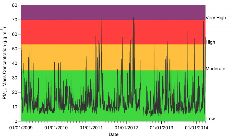
Aerosol mass concentration expressed as particulate matter with a diameter of less than 2.5µm (PM2.5) from the air quality monitoring station in North Kensington, London from January 2009 to 3 April 2014. The colours represent the PM2.5 pollution threshold for the DAQI. Data source: UK-Air.

To illustrate the variation in PM2.5, I’ve plotted the above graph of their daily average concentrations from a background urban site in North Kensington in London since 2009 to last weekend. I’ve also included the DAQI bandings based on their quoted PM2.5 thresholds. We can see that PM2.5 levels at this site regularly exceed the ‘low’ banding, with several days rated ‘high’.

Moderate PM2.5 levels or greater occur approximately 20 times per year at this site based on the DAQI scale. Of these, there have been 19 instances of ‘high’ PM2.5 levels (4-5 times per year), which equates to an approximately 1.2% increase in premature deaths over a short period. ‘Very high’ has occurred twice in that period, which corresponds to a 2.5%  increase in premature deaths.

These episodic periods of increased risk to susceptible members of the public occur due to a multitude of reasons, with roots at home and abroad. They are not particularly unusual.

Invisible threat

It is important to note that short-term exposure isn’t the only concern with air quality, as long-term exposure has been shown to have significant health implications. The World Health Organisation’s (WHO) Air Quality Guideline for annual average PM2.5 is 10µg/m3. This is based on their 2005 report, which is available here. For every 10µg/m3  increase above this recommended annual average, the WHO suggest that the risk of premature death increases by 6% [with an uncertainty range of 2-11%].

As well as increased mortality rates, there are also further adverse health effects due to long-term exposure; poor air quality tends to worsen pre-existing health conditions, further reducing quality of life for those affected. The North Kensington site used in the above graph has exceeded the WHO annual average in each of the last 5 years, with PM2.5 concentrations ranging from 11-14µg/m3. Several other sites in London and other parts of the UK also exceed this recommended limit.

Such concentrations are below what we would usually be able to see ourselves and they garner very little coverage in the media. This longer-term risk is associated with heart disease, strokes, chronic respiratory diseases and lung cancer; the WHO estimate that 3.7 million deaths in 2012 were attributable to outdoor air pollution. The WHO estimate that 88% of such premature deaths occurred in low- and middle-income countries (particularly in the Western Pacific and South-East Asia).

Higher-income countries in Europe saw a lower number of attributable deaths per capita (44 per 100,000) compared to the global average (53 per 100,000) but the figures illustrates that this is not a resolved matter in countries like the UK.

Complacency on this issue is not going to improve matters.

Air quality data acknowledgement

© Crown 2014 copyright Defra via uk-air.defra.gov.uk, licenced under the Open Government Licence (OGL).