EGU Blogs

Smoke

Fires in South East Asia

Smoke from a number of agricultural fires is currently blanketing Thailand and Cambodia. This is shown below in the satellite image from the MODIS instrument on the TERRA satellite. The red dots are classed as ‘thermal anomalies’ by the satellite instrument and are usually indicative of fires burning in these locations.

The majority of the fires are occurring in grass and cropland areas, which are the bale brown portions of the land surface in the image. This is indicative of agricultural burning, where farmers clear land and use the fires to recycle nutrients ahead of the growing season. In South-East Asia, the fire season usually runs from January to April/May.

Image of fires in South East Asia and the associated smoke haze from 24th February 2014 from the Moderate Resolution Imaging Spectroradiometer (MODIS) instrument on the TERRA satellite. Image courtesy of the NASA Earth Observatory. Click on the image for a larger view.

While the burning is beneficial to farmers, it isn’t too good for air quality in the region. The smoke generated by the fires has built up over Cambodia and Thailand (contrast the clearness of the image in the top-left over Myanmar with the haze to the east). The MODIS instrument on the satellite can also measure the amount of pollution in the atmosphere. This is known as the aerosol optical depth, which is well above 0.5 across the region. For context, a fairly polluted day in North-Western Europe might seen an aerosol optical depth of around 0.2.

This build up of pollution is harmful to health and can also cool or warm the atmosphere depending on the properties of the smoke. The side affects of such changes are uncertain but they could for instance alter atmospheric circulation patterns and rainfall.

Fires are a frequent occurrence across the globe and their impact can have long lasting consequences on our health and climate.

AGU 2013 roundup

Now that the 2013 AGU Fall Meeting has ended, I thought I would roundup what I’ve been involved with over the week for both this blog and the Barometer Podcast, which I was recording each day with Sam Illingworth. Links to each piece are available below. Many thanks to all who have read and shared these over the past week.

Recording the podcast at conferences is becoming a trend as we’ve covered AGU now in 2012 and 2013 plus the EGU in 2013. Recording these is a lot of fun and particular thanks should go to Dave ToppingBethan Davies and Mark Brandon for giving up their time to chat to us this week. Lastly, many thanks to Sam for his infectious enthusiasm and for being the only person I’ve ever met with a louder laugh than me.

The conference itself was excellent throughout, even if the amount of science on offer was overwhelming at times. The sessions on science communication I attended were also fantastic, thought-provoking and often inspiring. I’m planning to write a separate post on this aspect over the coming days.

So long San Francisco! Image: Will Morgan

So long AGU 2013 and thanks for all the science! Image: Will Morgan

Blog posts

Podcasts

Click here to display content from thebarometer.podbean.com

Click here to display content from thebarometer.podbean.com

Click here to display content from thebarometer.podbean.com

Click here to display content from thebarometer.podbean.com

Click here to display content from thebarometer.podbean.com

A continent on fire

While preparing my poster for the upcoming AGU Fall Meeting, I downloaded some data on fire activity in South America for background on why we are interested in biomass burning in the region. I wanted to quickly check I had the data in the correct format, so I just plotted the coordinates of the fire counts without an outline of South America.

I was surprised to see that the fire locations for August-October 2012 did a great job of outlining South America on their own!

Fire map.

Map of fire locations during August-October 2012 in South America from MODIS data from the Terra and Aqua satellites provided by NASA’s Earth Observing System Data and Information System (EOSDIS).

The data is from the MODIS instrument on NASA’s Terra and Aqua satellites. The data reports fire locations based on measuring  the emission of infrared radiation by the land surface from space (like the infrared cameras on your favourite police chase tv show).  Any 1km pixel with a fire detected within it is then included in the data – there could be more than one fire within the pixel but the instrument can’t distinguish these. You can find out more information about the technique here.

The widespread nature of the burning across South America is striking. Huge areas of the continent have fires detected within them. This is an annual endeavour with many of the fires started by people for land use change and agriculture. The main “season” runs from August to October, with the peak usually in September. These fires have been occurring for several decades now and they have transformed vast swathes of South America.

The burning produces large amounts of smoke, which can build up and pollute our atmosphere. This has important consequences for regional and global climate, air quality and also ecosystem development. I’m part of a project called SAMBBA, which as well as being a great acronym, is attempting to address some of the aspects of biomass burning that we don’t understand (which is a long list). I’ve written about the project and my part in it here and here previously.

As the map above illustrates, it is quite a big deal in the region. Stay tuned for future updates on the project.

Biomass burning birthday

Last September I spent a month in Brazil for a research project aiming to study the pollution produced by deforestation fires in the Amazon Basin. The fires are mainly started by people for agricultural needs or land clearing for buildings and infrastructure. These fires produce huge amounts of smoke that blanket vast regions of South America during the “dry” season, which can lead to significant affects on weather, climate and people’s health. The name of the project was SAMBBA (South American Biomass Burning Analysis) and I’ve written a little about it previously here. There are several aspects to the project but my major role was on board the Facility for Airborne Atmospheric Measurement’s BAe-146 research aircraft. I was a mission scientist, which basically means I get to tell the pilots where to fly (subject to standard aircraft operating procedures like avoiding mountains, severe storms and not running out of fuel).

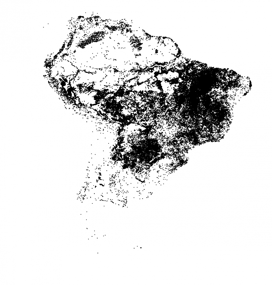
The Amazon usually conjures up images of pristine rainforest and giant meandering rivers but in the quest for air pollution, we were based in Porto Velho, which is the capital of Rondonia – a global poster-child for deforestation. Recently, a project involving Google, the U.S. Geological Survey (USGS), NASA and Time published an extraordinary series of satellite images from the Landsat program showing how the surface of the Earth has changed since the program began in 1984. One of the areas highlighted was Rondonia and the images showed how dramatically the landscape has changed over several decades. While deforestation began there in the 1970’s, the changes detailed in the images from Landsat are clear to see and are shown below. In 1984, the typical ‘fish-bone’ pattern of deforestation is already evident as pathways into the Amazon rainforest are cleared and tributaries of fire branch out from these. By 2012, the deforestation has spread out to envelop large swathes of areas that were previously rainforest.

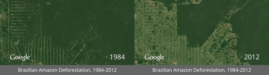
Comparison of deforestation of part of the Amazon rainforest in Rondonia state, Brazil from 1984 and 2012. The area pictured is to the south and south-east of Ji Parana and covers an area of approximately 60 x 120 miles. Images are from Google. An interactive version where you can expand the view and also visit other areas of the globe is available here, which is worth doing as it gives a feel for the scale over which the deforestation occurs.

This tweet by the EGU twitter account reminded me that it is a whole year since one of our most successful flights of the campaign, which took place in Rondonia. The image below shows the view of the fire we flew through from a satellite, with the smoke plume extending over 80km downwind and also a side-on view of the fire that I took from the aircraft. The fire was to the south-west of Porto Velho in a protected area, where you wouldn’t usually expect to see fires. After travelling to the home of deforestation in Brazil, the largest fire we found was actually a wildfire!

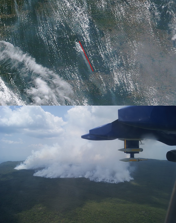
Satellite (top) and side-on view taken from Bae-146 research aircraft (bottom) of a large fire plume that was sampled in Rondonia on 20th September 2012 during SAMBBA. The red line overlayed on the satellite image is 80km long, with the fire plume visible to the left of the line. The satellite image is from NASA’s Terra mission.

The key thing we were trying to investigate during the flight was how the properties of the smoke plume changed as it blew downwind. This is the crucial intermediate step between the actual initial conditions on the ground where the fire starts and the regional build up of smoke haze that affects weather and climate. To do this, we performed a series of flight patterns including:

  1. Flying across the plume at regular intervals along the length of the plume e.g. above the fire, 20km from the fire, 40km from the fire etc.
  2. Flying directly up the length of plume, which is a particular challenge for the pilots as the plume doesn’t generally follow a straight line and you can’t actually see anything.

With these measurements, we can can compare how the properties of the smoke change with distance from the fire. We can combine this information with measurements just a few hundred metres above the fire, as well as flights in older regional pollution to understand the entire life cycle of fires in this region and compare it with other types of fire in various areas of the globe.

We’ve been working hard over the past year analysing the data from this flight and all of the other SAMBBA flights and hopefully there will be much more of the actual science story to tell on this over the next 12 months and more. Stay tuned.