EGU Blogs

Health

Night flight

Night flight

After what has seemed like an eternity (or more than one post-doc post, which is essentially the same thing), I’ve got a new paper published. To commemorate this auspicious occasion, I’m going to write about it.

The paper is published in Atmospheric Chemistry and Physics and is available open access here.

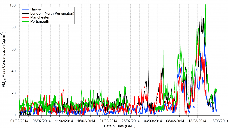
The study investigated how aerosol particles can alter atmospheric chemistry during the night using measurements on-board a research aircraft flying around the UK. These alterations are important as they can affect the build-up of pollution both during the night and into the following day. These changes can worsen air quality and affect regional climate. Most of the previous studies on this topic have been done in the USA, where the chemical make-up of aerosol particles is often quite different to European aerosol particles.

Specifically, the study looked at how a gaseous chemical compound called dinitrogen pentoxide, which is chemistry-speak for two nitrogen molecules and five oxygen molecules (N2O5), reacts with aerosol particles. Under the right conditions, N2O5 can interact with aerosol particles and be ‘captured’ by them via something called a heterogeneous reaction. This ‘uptake’ of N2O5 can lead to reactions with the water commonly associated with aerosol particles, form another compound called nitric acid and finally join the particle realm as nitrate aerosol.

Nitrate aerosol is a pollutant, so this process has ramifications for air quality plus nitrate aerosol is very good at bouncing sunlight back to space, which cools the surface of the Earth. Furthermore, under certain conditions, this process can enhance ozone formation in the lower atmosphere. Ozone is bad for our health if we breath it in and it is a greenhouse gas, so it warms the atmosphere.

The night-time bit of the equation is important as N2O5 is only present in the atmosphere in significant quantities during darkness; during the day it is destroyed by sunlight. There haven’t been many studies looking at this process in the real atmosphere and very few have been done on an aircraft.

A hard day’s night

Flying on the aircraft was an interesting experience as we were typically taking off around 10pm and not landing again until gone 2am (dirty stop outs that we were). Personally, I typically had another hour of work to do on the ground after a flight as I had to calibrate the instrument I was running, which meant I generally didn’t get back to the hotel until after 3am. This went on for two weeks, which meant we had to adjust our sleeping patterns accordingly. This was drastically different to any other flying campaign I have worked on, where we generally have to be on the aircraft between 4-6am to turn on the instruments. Bizarrely, I’ve never felt so rested during a project, as I typically got around 8 hours sleep every night!

So, what did we find out?

  • We found that the chemical make-up of the aerosol particles influenced night-time atmospheric chemistry. The strongest controls were the amount of water associated with the aerosol, which increased the uptake of N2O5 to the particles, and the amount of ammonium nitrate in the aerosol, which decreased the uptake of N2O5.
  • Compared to previous studies, the level of uptake of N2O5 was relatively efficient, which was probably a result of air being moister in our study region. The increased moister leads to more water being available to condense onto the aerosol particles, which will promote this uptake process.
  • When we compared our measurements to parameterisations that have been proposed for regional and global aerosol models, the parameterisations didn’t do very well. These parameterisations are equations that have been put together based on laboratory studies of the N2O5 uptake process.

These points are summarised in the graphic below, which shows a comparison of the parameterised and measured N2O5 uptake, which is commonly shortened to γ(N2O5). The horizontal axis is for the measurements, with the vertical axis for the parameterised values. Each sub-figure is for a set of calculations using different parameterisations and assumptions and the scales are the same in all of the plots. The markers are coloured according to the ratio of water to nitrate in the aerosol and the little bars denote the variation in each data point. Brighter colours are when water strongly outweighs nitrate, which typically occurs at greater N2O5 uptake values, while darker values are when the nitrate influence is stronger and N2O5 uptake is reduced.

N2O5 uptake comparison.

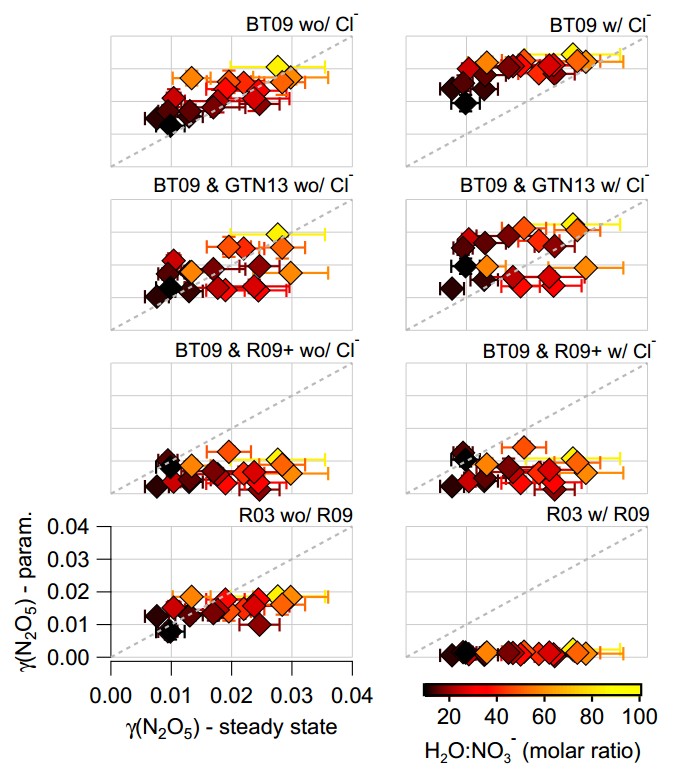
Comparisons between various parameterisations of N2O5 uptake and measured values from the aircraft. For more details, see Figure 6 in the original paper.

On the whole, the parameterised values ranged from OK to terrible when we compared them with the measurements. I should point out here that the parameterised values are calculated using the measured aerosol particle properties (size and chemical composition), alongside measurements of temperature and relative humidity. There are various assumptions required to do the calculations, although these are effectively the same as those that would be used in an actual aerosol model.

You shook me all night long

If we truly understood the N2O5 uptake process, then we would expect very reasonable agreement between the parameterisations and the measurements. The parameterisations give very different answers, so this isn’t just a case of the parameterisations being in one corner and the measurements being in another.

Scientifically, this is troubling, as we think we understand many of the underlying processes in the laboratory but these do not appear to translate to the real world. It may be that the relatively simple aerosol particles that are tested in the lab, which typically only contain one or two chemical components under closely controlled conditions, are not representative of the much more complicated particles we measure in the real world.

The parameterisation that performs the ‘best’ is the one in the top left, which is based on the water-to-nitrate ratio only. This broadly captures the variation in the measurements and the values are similar. However, this is another troubling outcome as we know that this is incorrect based on previous evidence from laboratory and field studies. We know that other aerosol chemical components, particularly organic aerosol, should be playing a role here but this parameterisation ignores it. If we do include organic aerosol, the parameterised N2O5 uptake is strongly under-predicted compared with the measurements.

This is an example of being ‘right’ for the wrong reasons. Something is missing from our understanding of how this complex system behaves. We’re not the only group to have seen this, although I would say we’ve done the most thorough look at a range of different parameterisations and assumptions.

Unfortunately, this is one of those scientific papers that provides problems rather than solutions. My hunch is that we need to study the N2O5 uptake process using more complex aerosol particles, both in the lab and field, in order to figure out some of these issues.

How much all of this matters is a good question. The upshot of the paper is that we currently don’t have a particularly good grasp of this process, which might have ramifications for regional and global aerosol model studies. We’ve actually got a paper coming out soon looking at some of these issues at the regional level, so hopefully some of the answers aren’t too far away.

—————————————————————————————————————————————————————–

I would like to thank the RONOCO (ROle of Nighttime chemistry in controlling the Oxidising Capacity of the atmOsphere) project, which as well as being a terrible acronym, was a great team of people to work with. Many thanks to all of the folks associated with the BAe-146 research aircraft used during the project. Also, the Natural Environment Research Council (NERC) funded the work.

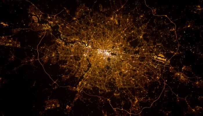
Header image: London, England at Night published on the NASA Marshall Flickr. The photograph was taken by astronaut Chris Hadfield on February 2, 2013 from the International Space Station. We flew around London on a couple of occasions during the project, which was a pretty cool sight during the night.

What is the Daily Air Quality Index?

The recent air pollution episode in the UK brought a previously obscure air quality metric into the public consciousness, with the Daily Air Quality Index (DAQI) appearing in weather forecasts and the media. The index describes the severity of pollution in different areas using a ten-point scale, with a score of ten being the worst score.

The question is what is the index based on?

The scale itself is based on a 2011 report by the Committee on the Medical Effects of Air Pollutants (COMEAP), who published a review of the previous system with updates based on the latest scientific research. The report is available here. COMEAP summarise the purpose of the index as follows:

The index is used to communicate information on short-term elevated levels of air pollution to the public, to allow potentially susceptible people – such as those with pre-existing heart or lung conditions – to take appropriate action to avoid adverse effects on their health.

The index is based on four pollutants; nitrogen dioxide, sulphur dioxide, ozone and particulate matter (also known as aerosol particles for regular readers). Nitrogen dioxide and sulphur dioxide are gaseous pollutants usually associated with vehicle emissions and power plants respectively. The other major source of sulphur dioxide in the UK is from ships. Ozone is another gaseous pollutant and similarly to particulate matter, it usually arises from a complex cocktail of different emissions from power plants, industry, vehicles, agriculture and even trees!

If any of these pollutants exceed certain thresholds, then the DAQI level is raised, with health advice adjusting accordingly. The Met Office have a page on their website that explains the bandings, along with the associated health advice. The Department for Environment, Food & Rural Affairs (DEFRA) report the index on their website based on both measurements and forecast pollution levels.

The recent pollution episode saw the East Midlands, the South East (excludes Greater London) and Yorkshire & Humberside reach level ten on the index, which corresponds to ‘very high’. Very high corresponds to “levels of air pollution where even healthy individuals may experience adverse effects of short-term exposure”. Several other regions saw ‘high’ pollution levels, which equates to a score from seven to nine and represents significant risks to susceptible people.

Since 2009, there have been 40 instances of very high levels, with a further 236 occurrences rating as high. Greater London has the highest number of incidences of high and moderate pollution of the 15 regions that DEFRA provide data for over that period. Unsurprisingly, Greater London also has the fewest number of days with low pollution.

Particulate matter

For particulate matter, the index takes into account two classes of these particles in relation to their size, splitting them into particles of 2.5µm or less (PM2.5) and 10µm or less (PM10). For comparison, a µm is one-millionth of a metre in size or around 70 times smaller than the width of a human hair. Basically very small!

The index level is based on whichever pollutant category is greatest i.e. if ozone is rated at level 4 (moderate) and nitrogen dioxide is rated at level 3 (low), then the overall index level is moderate. Therefore, if a PM10 threshold is breached, then the PM2.5 level is breached also. From a health standpoint, PM2.5 is likely the more relevant metric as the size of these particles means they can penetrate deeper into our lungs and potentially enter our blood stream; unpleasant stuff.

Aerosol mass concentration expressed as particulate matter with a diameter of less than 2.5µm (PM2.5) from the air quality monitoring station in North Kensington, London from January 2009 to 3 April 2014. The colours represent the PM2.5 pollution threshold for the DAQI. Data source: UK-Air.

To illustrate the variation in PM2.5, I’ve plotted the above graph of their daily average concentrations from a background urban site in North Kensington in London since 2009 to last weekend. I’ve also included the DAQI bandings based on their quoted PM2.5 thresholds. We can see that PM2.5 levels at this site regularly exceed the ‘low’ banding, with several days rated ‘high’.

Moderate PM2.5 levels or greater occur approximately 20 times per year at this site based on the DAQI scale. Of these, there have been 19 instances of ‘high’ PM2.5 levels (4-5 times per year), which equates to an approximately 1.2% increase in premature deaths over a short period. ‘Very high’ has occurred twice in that period, which corresponds to a 2.5%  increase in premature deaths.

These episodic periods of increased risk to susceptible members of the public occur due to a multitude of reasons, with roots at home and abroad. They are not particularly unusual.

Invisible threat

It is important to note that short-term exposure isn’t the only concern with air quality, as long-term exposure has been shown to have significant health implications. The World Health Organisation’s (WHO) Air Quality Guideline for annual average PM2.5 is 10µg/m3. This is based on their 2005 report, which is available here. For every 10µg/m3  increase above this recommended annual average, the WHO suggest that the risk of premature death increases by 6% [with an uncertainty range of 2-11%].

As well as increased mortality rates, there are also further adverse health effects due to long-term exposure; poor air quality tends to worsen pre-existing health conditions, further reducing quality of life for those affected. The North Kensington site used in the above graph has exceeded the WHO annual average in each of the last 5 years, with PM2.5 concentrations ranging from 11-14µg/m3. Several other sites in London and other parts of the UK also exceed this recommended limit.

Such concentrations are below what we would usually be able to see ourselves and they garner very little coverage in the media. This longer-term risk is associated with heart disease, strokes, chronic respiratory diseases and lung cancer; the WHO estimate that 3.7 million deaths in 2012 were attributable to outdoor air pollution. The WHO estimate that 88% of such premature deaths occurred in low- and middle-income countries (particularly in the Western Pacific and South-East Asia).

Higher-income countries in Europe saw a lower number of attributable deaths per capita (44 per 100,000) compared to the global average (53 per 100,000) but the figures illustrates that this is not a resolved matter in countries like the UK.

Complacency on this issue is not going to improve matters.

Air quality data acknowledgement

© Crown 2014 copyright Defra via uk-air.defra.gov.uk, licenced under the Open Government Licence (OGL).

UK Air Pollution: March/April 2014

Air pollution over the UK has been high on the agenda today with the media covering the widespread build up of aerosol pollution since the end of last week. This has led to health concerns, particularly for vulnerable groups such as children, the elderly and people with pre-existing heart and lung conditions. This follows the recent event in mid-March, which I covered here and saw Paris take measures to reduce local traffic pollution within the city by banning some cars from the road.

Over the past weekend, pollution levels were broadly similar to the previous event in March, although perhaps it is currently more widespread and it has lasted longer (unfortunately the Defra website appears to be struggling at the moment so I can’t be more specific).

What appears to have captured attention is the association of this event with a Saharan dust outbreak, which the Met Office explained here along with some nice images and videos from a satellite.

Below is the forecast for today (Wednesday 2nd April 2014) from Defra (provided by the Met Office) showing their “Daily Air Quality Index“, which is a measure of pollution levels categorised into different bands reflecting the severity of the pollution. I’ve included Defra’s actions and advise table below also, as the website has been unresponsive at times today. The Met Office also have a page on their website, which includes a more expansive explanation of the bandings.

Blah.

IndexBands

Daily Air Quality Index forecast valid for Wednesday 2nd April 2014 provided by the Department for Environment, Food & Rural Affairs (DEFRA) and the Met Office. Source: Defra

HealthAdvice

The forecast predicts that pollution levels will be high or very high over many regions of England, with moderate pollution levels expected over Wales.

So the question is what is causing this event?

Much of the media coverage has played on the role of the Saharan dust and this is the most visible aspect of the current event, as the size and shape of the dust helps to create especially vivid sunsets and people have had to sweep dust off their cars as rain sweeps it out of the air. However, the pollution event is being driven by a mixture of the dust and pollution from continental Europe and more local/regional sources within the UK itself.

On the forecast above, we can see very high levels of pollution over continental Europe, in particular over Belgium and the Netherlands. Pollution over these regions is typically a result of a cocktail of emissions from industry and traffic emissions, with a key ingredient often being from agricultural emissions. Your very own home-grown pollution detector (your nose) may have picked up the scent of such emissions from agriculture should you live in rural areas near farmland, as manure is applied as a fertiliser at this time of year. I wrote about the emissions situation in Europe here, using data from the EU Environment Agency.

These emissions mix together, forming various types of aerosol species that are then blown over the UK. This can combine with similar emissions within the UK and if the winds are light and rainfall is low, you have the perfect conditions for a pollution event.

This isn’t a particularly unusual event; the two main differences are that Saharan dust has joined the fold and the media have been paying much more attention than usual. The major issue is that it has been a relatively prolonged event, likely to last about a week. Pollution events such as the ongoing one over the UK tend to represent acute risks for vulnerable groups, while the general population might notice relatively minor symptoms such as itching eyes or a cough.

Air pollution is a pernicious problem, with even low levels having health implications over prolonged periods. The World Health Organisation recently declared that air pollution is the world’s largest single environmental health risk and was linked with 7 million deaths in 2012 alone. Air pollution is still an unresolved issue in the UK, with significant implications.

UK Air Pollution: March 2014

After the UK’s wettest winter since 1910, spring has sprung with several warm and clear days in March so far. High pressure has been the dominant meteorological situation, which has seen clear skies during the day and cold nights, with fog settling overnight and continuing into the morning. While the high pressure and much reduced rainfall has brought much needed respite to those affected by the severe flooding during the winter, it comes with a sting in the tail in terms of air quality.

Blah.

Surface pressure analysis chart for midnight on the 14th March 2014. Source: Wetterzentrale.de and the Met Office.

This is illustrated on the graph below, which shows hourly aerosol mass concentrations from four sites in England from the beginning of February through until 0800 on the 14th March. Throughout February, the concentrations were relatively low at the four sites. Once we move into March, there are periods of increased aerosol concentrations lasting a few days at a time.

Aerosol mass concentration expressed as particulate matter with a diameter of less than 2.5µm from four air quality monitoring stations in England during February and March 2014. Data source: UK-Air.

Aerosol mass concentration expressed as particulate matter with a diameter of less than 2.5µm from four air quality monitoring stations in England during February and March 2014. Data source: UK-Air.

The interesting thing about the past week has been that the concentrations have risen at all of the sites. While Manchester, London and Portsmouth are likely to have a large contribution from more local urban sources, such as cars, Harwell is in Oxfordshire and is less influenced by such sources. This suggests that the pollution event is also regionally driven. The meteorological situation recently has led to air from mainland Europe being blown across the UK and this air is likely contributing to the pollution situation.

This is typically a strong driver of regional pollution episodes in the UK, as easterly or southerly winds bring pollution from the continent to the UK, which exacerbates more local pollution problems. My PhD research focussed a lot on this very phenomenon; a couple of open access papers I wrote are available here and here. We found that such periods were often associated with enhanced concentrations of ammonium nitrate aerosol, which forms due to a combination of urban and agricultural emissions.

I suspect that this particular species of aerosol will be playing a role in the current pollution episode.

————————————————————————————————————————————————-

Update: 17/03/14

A change in the weather over the weekend brought stronger winds over the UK, helping to disperse the build-up of pollution. This saw a large decrease in pollution levels over the UK, as seen in the updated graph below.

Feb_March_AQ_Data_Updated

Aerosol mass concentration expressed as particulate matter with a diameter of less than 2.5µm from four air quality monitoring stations in England during February and March 2014. Data source: UK-Air.

In terms of what next for the pollution, the answer is blowin’ in the wind.

————————————————————————————————————————————————-

Air quality data acknowledgement

© Crown 2014 copyright Defra via uk-air.defra.gov.uk, licenced under the Open Government Licence (OGL).