My commute to work yesterday morning took an unexpected turn as my train pulled into my usual stop in Salford, Greater Manchester. To my right was a huge plume of smoke, which I would usually associate more with deforestation fires in Brazil! A plume of black smoke was rising up against the backdrop of beautifully clear skies, with the smoke gradually changing to a lighter shade of grey higher up. The photo below is from just after 8am on Monday morning.

Photo of the Salford fire taken at 8:15am on the 3rd March 2014.
Source: Will Morgan
A quick internet search when I got to the office revealed that a paper recycling facility on Duncan Street had caught fire late Sunday night and had burnt through until morning. You can see lots of images of the fire on Twitter, plus this video shows some aerial footage of the fire.
As someone who studies air pollution from fires, I was obviously fascinated by its development and some key processes for more ‘normal’ fires are actually displayed by this fire.
Light my fire
Notice how the fire seems to hit an invisible force field and gradually lean over to one side; this occurs due to the fire hitting a layer of warmer air above the surface but in this instance, there is cooler air at the surface and the warmer surface above it. This is known as a temperature inversion and they often occur during cold winter nights. On my train journey, it was noticeable that there were layers of fog near the surface in the outer suburbs of Greater Manchester, which can also form as a consequence of such inversions.
Whiter shade of pale
Another feature of the smoke plume was that the initial column of rising smoke is much darker than the plume where it starts to curve. The dark grey/black smoke is likely due to a large number of dark soot particles in the fire. That warmer air I referred to earlier is probably moister than the air below, which means that there is more water vapour residing in that air. The fire itself also generates water vapour as a product of the combustion process.
Introducing a heavy dose of aerosol particles to the mix will typically lead to some of that water vapour condensing onto the tiny aerosol particles. This condensation makes the aerosol particles a little less tiny and more reflective; this makes the smoke lighter giving it the lighter grey colour. This is actually a really important process more generally for atmospheric aerosols, as this condensation of water vapour onto these tiny particles can strongly enhance their cooling effects on our climate.
Get off of my cloud
The third step relates to when the plume of smoke rises higher still and manages to break through what is known as the ‘planetary boundary layer’. This layer is technically defined as the region of the atmosphere most directly influenced by its contact with the surface of the Earth. Of more importance for this stage in the fire’s evolution, it is also where most low clouds form! The photo below is from my office building and shows the plume against the backdrop of an almost entirely blue and cloud-free sky; there were no other low-level clouds in sight.
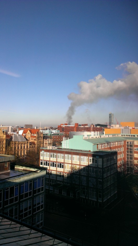
Photo of the Salford fire taken at 8:45am on the 3rd March 2014.
Source: Will Morgan
The intensity of the fire means that the plume of smoke has sufficient energy to burst through the boundary layer. Once through, the aerosol particles and moisture generated by the fire produce a special type of cloud known as pyrocumulus. Without the fire, the cloud wouldn’t have formed and spoilt a rare sunny morning in Manchester!
We didn’t start the fire
The final stage in the smoke’s journey occurs as the night draws in and the atmosphere cools. This leads to the planetary boundary layer that I described earlier becoming ‘thinner’, which sees this lower part of the atmosphere ‘squished’. This causes the smoke plume to descend closer to the ground, which increases the risks associated with the fire, such as reducing visibility and potentially causing health difficulties for people exposed to the smoke.
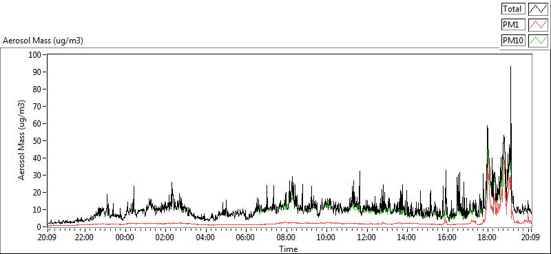
Graph of aerosol mass concentration on the 3rd March 2014. Image from the Whitworth Observatory reproduced with permission from Michael Flynn, Centre for Atmospheric Science, University of Manchester.
The graph above shows data from the Whitworth Observatory, which is located on the roof of the George Kenyon Building at the University of Manchester. The graph shows how the amount of aerosol pollution measured at the observatory rapidly increased from around 6pm, peaking at about 90 µg/m3, which is much greater than the previous measurements during the day. The wind direction and descent of the plume meant that the smoke plume and the observatory were lined up so the instruments were able to measure it.
Hopefully this post has provided a few scientific insights into how this fire and fires more generally tend to develop. With reports suggesting that the fire could burn for days, the fire is likely to cause disruption for a while yet. Hopefully the fire services will be able to make quick progress on extinguishing it.