EGU Blogs

Aerosols

UK Air Pollution: March/April 2014

Air pollution over the UK has been high on the agenda today with the media covering the widespread build up of aerosol pollution since the end of last week. This has led to health concerns, particularly for vulnerable groups such as children, the elderly and people with pre-existing heart and lung conditions. This follows the recent event in mid-March, which I covered here and saw Paris take measures to reduce local traffic pollution within the city by banning some cars from the road.

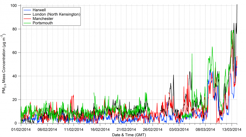
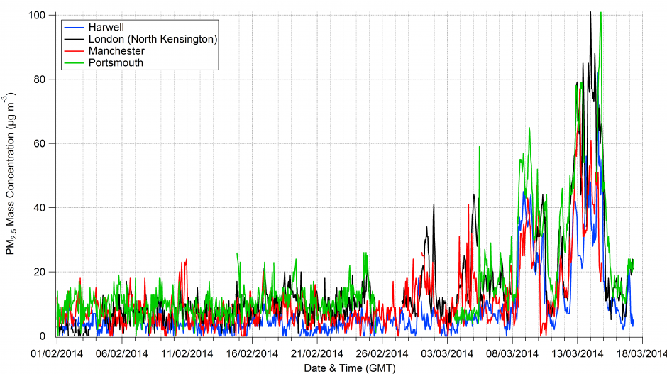
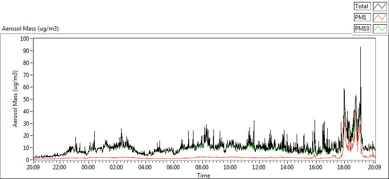
Over the past weekend, pollution levels were broadly similar to the previous event in March, although perhaps it is currently more widespread and it has lasted longer (unfortunately the Defra website appears to be struggling at the moment so I can’t be more specific).

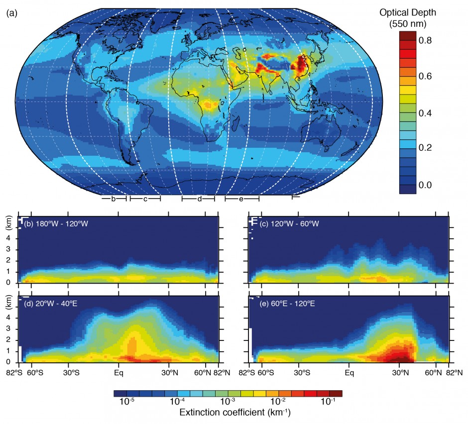
What appears to have captured attention is the association of this event with a Saharan dust outbreak, which the Met Office explained here along with some nice images and videos from a satellite.

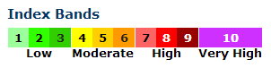
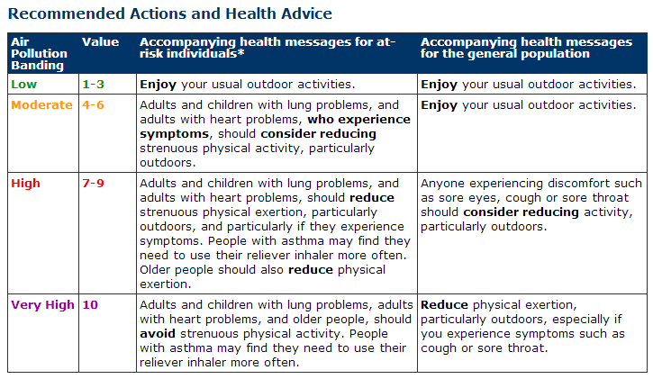
Below is the forecast for today (Wednesday 2nd April 2014) from Defra (provided by the Met Office) showing their “Daily Air Quality Index“, which is a measure of pollution levels categorised into different bands reflecting the severity of the pollution. I’ve included Defra’s actions and advise table below also, as the website has been unresponsive at times today. The Met Office also have a page on their website, which includes a more expansive explanation of the bandings.

Blah.

IndexBands

Daily Air Quality Index forecast valid for Wednesday 2nd April 2014 provided by the Department for Environment, Food & Rural Affairs (DEFRA) and the Met Office. Source: Defra

HealthAdvice

The forecast predicts that pollution levels will be high or very high over many regions of England, with moderate pollution levels expected over Wales.

So the question is what is causing this event?

Much of the media coverage has played on the role of the Saharan dust and this is the most visible aspect of the current event, as the size and shape of the dust helps to create especially vivid sunsets and people have had to sweep dust off their cars as rain sweeps it out of the air. However, the pollution event is being driven by a mixture of the dust and pollution from continental Europe and more local/regional sources within the UK itself.

On the forecast above, we can see very high levels of pollution over continental Europe, in particular over Belgium and the Netherlands. Pollution over these regions is typically a result of a cocktail of emissions from industry and traffic emissions, with a key ingredient often being from agricultural emissions. Your very own home-grown pollution detector (your nose) may have picked up the scent of such emissions from agriculture should you live in rural areas near farmland, as manure is applied as a fertiliser at this time of year. I wrote about the emissions situation in Europe here, using data from the EU Environment Agency.

These emissions mix together, forming various types of aerosol species that are then blown over the UK. This can combine with similar emissions within the UK and if the winds are light and rainfall is low, you have the perfect conditions for a pollution event.

This isn’t a particularly unusual event; the two main differences are that Saharan dust has joined the fold and the media have been paying much more attention than usual. The major issue is that it has been a relatively prolonged event, likely to last about a week. Pollution events such as the ongoing one over the UK tend to represent acute risks for vulnerable groups, while the general population might notice relatively minor symptoms such as itching eyes or a cough.

Air pollution is a pernicious problem, with even low levels having health implications over prolonged periods. The World Health Organisation recently declared that air pollution is the world’s largest single environmental health risk and was linked with 7 million deaths in 2012 alone. Air pollution is still an unresolved issue in the UK, with significant implications.

UK Air Pollution: March 2014

After the UK’s wettest winter since 1910, spring has sprung with several warm and clear days in March so far. High pressure has been the dominant meteorological situation, which has seen clear skies during the day and cold nights, with fog settling overnight and continuing into the morning. While the high pressure and much reduced rainfall has brought much needed respite to those affected by the severe flooding during the winter, it comes with a sting in the tail in terms of air quality.

Blah.

Surface pressure analysis chart for midnight on the 14th March 2014. Source: Wetterzentrale.de and the Met Office.

This is illustrated on the graph below, which shows hourly aerosol mass concentrations from four sites in England from the beginning of February through until 0800 on the 14th March. Throughout February, the concentrations were relatively low at the four sites. Once we move into March, there are periods of increased aerosol concentrations lasting a few days at a time.

Aerosol mass concentration expressed as particulate matter with a diameter of less than 2.5µm from four air quality monitoring stations in England during February and March 2014. Data source: UK-Air.

Aerosol mass concentration expressed as particulate matter with a diameter of less than 2.5µm from four air quality monitoring stations in England during February and March 2014. Data source: UK-Air.

The interesting thing about the past week has been that the concentrations have risen at all of the sites. While Manchester, London and Portsmouth are likely to have a large contribution from more local urban sources, such as cars, Harwell is in Oxfordshire and is less influenced by such sources. This suggests that the pollution event is also regionally driven. The meteorological situation recently has led to air from mainland Europe being blown across the UK and this air is likely contributing to the pollution situation.

This is typically a strong driver of regional pollution episodes in the UK, as easterly or southerly winds bring pollution from the continent to the UK, which exacerbates more local pollution problems. My PhD research focussed a lot on this very phenomenon; a couple of open access papers I wrote are available here and here. We found that such periods were often associated with enhanced concentrations of ammonium nitrate aerosol, which forms due to a combination of urban and agricultural emissions.

I suspect that this particular species of aerosol will be playing a role in the current pollution episode.

————————————————————————————————————————————————-

Update: 17/03/14

A change in the weather over the weekend brought stronger winds over the UK, helping to disperse the build-up of pollution. This saw a large decrease in pollution levels over the UK, as seen in the updated graph below.

Feb_March_AQ_Data_Updated

Aerosol mass concentration expressed as particulate matter with a diameter of less than 2.5µm from four air quality monitoring stations in England during February and March 2014. Data source: UK-Air.

In terms of what next for the pollution, the answer is blowin’ in the wind.

————————————————————————————————————————————————-

Air quality data acknowledgement

© Crown 2014 copyright Defra via uk-air.defra.gov.uk, licenced under the Open Government Licence (OGL).

Fire in Salford

My commute to work yesterday morning took an unexpected turn as my train pulled into my usual stop in Salford, Greater Manchester. To my right was a huge plume of smoke, which I would usually associate more with deforestation fires in Brazil! A plume of black smoke was rising up against the backdrop of beautifully clear skies, with the smoke gradually changing to a lighter shade of grey higher up. The photo below is from just after 8am on Monday morning.

Photo of the Salford fire taken at 8:15am on the 3rd March 2014. Source: Will Morgan

Photo of the Salford fire taken at 8:15am on the 3rd March 2014.
Source: Will Morgan

A quick internet search when I got to the office revealed that a paper recycling facility on Duncan Street had caught fire late Sunday night and had burnt through until morning. You can see lots of images of the fire on Twitter, plus this video shows some aerial footage of the fire.

As someone who studies air pollution from fires, I was obviously fascinated by its development and some key processes for more ‘normal’ fires are actually displayed by this fire.

Light my fire

Notice how the fire seems to hit an invisible force field and gradually lean over to one side; this occurs due to the fire hitting a layer of warmer air above the surface but in this instance, there is cooler air at the surface and the warmer surface above it. This is known as a temperature inversion and they often occur during cold winter nights. On my train journey, it was noticeable that there were layers of fog near the surface in the outer suburbs of Greater Manchester, which can also form as a consequence of such inversions.

Whiter shade of pale

Another feature of the smoke plume was that the initial column of rising smoke is much darker than the plume where it starts to curve. The dark grey/black smoke is likely due to a large number of dark soot particles in the fire. That warmer air I referred to earlier is probably moister than the air below, which means that there is more water vapour residing in that air. The fire itself also generates water vapour as a product of the combustion process.

Introducing a heavy dose of aerosol particles to the mix will typically lead to some of that water vapour condensing onto the tiny aerosol particles. This condensation makes the aerosol particles a little less tiny and more reflective; this makes the smoke lighter giving it the lighter grey colour. This is actually a really important process more generally for atmospheric aerosols, as this condensation of water vapour onto these tiny particles can strongly enhance their cooling effects on our climate.

Get off of my cloud

The third step relates to when the plume of smoke rises higher still and manages to break through what is known as the ‘planetary boundary layer’.  This layer is technically defined as the region of the atmosphere most directly influenced by its contact with the surface of the Earth. Of more importance for this stage in the fire’s evolution, it is also where most low clouds form! The photo below is from my office building and shows the plume against the backdrop of an almost entirely blue and cloud-free sky; there were no other low-level clouds in sight.

Photo of the Salford fire taken at 8:45am on the 3rd March 2014. Source: Will Morgan

Photo of the Salford fire taken at 8:45am on the 3rd March 2014.
Source: Will Morgan

The intensity of the fire means that the plume of smoke has sufficient energy to burst through the boundary layer. Once through, the aerosol particles and moisture generated by the fire produce a special type of cloud known as pyrocumulus. Without the fire, the cloud wouldn’t have formed and spoilt a rare sunny morning in Manchester!

We didn’t start the fire

The final stage in the smoke’s journey occurs as the night draws in and the atmosphere cools. This leads to the planetary boundary layer that I described earlier becoming ‘thinner’, which sees this lower part of the atmosphere ‘squished’. This causes the smoke plume to descend closer to the ground, which increases the risks associated with the fire, such as reducing visibility and potentially causing health difficulties for people exposed to the smoke.

Graph of aerosol mass concentration on the 3rd March 2014. Image from the Whitworth Observatory reproduced with permission from Michael Flynn, Centre for Atmospheric Science, University of Manchester.

The graph above shows data from the Whitworth Observatory, which is located on the roof of the George Kenyon Building at the University of Manchester. The graph shows how the amount of aerosol pollution measured at the observatory rapidly increased from around 6pm, peaking  at about 90 µg/m3, which is much greater than the previous measurements during the day. The wind direction and descent of the plume meant that the smoke plume and the observatory were lined up so the instruments were able to measure it.

Hopefully this post has provided a few scientific insights into how this fire and fires more generally tend to develop. With reports suggesting that the fire could burn for days, the fire is likely to cause disruption for a while yet. Hopefully the fire services will be able to make quick progress on extinguishing it.

Aerosols and the pause

There is a new commentary piece in Nature Geoscience by Gavin Schmidt and colleagues on ‘Reconciling warming trends’. The paper investigates several potential causes for the discrepancy between climate model projections and the recent ‘slowdown’ in global surface temperatures, which is nicely illustrated on Ed Hawkins’ Climate Lab Book blog.

One of the aspects the paper looks at is the influence of aerosol particles in the troposphere (the lower part of the atmosphere), which tend to exert a cooling influence on our climate. Of the aspects they looked at, aerosol particles are the most uncertain.

As I summarised in this previous post, the final report from the Intergovernmental Panel on Climate Change (IPCC) on the physical science basis concluded that aerosols was continue to dominate the uncertainty in the human influence on climate. They said that a complete understanding of past and future climate change requires a thorough assessment of aerosol-cloud-radiation interactions.

With this in mind, I want to delve into the details of how the chemical make-up of aerosol particles varies across the globe and how this is important for our climate and how this relates to the warming trends paper.

What are aerosols made of?

Aerosols are made up of a large variety of different chemical species, which vary by the time of day, seasonally, regionally and a host of other factors. There is no single type of aerosol in our atmosphere.

The figure below attempts to pull together a huge collection of studies that have been measuring the major aerosol chemical species in different regions of the globe. We can see on the map that many of the sites are in North America and Western Europe, where large coordinated surface networks have been making such measurements for decades. Measurements elsewhere are much more limited, particularly in the Southern Hemisphere.

This is one of the major difficulties in understanding aerosols; they are difficult to measure, the techniques used are typically quite labour intensive and they require access to well developed infrastructure and supporting measurements.

Fig7.13-Final-2

Summary of aerosol chemical species split across different regions based on surface measurements. The map shows the locations of the sites. For each area, the panels represent the median, the 25th to 75th percentiles (box), and the 10th to 90th percentiles (whiskers) for each aerosol component. The colour code for the measured components is shown in the key where SO4 refers to sulphate, OC is organic aerosol (strictly organic carbon), NO3 is nitrate, NH4 is ammonium, EC is black carbon (strictly elemental carbon), mineral refers to mineral dust e.g. from deserts and sea-salt refers to aerosols produced by ocean waves. The figure is 7.13 from the IPCC report, where the numerous references for the data are included. Click on the image for a larger view. Source: IPCC.

Bearing this in mind, we are able to draw some broad conclusions on their chemical make-up. We can see that in all of the non-marine regions, the aerosol is broadly made up of sulphate, organic carbon, nitrate, ammonium and black carbon, with the influence of mineral dust varying depending on location e.g. concentrations are much greater in locations such as Africa and Asia where large deserts exist.

Of these species, sulphate, nitrate, ammonium and black carbon are predominantly man-made in origin, while organic carbon can be a consequence of both natural and man-made emissions. We see that concentrations of organic carbon and nitrate are broadly equivalent to those of sulphate, with organic carbon being much greater in South America, Oceania, Africa and parts of Asia.

Where is the aerosol?

One of the key properties of aerosol particles in the troposphere is that they have a short lifetime, as they are removed from the atmosphere by rain or simply by crashing into things (terrible drivers those aerosol particles). This typically means that the largest concentrations occur near their sources; they are regionally very important in a climate context but their impact evens out at larger scales, although they do still exert a global influence.

Below is an illustration of this based on satellite measurements combined with a forecast model system, which shows ‘hotspots’ of aerosol particles over China, India and Southern Africa in particular. The metric used here is the aerosol optical depth, which is a measure of the amount of aerosol present in a vertical slice through the atmosphere.

Horizontal and vertical distributions of aerosol amount based on a combination of the European Centre for Medium Range Weather Forecasts (ECMWF) Integrated Forecast System model with satellite measurements from the Moderate Resolution Imaging Spectrometer (MODIS) averaged over the period 2003–2010 and the Cloud–Aerosol Lidar with Orthogonal Polarization (CALIOP) instrument for the year 2010. The figure is 7.14 in the IPCC report and references for studies are available there. Click on the image for a larger view. Source: IPCC.

Comparing the two figures, we see that the enhanced aerosol optical depth in Asia is consistent with the large aerosol concentrations measured by the surface based networks. Of the man-made species, organic carbon is a big driver here, with nitrate, sulphate and ammonium also playing a major role. These aerosol particles are formed due to the substantial emissions from the region.

What about the pause?

Of these species, sulphate and black carbon are the major species that climate models have historically focussed on. Organic carbon is generally included, although there are large discrepancies in relation to measurements, particularly related to the secondary organic aerosol component. Nitrate has received comparatively little attention and those that have included it have shown that it is an important aerosol species both today and over the 21st Century. Drew Shindell and colleagues when comparing aerosol optical depth from satellite measurements and climate models concluded that:

A portion of the negative bias in many models is due to missing nitrate and secondary organic aerosol.

I’ve been involved in research showing how nitrate is important in North-Western Europe and how it enhances the aerosol radiative forcing in the region (many others have done so also by the way). Nitrate has long been known to be important in North America, particularly in California, where large urban and agricultural emissions coincide. Several studies have investigated its importance in East Asia, showing that it is particularly prevalent during the winter.

The ‘Reconciling warming trends’ commentary notes that nitrate was only included in two of the models that contributed to the Coupled Model Intercomparison Project (CMIP5) and that including this across all models brings them closer to the observed surface temperature trend. They also note that underestimating the secondary organic aerosol contribution would have a similar effect but don’t put a value on this.

While this certainly isn’t the last word on the importance of these species for climate change and research on the ‘pause’ will undoubtedly continue, further recognition of their contribution to atmospheric aerosol is a step in the right direction. There are many unanswered questions in this realm, particularly relating to the large differences across climate models in terms of what contribution each species makes to regional and global aerosol.

Bringing the aerosol measurement and modelling communities together more to address such issues is likely the way forward. This is a big focus in many aerosol related research projects these days…we’re trying, honest.