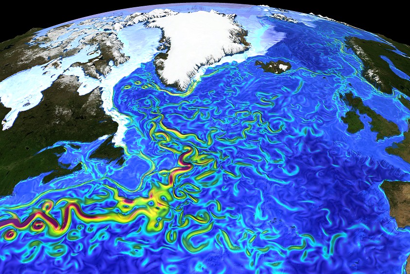
For a bit of a change of pace the photo of the week this week isn’t a photo at all. Rather it’s a fascinating model output showing ocean surface currents in the North Atlantic. The Gulf Stream is clearly visible as it flows past Atlantic Canada and out towards the middle of the north Atlantic. I am guessing that colour scheme has something to do with current velocity or mass flux or something. Anyway, I think that red means a bigger current than blue.
Modelling is something that I have written briefly about before and am starting to get involved with in my own work. It’s a fascinating field although I believe that all model results should be taken with a grain of salt given that they try to mimic and quantify what is actually happening in nature but cannot always incorporate all of the inter-relationships that exist between the variables. This makes them only representations of what is actually occurring in the real world. However, the insane level of complexity in real systems makes models the only way to try and understand processes that we can’t observe easily. As we learn more the model can then be adjusted to incorporate new linkages and their importance more accurately.
Enough of my ranting, enjoy this unique and beautiful model output of the north Atlantic’s currents.

Surface currents in the North Atlantic– by Erik Behrens, GEOMAR, Kiel, Germany Snapshot of surface speed in a eddying (0.05°, VIKING20) ocean sea-ice model resolving important mesocale eddies and filaments explicitly.


