This guest post is by Dr Grace Shephard, a postdoctoral researcher in tectonics and geodynamics at the Centre of Earth Evolution and Dynamics (CEED) at the University of Oslo, Norway. This blog entry describes the latest findings of a study that maps deep remnants of past oceans. Her open access study, in collaboration with colleagues at CEED and the University of Oxford, was published this week in the Nature Journal: Scientific Reports. This post is modified from a version that first appeared on the CEED Blog.
Quick summary:
There are several ways of imaging the insides of the Earth by using information from earthquake data. When these different images are viewed at the same time, a new type of map allows geoscientists to identify the most robust features. These deep structures are likely the remains of extinct oceans, known as slabs, that were destroyed hundreds of millions of years ago. The maps are computed at different depths inside the Earth and the resulting slabs can be resurrected back to the surface. Along with a freely available paper and website, the analysis yields new insights into the structure and evolution of our planet in deep time and space.
Earth in constant motion
The surface of the Earth is in constant motion and this is particularly true of the rocks found under the oceans. The crust – the outermost layer of the planet – is continually being formed in the middle of oceans, such as the Mid-Atlantic Ridge. In other places, older crust is being destroyed, such as where the Pacific Ocean is moving under Japan. A third type of locality sees the crust shifted along laterally, such as the San Andreas Fault in San Francisco. These three types of locations are often referred to as plate boundaries, and they connect up to divide the Earth’s surface into tectonic plates of different sizes and motions.
Where plates plunge into the mantle are termed subduction zones (red lines Figure 1, below). The configuration of these subduction zones has changed throughout geological time. Indeed, much of the ocean seafloor (blue area in Figure 1) that existed when the dinosaurs roamed the Earth has long since been lost into the Earth’s mantle and are now known as slabs. The mantle is the domain beneath the outer shell of our planet and extends to around 2800 km depth, to the boundary with the core.
The age and fabric of the seafloor contains some of the most important constraints in understanding the past configuration of Earth. However, the constant recycling of oceans means that the Earth’s surface as it is today can only tell us so much about the deep geological past – the innards of our planet hold much of this information, and we need to access, visualize, and disseminate it.
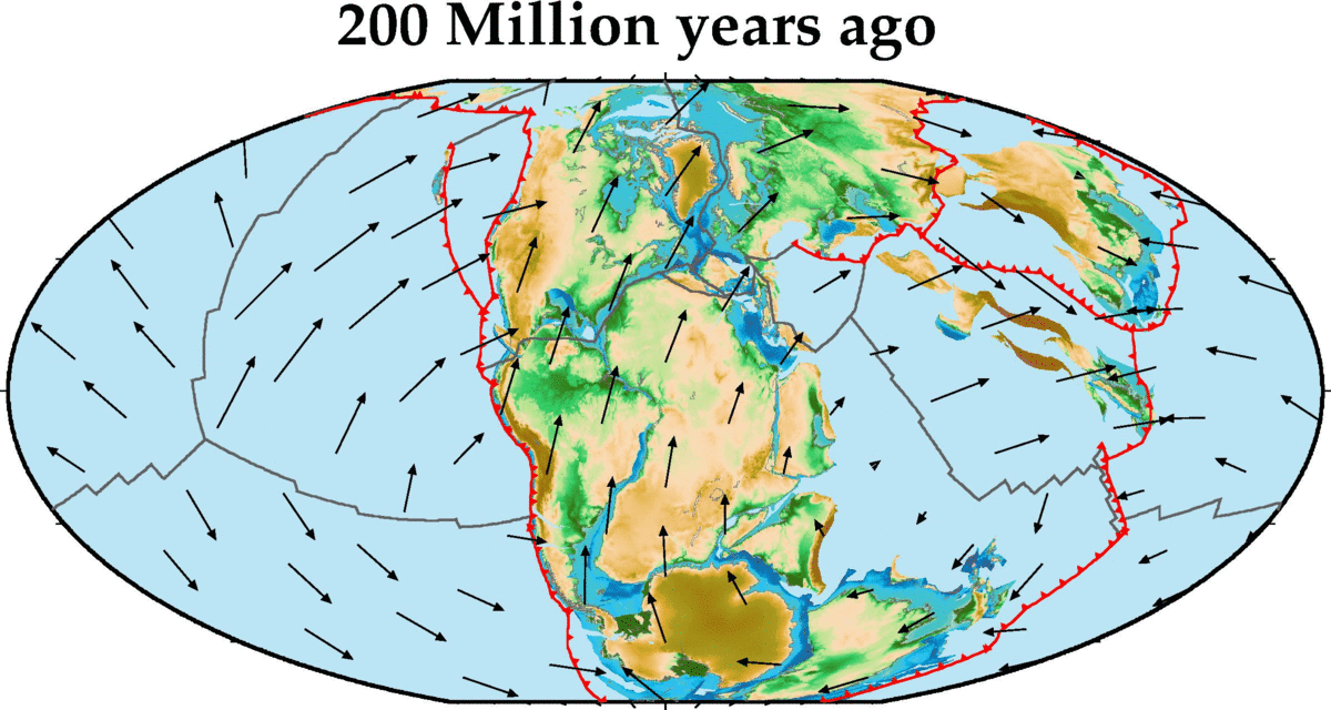
Figure 1. A reconstruction of the Earth’s surface from 200 Million years ago to present day in jumps of 10 Million years. Red lines show the location of subduction zones, other plate boundaries in black, plate velocities are also shown. Continents are reconstructed with the present-day topography for reference. Based on the model of Matthews et al. (2016; Global and Planetary Change). Credit: G Shephard (CEED/UiO) using GPlates and GMT software.
Imaging the insides
Using information from earthquake data, seismologists can produce images of the Earth’s interior via computer models – this technique is called seismic tomography. Similar to a medical X-ray scan that looks for features within the human body, these models image the internal structure of the Earth. Thus, a given seismic tomography model is a snapshot into the present-day structure, which has been shaped by hundreds of millions to billions of years of Earth’s history.
However, there are different types of data that can be used to generate these models and different ways they can be created, each with varying degrees of resolution and sensitivity to the real Earth structure. This variability has led to dozens of tomographic models available in the scientific arena, which all have slightly different snapshots of the Earth. For example, deep under Canada and the USA is a well-known chunk of subducted ocean seafloor (see ‘slab’ label in Figure 2). A vertical slice through the mantle for three different tomography models shows that while overall the models are similar, there are some slight shifts in its location and shape.
Importantly, seismic waves pass through subducted, old, cold oceanic plates more quickly than they do through the surrounding mantle (in the same way that sound travels faster through solids than air). It follows that these subducted slabs can be ‘imaged’ seismically (usually these slab regions show up as blue in tomography models such as in Figure 2 and as shown in this video by co-author Kasra Hosseini. The red regions might represent thermally hot features like mantle plumes).
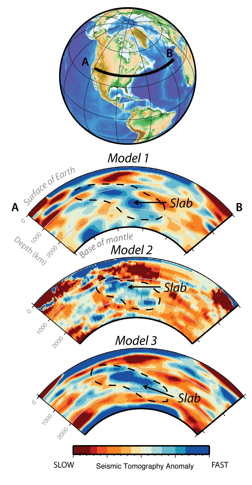
Figure 2. Vertical slices through three different seismic tomography models under North America and the Atlantic Ocean (profile running from A to B). The blue region outlined by black dashed line is related to the so-called Farallon slab. While it is imaged in all three models the finer details of the slab geometry and depth are different. Model 1 is S40RTS (Ritsema et al., 2011), 2 is UU-P07 (Amaru, 2007) and 3 is GyPSum-S (Simmons et al., 2010).
For other geoscientists to utilize this critical information, for example to work out how continents and oceans moved through time, requires a spectrum of seismic tomography models to be considered. But several limiting questions arise:
Which tomography model(s) should be used?
Are models based certain data types more likely to pick up a feature?
How many models are sufficient to say that a deep slab can be imaged robustly?
Voting maps of the deep
To facilitate solutions to these questions, a novel yet simple approach was undertaken in the study. Different tomography models were combined to generate counts, or votes, of the agreement between models – a sort of navigational guidebook to the Earth’s interior (Figure 3).
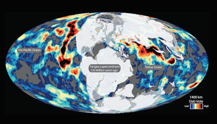
Figure 3. An interactive 360° style image for the vote map at 1000 km depth. The black and red regions highlight the most robust features (high vote count = likely to be a subducted slab of ocean) and the blue regions are the least robust areas (low vote count). Coastlines in black for reference. Image: G Shephard (CEED/UiO) using 360player (https://360player.io/) and GMT software. More depth slices and options can be also imaged at our website.
A high vote count (black-red features in Figure 3) means that an increased number of tomography models agree that there could be a slab at that location. For the study in Scientific Reports the focus was on the oldest and deepest slabs, but the process can be undertaken for shallower and younger slabs, and for other features such as mantle plumes. The maps show the distribution of the most robust slabs at different depths – the challenge is to now try and verify the features and potentially link them to subduction zones at the surface back in time.
One way to achieve this is to assume that a subducted portion of ocean will sink vertically in the mantle, and then to apply a sinking rate to connect depth and time. This enables pictures that link the surface and deep Earth, like the cover image, to be made. A sinking rate of say, 1.2 centimeters per year, means that a feature that existed at the surface around 100 Million years ago might be found at 1200 km depth.
Many studies have started to undertake a similar exercise on both regional and global scales. However, because these vote maps are free to access, showcase a lot of different models and can be remade with a sub-selection of them, they serve as an easy resource for the community to continue this task.
Secrets in depth
A bit like dessert-time discussions about the best way to cut a cake, so too are the ways of imaging and analyzing the Earth (Figure 4). Do you slice it horizontally and see things that might correspond to the same age all over the globe? Or slice vertically from the surface to see a spectrum of ages (depths) at a given location? Or perhaps a 3-D imaging would be most insightful? Whichever choice is made for the vote maps, many interesting features are displayed.

Figure 4. Vote maps visualized using alternative imaging options on a sphere. Credit: G Shephard (CEED/UiO) using GPlates software
By comparing the changes in vote counts with depth, some intriguing results were found. An apparent increase in the amount of the slabs was found around 1000-1400 km depth. This could mean that about 130 Million years ago more oceanic basins were lost into the mantle. Or perhaps there is a specific region in the mantle that has “blocked” the slabs from sinking deeper for some period of time (for example, an increase in viscosity).
The vote maps and their associated depth-dependent changes hold implications on an interdisciplinary stage including through linking plate tectonics, mantle dynamics, and mineral physics.
Of course, the vote maps are only as good as the tomography models that they are comprised of – and by very definition, a model is just one way of representing the true Earth.
A resource for the community
Having accessed a variety of tomography models provided by different research groups or data repositories, this study was facilitated using open-source software (Generic Mapping Tools and GPlates).
An important component of reproducible science and advancing our understanding of Earth is to make datasets and workflows publicly available for further investigations.
An online toolkit to visualize seismic tomography data is being developed by the co-authors and a preliminary vote maps page is already online. Here, vote maps for a sub-selection of tomography models can be generated, including with a choice in colour scales and with overlays of plate reconstruction models. More functionality will soon be available – so watch this space!
By Grace Shephard, a postdoctoral researcher in tectonics and geodynamics at the Centre of Earth Evolution and Dynamics (CEED)
Contact information for more details: Grace Shephard – g.e.shephard@geo.uio.no
Full reference to the article, freely available to the public:
Amaru, M. L. Global travel time tomography with 3-D reference models,. Geol. Ultraiectina 274, 174 (2007).
Matthews, K.J. K.T. Maloney, S. Zahirovic, S.E. Williams, M. Seton, R.D. Müller. 2016. Global plate boundary evolution and kinematics since the late Paleozoic. Global and Planetary Change. v146. doi: 10.1016/j.gloplacha.2016.10.002
Ritsema, J., Deuss, A., van Heijst, H. J. & Woodhouse, J. H. S40RTS: a degree-40 shear-velocity model for the mantle from new Rayleigh wave dispersion, teleseismic traveltime and normal-mode splitting function measurements. Geophysical Journal International 184, 1223-1236, doi:10.1111/j.1365-246X.2010.04884.x (2011).
Simmons, N. A., Forte, A. M., Boschi, L. & Grand, S. P. GyPSuM: A joint tomographic model of mantle density and seismic wave speeds. Journal of Geophysical Research: Solid Earth 115, doi:10.1029/2010JB007631 (2010).