EGU Blogs

Smoke

Around the world

Around the world

The short lifetime of aerosol particles in the atmosphere means that they tend to be found concentrated in regions close to where they were formed. As they only last for days to weeks in the atmosphere, they don’t travel too far as the Earth’s winds aren’t able to fully mix the air over such a short period.

This short lifetime should also mean that any changes in the emissions of aerosol particles and their gas-phase building blocks will show up quickly when we measure their concentrations in the atmosphere. This contrasts with greenhouse gases, which typically have much-longer lifetimes (decades to centuries), so their concentrations remain much further into the future (even if their emissions were ceased completely).

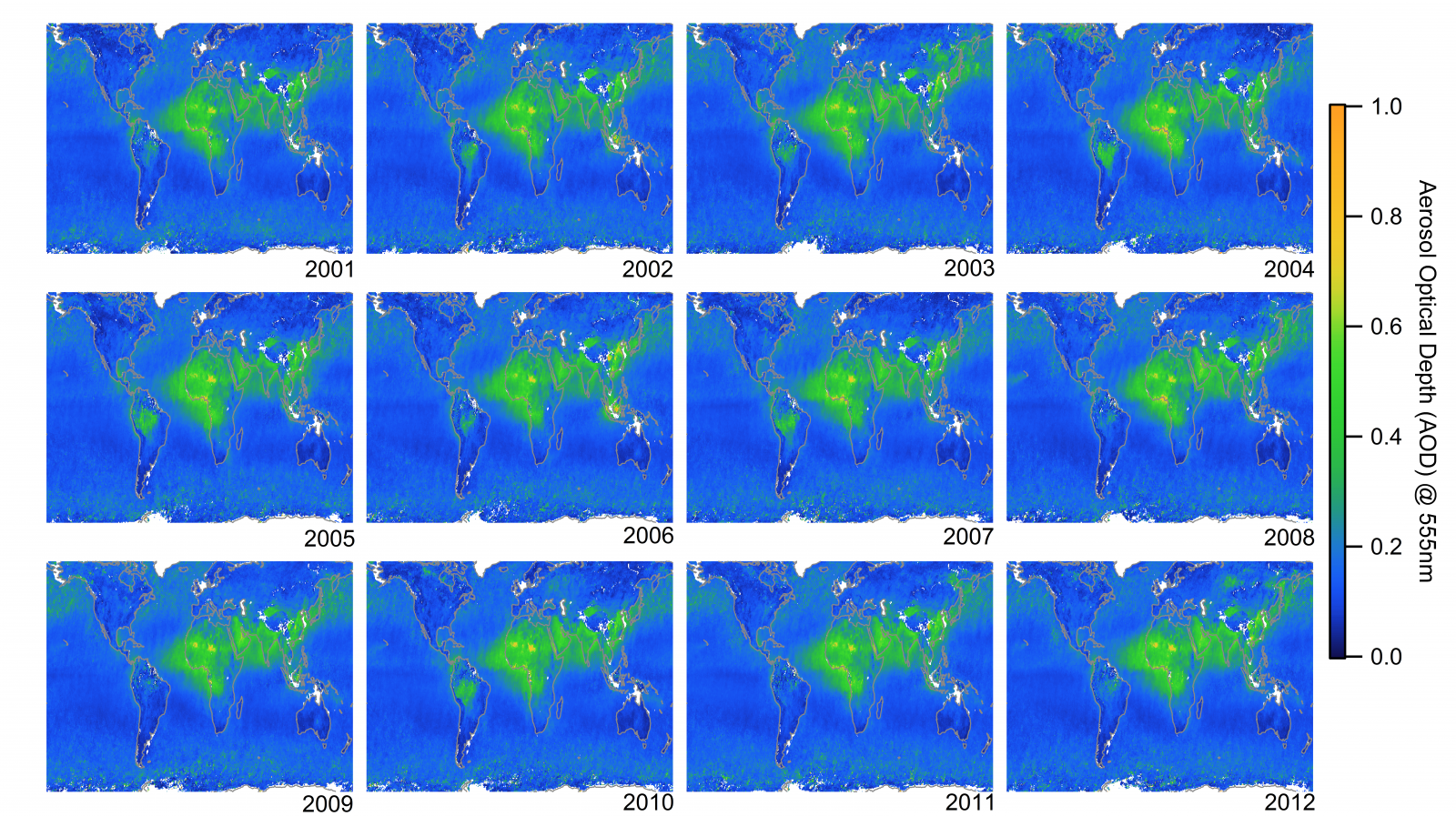
Below is a collection of images of the global aerosol view from 2001 to 2012 from the Multi-angle Imaging SpectroRadiometer (MISR) on board NASA’s TERRA satellite. Each map is a single year, with the year noted to the bottom right of the image. The maps show the Aerosol Optical Depth (AOD), which is a measure of the amount of aerosol within the atmosphere. As the measurements are made from space, the instrument measures the aerosol in a vertical column below the satellite. Terra orbits the Earth continuously and gradually builds up a picture of the Earth below; MISR itself will typically build up a global picture over a couple of weeks.
Global view of the Aerosol Optical Depth (AOD) from 2001-2012 observed by the Multi-angle Imaging SpectroRadiometer (MISR) on board NASA's TERRA satellite. White spaces indicate there is no data.

Global view of the Aerosol Optical Depth (AOD) from 2001-2012 observed by the Multi-angle Imaging SpectroRadiometer (MISR) on board NASA’s TERRA satellite. White spaces indicate there is no data. High latitudes are excluded as the satellite retrievals don’t work over highly-reflective surfaces (snow/ice). Click on the image for a larger view.

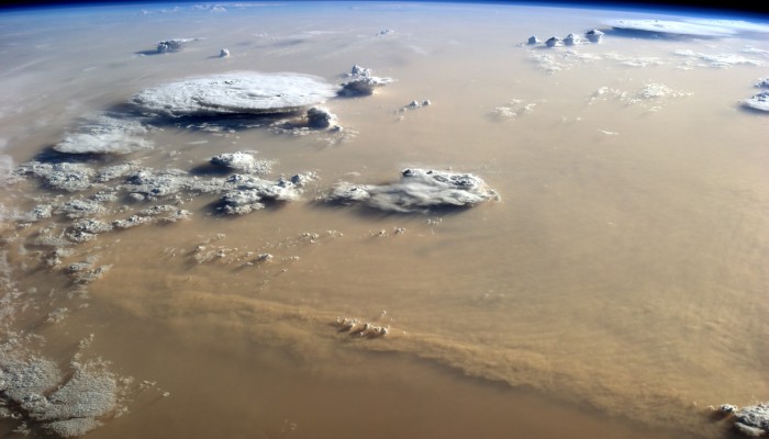
The most persistent feature is the large expanse of aerosol over Africa, which also extends into the Atlantic Ocean. Over North Africa, much of this aerosol is a result of the wind whipping up a storm of Saharan dust, which can then be blown over large distances. Sometimes, the dust even makes its way across the whole Atlantic Ocean and lands in North or South America. Further south, frequent burning occurs to clear savannah areas in Southern Africa, which creates large amounts of smoke.

The Arabian Peninsula, India and South-East Asia (particularly China) are other regions where aerosol is prevalent. Similarly to the Sahara, Saudi Arabia is prone to large dust storms, while India and China have undergone significant economic development recently, which has led to increased burning of fossil fuels. South America also sees a large build up of aerosol over the Amazon Rainforest due to deforestation fires, although the amount of aerosol varies more from year-to-year.

Europe, North America and Australia display relatively low levels of aerosol compared to these other regions. Bear in mind that these are annual averages, so they will miss intense and short-lived pollution events, which do still affect these regions.

The atmosphere above the Earth’s oceans is generally quite clean as far as aerosol is concerned, as the major sources of aerosol are far away. There are deviations from this general observation though, for example, aerosol is transported across the Pacific Ocean from Asia to North America. This can be seen in the top right of each image (as well as in the top left at times). The strong winds in the Southern Ocean also see elevated aerosol amounts, as the wind helps to produce sea spray aerosol.

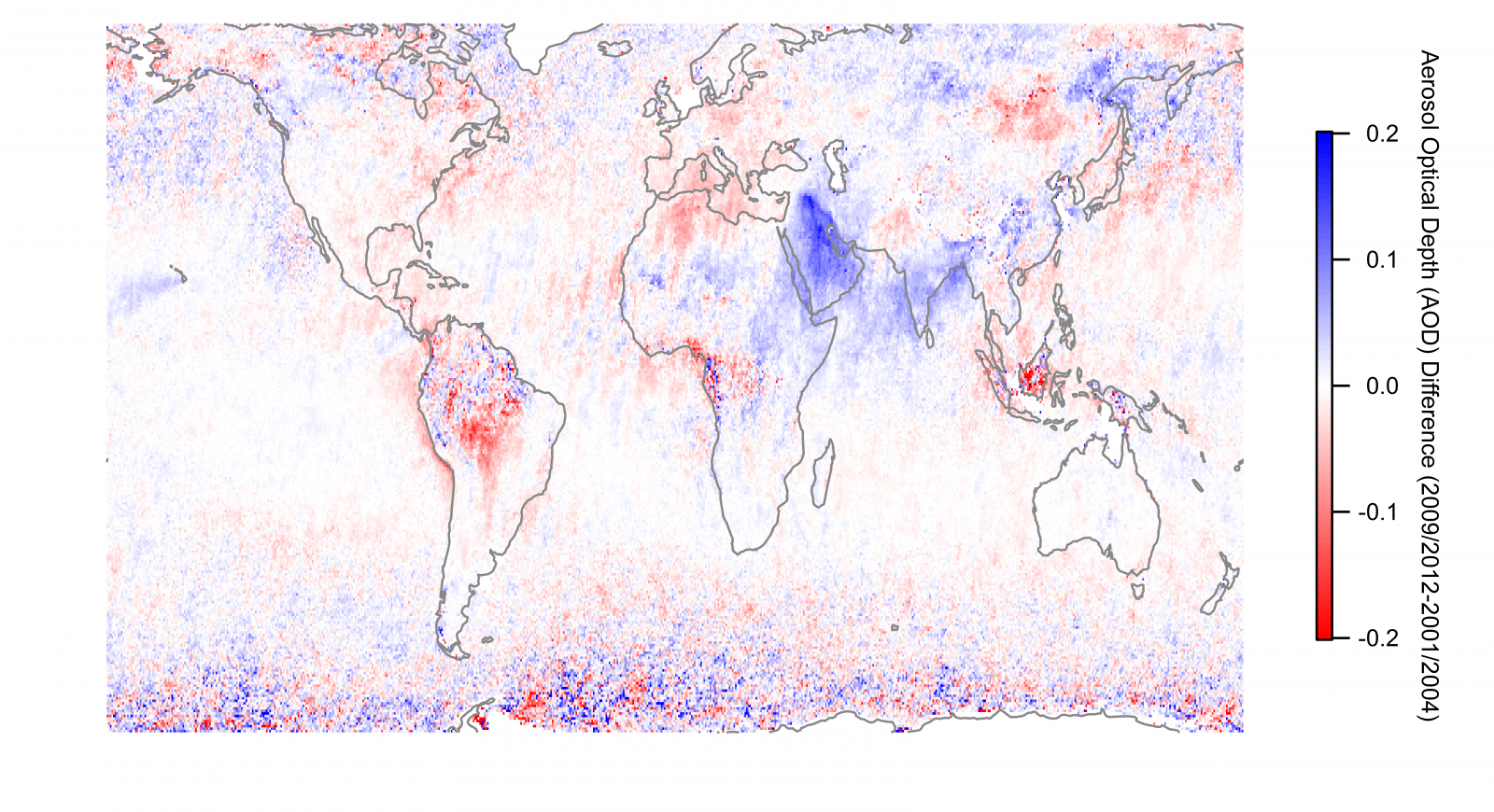
Below is a map showing the difference between the last four years shown above (2009-2012) and the first four years (2001-2004) in order to highlight changes in aerosol over this period. Overall, there hasn’t been a great change in the global amount of aerosol; Dan Murphy, in a paper in Nature Geoscience (pay walled, sorry), showed that the level of aerosol hasn’t changed much over this period but that there have been regional changes. This is in agreement with several other papers using similar and/or the same measurements (some non-pay walled papers here and here). From a statistical point of view, the trend in global aerosol is negligible and weakly positive i.e. aerosol levels have increased since the turn of the century but the increase isn’t statistically significant.
Difference in Aerosol Optical Depth (AOD) from 2009-2012 to 2001-2004. Data source is the same as above. Blue colours indicate an increase in aerosol, while red colours show a decrease.

Difference in Aerosol Optical Depth (AOD) from 2009-2012 to 2001-2004. Data source is the same as above. Blue colours indicate an increase in aerosol, while red colours show a decrease.

The strongest increases have been over the Arabian Peninsula and India. These increases are likely a consequence of natural causes in the case of Saudi Arabia via increased dust emissions and transport, whereas India is likely a consequence of increased burning of fossil fuels. South America is probably the most notable region as far as aerosol decline is concerned; in recent years, deforestation has decreased compared to the early 2000s combined with some wetter years over the Amazon. Significant burning does still occur though, with 2010 being a notable year where drought conditions meant that a very large amount of smoke built up over the Amazon during the biomass burning season. There have also been declines in aerosol over Europe and the North Eastern USA, which are likely due to decreased emissions of sulphur dioxide from coal power stations.

The upshot of these trends is that since the year 2000, aerosol particles have undergone relatively minor changes on the global scale. The question going forward is whether this will continue and what impact will such changes have on our climate. Thus far, the declines in Europe and North America have been offset by increases in Asia, although the climate-relevant properties of the aerosol may not be the same. Furthermore, much of the decline in aerosol has been driven by reductions in sulphate aerosol but other species, such as secondary organic aerosol and ammonium nitrate, may become comparatively more important. These species are often missing or poorly represented in climate models, which has been suggested as an explanation for the recent pause/hiatus/slowdown in global mean surface temperature.

This is clearly a major issue in climate science currently and the role of aerosol is unclear. I’ll be writing more on this topic in the future, so watch this space!

—————————————————————————————————————————————————————–

Header image: Dust and Clouds Dance Over the Sahara, published by NASA Earth Observatory. The photograph was taken by astronaut Alex Gerst on September 8, 2014, from the International Space Station.

MISR analyses and visualizations used in this blog post were produced with the Giovanni online data system, developed and maintained by the NASA GES DISC.

The dark side of the atmosphere: the blog awakens

The dark side of the atmosphere: the blog awakens

Aerosol particles come in lots of different flavours and one of their most important properties is how they deal with incoming sunlight. Some are rather unwelcoming and send sunlight back to whence it came (space), which leads to a cooling of the atmosphere as the sunlight doesn’t reach the surface of the Earth. Others offer sunlight a warm(ing) embrace and absorb it, which heats up the atmosphere.

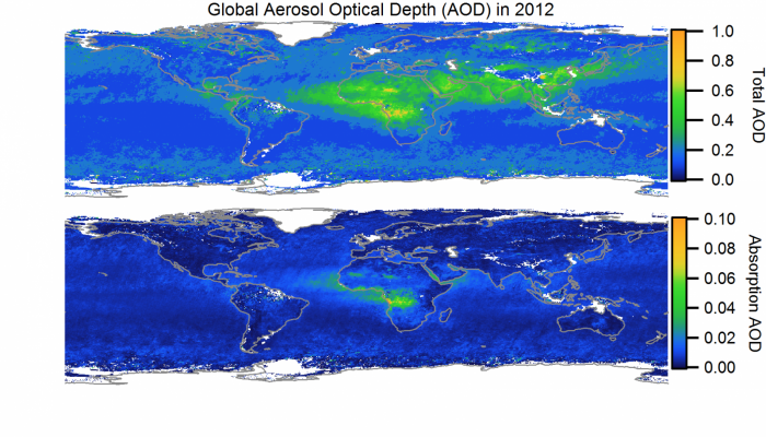
The relative amount of absorbing aerosol compared to the total aerosol burden in the atmosphere is the primary control on whether aerosol particles have a warming or cooling impact. Overall, aerosol particles are thought to cool climate but there are differences regionally and over the course of a typical year. We can see in the maps above that the absorbing aerosol is typically much smaller than the total amount of aerosol; the absorbing fraction is generally less than 5% of the total.

Regionally, the level of absorption and its relative contribution can be much larger, particularly where large-scale biomass burning occurs. Southern-West Africa sticks out in the above image where large-scale biomass burning occurs frequently. These open fires release large amounts of black carbon, which is the major absorbing aerosol species in the atmosphere. In addition, the fires can release so-called ‘brown carbon‘, which is a more weakly absorbing aerosol made up of organic material.

To complicate matters, biomass burning aerosol is also made up of the unaccommodating aerosols that scatter sunlight back to space. The competition between the scattering and absorbing aerosol species is quite intense and uncertain. The most recent Intergovernmental Panel on Climate Change (IPCC) report underlined our poor understanding of biomass burning aerosol, as its estimate of its impact didn’t pin down whether it cooled or warmed our atmosphere overall. The highlighted region over Southern-West Africa is a particularly complex and uncertain case.

Absorbing aerosol species are one of the hottest areas of research in aerosol science, as they have an uncertain contribution to climate warming (particularly on regional scales). Black carbon has received much attention on this front as a ‘short-lived climate forcer‘, plus there are significant health implications associated with it also. There are major questions relating to the impact of absorbing aerosol species on climate, which I will explore down the line on the blog and through my own research.

The dark side is clearly powerful. How powerful remains to be seen.

—————————————————————————————————————————————————————–

Multi-angle Imaging SpectroRadiometer (MISR) data was obtained from the NASA Langley Research Center Atmospheric Science Data Center.

Fire in Salford

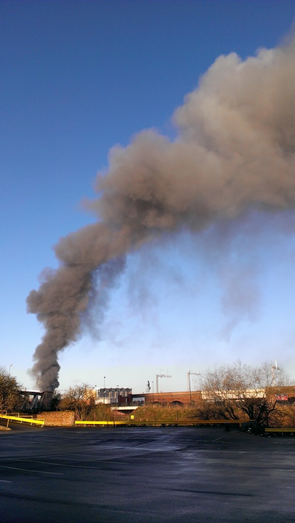
My commute to work yesterday morning took an unexpected turn as my train pulled into my usual stop in Salford, Greater Manchester. To my right was a huge plume of smoke, which I would usually associate more with deforestation fires in Brazil! A plume of black smoke was rising up against the backdrop of beautifully clear skies, with the smoke gradually changing to a lighter shade of grey higher up. The photo below is from just after 8am on Monday morning.

Photo of the Salford fire taken at 8:15am on the 3rd March 2014. Source: Will Morgan

Photo of the Salford fire taken at 8:15am on the 3rd March 2014.
Source: Will Morgan

A quick internet search when I got to the office revealed that a paper recycling facility on Duncan Street had caught fire late Sunday night and had burnt through until morning. You can see lots of images of the fire on Twitter, plus this video shows some aerial footage of the fire.

As someone who studies air pollution from fires, I was obviously fascinated by its development and some key processes for more ‘normal’ fires are actually displayed by this fire.

Light my fire

Notice how the fire seems to hit an invisible force field and gradually lean over to one side; this occurs due to the fire hitting a layer of warmer air above the surface but in this instance, there is cooler air at the surface and the warmer surface above it. This is known as a temperature inversion and they often occur during cold winter nights. On my train journey, it was noticeable that there were layers of fog near the surface in the outer suburbs of Greater Manchester, which can also form as a consequence of such inversions.

Whiter shade of pale

Another feature of the smoke plume was that the initial column of rising smoke is much darker than the plume where it starts to curve. The dark grey/black smoke is likely due to a large number of dark soot particles in the fire. That warmer air I referred to earlier is probably moister than the air below, which means that there is more water vapour residing in that air. The fire itself also generates water vapour as a product of the combustion process.

Introducing a heavy dose of aerosol particles to the mix will typically lead to some of that water vapour condensing onto the tiny aerosol particles. This condensation makes the aerosol particles a little less tiny and more reflective; this makes the smoke lighter giving it the lighter grey colour. This is actually a really important process more generally for atmospheric aerosols, as this condensation of water vapour onto these tiny particles can strongly enhance their cooling effects on our climate.

Get off of my cloud

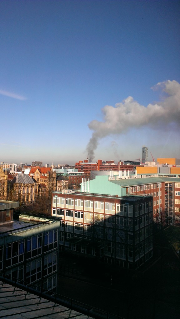
The third step relates to when the plume of smoke rises higher still and manages to break through what is known as the ‘planetary boundary layer’.  This layer is technically defined as the region of the atmosphere most directly influenced by its contact with the surface of the Earth. Of more importance for this stage in the fire’s evolution, it is also where most low clouds form! The photo below is from my office building and shows the plume against the backdrop of an almost entirely blue and cloud-free sky; there were no other low-level clouds in sight.

Photo of the Salford fire taken at 8:45am on the 3rd March 2014. Source: Will Morgan

Photo of the Salford fire taken at 8:45am on the 3rd March 2014.
Source: Will Morgan

The intensity of the fire means that the plume of smoke has sufficient energy to burst through the boundary layer. Once through, the aerosol particles and moisture generated by the fire produce a special type of cloud known as pyrocumulus. Without the fire, the cloud wouldn’t have formed and spoilt a rare sunny morning in Manchester!

We didn’t start the fire

The final stage in the smoke’s journey occurs as the night draws in and the atmosphere cools. This leads to the planetary boundary layer that I described earlier becoming ‘thinner’, which sees this lower part of the atmosphere ‘squished’. This causes the smoke plume to descend closer to the ground, which increases the risks associated with the fire, such as reducing visibility and potentially causing health difficulties for people exposed to the smoke.

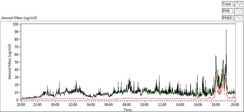
Graph of aerosol mass concentration on the 3rd March 2014. Image from the Whitworth Observatory reproduced with permission from Michael Flynn, Centre for Atmospheric Science, University of Manchester.

The graph above shows data from the Whitworth Observatory, which is located on the roof of the George Kenyon Building at the University of Manchester. The graph shows how the amount of aerosol pollution measured at the observatory rapidly increased from around 6pm, peaking  at about 90 µg/m3, which is much greater than the previous measurements during the day. The wind direction and descent of the plume meant that the smoke plume and the observatory were lined up so the instruments were able to measure it.

Hopefully this post has provided a few scientific insights into how this fire and fires more generally tend to develop. With reports suggesting that the fire could burn for days, the fire is likely to cause disruption for a while yet. Hopefully the fire services will be able to make quick progress on extinguishing it.

Aerosols and the pause

There is a new commentary piece in Nature Geoscience by Gavin Schmidt and colleagues on ‘Reconciling warming trends’. The paper investigates several potential causes for the discrepancy between climate model projections and the recent ‘slowdown’ in global surface temperatures, which is nicely illustrated on Ed Hawkins’ Climate Lab Book blog.

One of the aspects the paper looks at is the influence of aerosol particles in the troposphere (the lower part of the atmosphere), which tend to exert a cooling influence on our climate. Of the aspects they looked at, aerosol particles are the most uncertain.

As I summarised in this previous post, the final report from the Intergovernmental Panel on Climate Change (IPCC) on the physical science basis concluded that aerosols was continue to dominate the uncertainty in the human influence on climate. They said that a complete understanding of past and future climate change requires a thorough assessment of aerosol-cloud-radiation interactions.

With this in mind, I want to delve into the details of how the chemical make-up of aerosol particles varies across the globe and how this is important for our climate and how this relates to the warming trends paper.

What are aerosols made of?

Aerosols are made up of a large variety of different chemical species, which vary by the time of day, seasonally, regionally and a host of other factors. There is no single type of aerosol in our atmosphere.

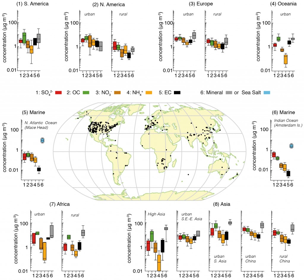
The figure below attempts to pull together a huge collection of studies that have been measuring the major aerosol chemical species in different regions of the globe. We can see on the map that many of the sites are in North America and Western Europe, where large coordinated surface networks have been making such measurements for decades. Measurements elsewhere are much more limited, particularly in the Southern Hemisphere.

This is one of the major difficulties in understanding aerosols; they are difficult to measure, the techniques used are typically quite labour intensive and they require access to well developed infrastructure and supporting measurements.

Fig7.13-Final-2

Summary of aerosol chemical species split across different regions based on surface measurements. The map shows the locations of the sites. For each area, the panels represent the median, the 25th to 75th percentiles (box), and the 10th to 90th percentiles (whiskers) for each aerosol component. The colour code for the measured components is shown in the key where SO4 refers to sulphate, OC is organic aerosol (strictly organic carbon), NO3 is nitrate, NH4 is ammonium, EC is black carbon (strictly elemental carbon), mineral refers to mineral dust e.g. from deserts and sea-salt refers to aerosols produced by ocean waves. The figure is 7.13 from the IPCC report, where the numerous references for the data are included. Click on the image for a larger view. Source: IPCC.

Bearing this in mind, we are able to draw some broad conclusions on their chemical make-up. We can see that in all of the non-marine regions, the aerosol is broadly made up of sulphate, organic carbon, nitrate, ammonium and black carbon, with the influence of mineral dust varying depending on location e.g. concentrations are much greater in locations such as Africa and Asia where large deserts exist.

Of these species, sulphate, nitrate, ammonium and black carbon are predominantly man-made in origin, while organic carbon can be a consequence of both natural and man-made emissions. We see that concentrations of organic carbon and nitrate are broadly equivalent to those of sulphate, with organic carbon being much greater in South America, Oceania, Africa and parts of Asia.

Where is the aerosol?

One of the key properties of aerosol particles in the troposphere is that they have a short lifetime, as they are removed from the atmosphere by rain or simply by crashing into things (terrible drivers those aerosol particles). This typically means that the largest concentrations occur near their sources; they are regionally very important in a climate context but their impact evens out at larger scales, although they do still exert a global influence.

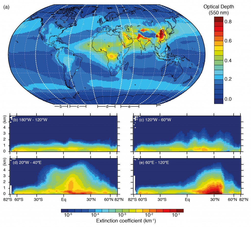
Below is an illustration of this based on satellite measurements combined with a forecast model system, which shows ‘hotspots’ of aerosol particles over China, India and Southern Africa in particular. The metric used here is the aerosol optical depth, which is a measure of the amount of aerosol present in a vertical slice through the atmosphere.

Horizontal and vertical distributions of aerosol amount based on a combination of the European Centre for Medium Range Weather Forecasts (ECMWF) Integrated Forecast System model with satellite measurements from the Moderate Resolution Imaging Spectrometer (MODIS) averaged over the period 2003–2010 and the Cloud–Aerosol Lidar with Orthogonal Polarization (CALIOP) instrument for the year 2010. The figure is 7.14 in the IPCC report and references for studies are available there. Click on the image for a larger view. Source: IPCC.

Comparing the two figures, we see that the enhanced aerosol optical depth in Asia is consistent with the large aerosol concentrations measured by the surface based networks. Of the man-made species, organic carbon is a big driver here, with nitrate, sulphate and ammonium also playing a major role. These aerosol particles are formed due to the substantial emissions from the region.

What about the pause?

Of these species, sulphate and black carbon are the major species that climate models have historically focussed on. Organic carbon is generally included, although there are large discrepancies in relation to measurements, particularly related to the secondary organic aerosol component. Nitrate has received comparatively little attention and those that have included it have shown that it is an important aerosol species both today and over the 21st Century. Drew Shindell and colleagues when comparing aerosol optical depth from satellite measurements and climate models concluded that:

A portion of the negative bias in many models is due to missing nitrate and secondary organic aerosol.

I’ve been involved in research showing how nitrate is important in North-Western Europe and how it enhances the aerosol radiative forcing in the region (many others have done so also by the way). Nitrate has long been known to be important in North America, particularly in California, where large urban and agricultural emissions coincide. Several studies have investigated its importance in East Asia, showing that it is particularly prevalent during the winter.

The ‘Reconciling warming trends’ commentary notes that nitrate was only included in two of the models that contributed to the Coupled Model Intercomparison Project (CMIP5) and that including this across all models brings them closer to the observed surface temperature trend. They also note that underestimating the secondary organic aerosol contribution would have a similar effect but don’t put a value on this.

While this certainly isn’t the last word on the importance of these species for climate change and research on the ‘pause’ will undoubtedly continue, further recognition of their contribution to atmospheric aerosol is a step in the right direction. There are many unanswered questions in this realm, particularly relating to the large differences across climate models in terms of what contribution each species makes to regional and global aerosol.

Bringing the aerosol measurement and modelling communities together more to address such issues is likely the way forward. This is a big focus in many aerosol related research projects these days…we’re trying, honest.