EGU Blogs

Guest Post

Guest Post: Jeremy Bennett – Approaches to modelling heterogeneity in sedimentary deposits

Hello everyone. Great that you could make it out to my blog post. I would like to introduce you to some ideas about environmental modelling that I have recently discovered during my work. These ideas are from this paper by Christine Koltermann and Steven Gorelick back in 1996. Whilst the primary focus of their paper is on modelling hydrogeological properties such as hydraulic conductivity, I think there is crossover with other modelling too.

What I find the most interesting about this work are the words they used to describe modelling approaches, meaning the way the modeller sees the world. They break down modelling into three different approaches: structure-imitating, process-imitating, and descriptive methods. Over the next few mousewheel-scrolls I hope I can explain these ideas in simple terms so that they are easy to understand.

This paper discusses models that are spatially distributed – this means that we are trying to estimate values at different locations in space. In the following diagrams I have simplified things to one dimension to hopefully make things a bit clearer. It is also important to note that many models will combine elements of one or more of the following model approaches – often at different scales.

Descriptive methods

Descriptive modelling approaches are primarily conceptual – kind of like joining the data dots in Figure 1 to produce the circle. There might be no hard and fast rules here, although models may be based on years of experience and observation in the field. These models may not be so rigorous and possibly difficult to replicate in different environments.

desc-1

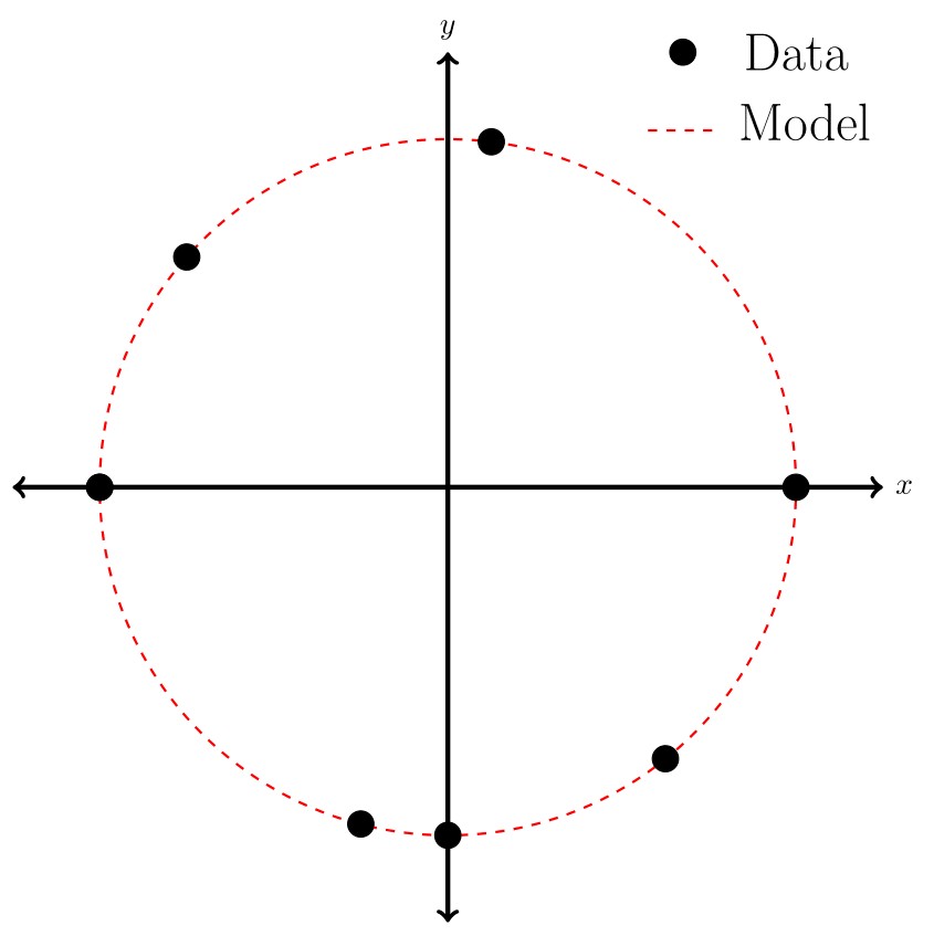
Fig.1. Descriptive diagram

A good example of descriptive modelling are geological cross sections. They are constructed using borehole data and similar lithologies at similar depths are assumed to be part of the same geological formation. More experienced practitioners will have better intuition for connecting the dots and interpreting the stratigraphic record. In many cases thes cross sections are a suitable model. However in some hydrogeological applications this level of modelling is insufficient as more information is required about the geometry of the formation, and perhaps variations in its hydraulic properties – something that is difficult to derive solely from descriptive methods.

Structure-imitating methods

Structure-imitating modelling approaches quantify observations of the thing to be modelled and use these rules to produce something that looks similar. The structure that is imitated could be the actual shape of the object to be modelled, or it could be something more abstract, such as the geostatistical structure of the observations. To demonstrate: In Figure 2 we have some data shown with black lines. We can then derive information about this data, say in this case the distance of each data point from the centre. From this structural information we can model the rest of the circle.

struc-1

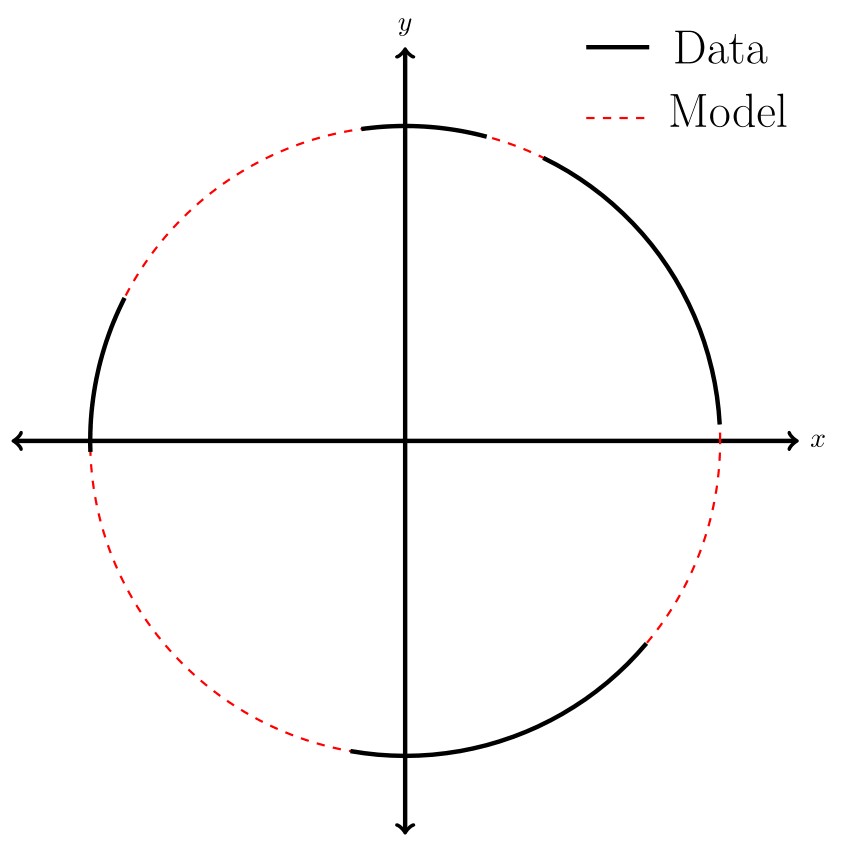
Fig.2. Structure-imitating diagram

A well-known structure-imitating method is kriging. This method uses the geostatistical structure (i.e. mean and covariance) of a set of observations to estimate values of a variable at other locations. A typical criticism of kriging and other geostatistical methods is that defined boundaries between facies become indistinct and don’t look so geologically plausible. Many other methods have been developed, such as multiple-point statistics, to address these arguments.

Process-imitating methods

Process-imitating modelling approaches rely on the governing equations of a process to produce a plausible model. Governing equations describe the physical principles underlying processes such as fluid motion or sediment transport. This type of approach can occur both as forward or inverse modelling. Forward models require setting key parameters in the model (such as hydraulic conductivity) and then predicting an outcome, such as the distribution of groundwater levels. Inverse models start with the observations and try to fit the hydrogeological parameters to the data.

Our final circle model is in Figure 3. In this particular case we know the equation that gives us the circle. As with all process-imitating modelling approaches there is some kind of parameter input required (or forcing). Here we have assumed that the circle is centred about the origin, and our parameter input is the radius of the circle (4) on the right hand side of the equation. Thus we can model the circle based on the equation and a parameter input.

proc-1

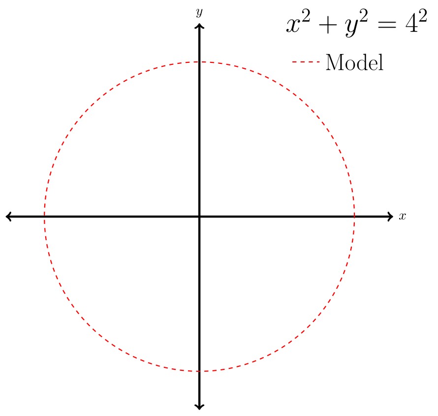
Fig.3. Process-imitating diagram

The classic process-imitating model approach in hydrogeology is aquifer model calibration. This is a relatively simple, but widely used, application where zones of hydraulic conductivity are created and adjusted to reproduce measured groundwater levels (hydraulic heads). Often these zones are tweaked using a trial-and-error process to get a better match (or reduce the error). Aquifer model calibration is considered a process-imitating approach because it attempts to replicate the governing equations of fluid flow within porous media. MODFLOW is a model from USGS that is often used in this type of modelling.

Thanks for making it all the way down here. My aim was to provide you with a couple of new words to describe modelling approaches in geosciences and beyond. If you are working in hydrogeology then this paper by Koltermann and Gorelick is definitely worth a read – it gives an excellent foot-in-the-door to hydrogeological modelling.

Reference

Koltermann, C. E., and Gorelick, S. M. (1996). Heterogeneity in Sedimentary Deposits: A Review of Structure-Imitating, Process-Imitating, and Descriptive Approaches. Water Resources Research, 32(9), pp.2617-2658.

About Jeremy CVpic

Jeremy Bennett is conducting doctoral research at the University of Tübingen, Germany. He is researching flow and transport modelling in heterogeneous porous media. Prior to his post-graduate studies in Germany he worked in environmental consultancies in Australia and New Zealand. Jeremy figures there is no better way to understand a concept than to explain it to others – hopefully this hypothesis proves true. Tweets as @driftingtides and blogs here.

Guest Post: Dr. Sam Illingworth – To Boldy Go

Satellites are now so ubiquitous in our lives that there is something of a precedent to take them for granted. A normal daily routine for may people across the world may include watching television (satellite) as you check your twitter account (satellite) and have a look at the weather (satellite), all before you’ve even eaten your breakfast (not a satellite); whilst for those of us in the remote sensing community, whose work consists of analysing data from a large plethora of Earth-observing satellites, it can often seem that our lives are intertwined with those majestic flying machines as they dance their cosmic waltz far above the confines of planet Earth. It is almost staggering to believe that just over 50 years ago there was not a single manmade satellite in space, especially when you take into the consideration the fact that since its conception in 1957 the United States Satellite Surveillance Network (SNN) has chartered some 8,000+ anthropogenic obiters.

Sputnik 1 (souce: www.interestingfacts.org)

After the Second World War, the two global powerhouses of that era, the USA and the USSR, found themselves locked in a conflict of attrition that will come to be known as the Cold War. A war whose victors are judged not by the more conventional markers of land gain or battle tallies, but rather through the accumulation of weaponry and the rapid advancement of technology, of which the race to get into space plays a key and pivotal role. Most people, if asked who they considered to be the winners of the Space Race, would tell you that it was of course the USA, taking one small step for man and one giant leap for capitalism when Neil Alden Armstrong walked across the lunar landscape on July 21st 1969. Ask another group of people from a certain vintage or scientific persuasion, and they would probably tell you that the true winners of the Space Race were the Soviets, seeing as they were the first to actually get something up there with the launch of Sputnik 1 on October 4th 1957.  But for me there can only be one winner, and it is neither Apollo 11 nor Sputnik 1, but instead the much less lauded US satellite: Explorer 1.

The Sputnik satellite may have been the first into space, and the Apollo missions may have bee the first to demonstrate the capability of manned spaceflight, but as an Earth observational scientist it was the Explorer 1 satellite that I find to be the most intriguing, being as it was the first to carry a scientific payload; a set of instrumentation which would be used to make the first great scientific discovery from space.

The achievements of the Russian polymaths in ensuring that the Soviets were the first into space should of course never be overlooked, nor would it be strictly fair to say that the scientific significance of Sputnik 1 disappeared as soon as it had successfully reached the edge of the atmosphere – by measuring the drag on the satellite, scientists were able gain useful information about the density of the upper atmosphere – but I like to think of Sputnik 1 as that valiant guest at a wedding, who wishing to get the party started with suitable aplomb, makes a line straight for the empty dance floor only to find that once there they lack any of the necessary moves to do anything of particular note. Explorer 1 on the other hand can be thought of as the louder, more eccentric cousin of Sputnik 1, strutting up to the dance floor without a tie (incredibly there was no tape recorder installed on Explorer 1, meaning that data could only be analysed in near real time as it was transmitted back down the scientists on the ground) before starting to cut shapes that would make even a computerised lathe turn green with envy.

From left to right: William H. Pickering, director of the Jet Propulsion Laboratory, which designed and built Explorer 1. James A. Van Allen, University of Iowa physicist who directed the design and creation of Explorer’s instruments.
Wernher von Braun, head of the U.S. Army Ballistic Missile Agency team that designed and built the Jupiter-C rocket (Source: Smithsonian National Air and Space Museum).

Explorer 1 was launched on the 31st January 1958, becoming the first of the USA’s forays into the vast unknowns of the surrounding cosmos. The design and build of the scientific payload was Lead by Dr. James Van Allen of the University of Iowa, its purpose being to measure cosmic rays as they made their way from the Supernovae explosions of distant stars within our galaxy and towards the Earth. The instrumentation was effectively a Geiger-Müller counter, set up to count the number of high energy cosmic rays as they passed through the relatively fragile shell of the satellite’s metallic exterior, and it was expected that the instrument would return values of approximately 30 rays per second. However, the scientists noted that at certain points in its orbit the instrumentation was returning values of 0 rays per second. Upon closer inspection of the data (along with the measurements taken by Explorer 3, launched on 26th March 1958, and complete with requisite tape recorder) it turned out that these zero values all seemed to be concentrated around South America, and that they only seemed to be present when the satellite was flying at an altitude of greater than 2000 km; at altitudes less than this the instrument recorded the expected 30 counts per second. The team at Iowa soon deduced that these zero counts weren’t zero counts at all, rather they were errors in the data brought about by the instrumentation being bombarded by a powerful stream of highly energised particles that were beyond its measuring capabilities. Van Allen (and others at the University of Iowa) proposed that the reason for this localised concentration was a doughnut-shaped belt of highly energized particles, trapped in formation as a result of the Earth’s magnetic field. These belts have since been named after their discoverer (and not as I had assumed, much to the amusement of one of my undergraduate lecturers, after US rock-hero Eddie van Halen), becoming the first scientific discovery to be made from space.

The Van Allen belts (source: Wikipedia

It was this monumental achievement that formed a significant contribution towards the potential of satellites to inform on the many wonders of our home planet, and it is for this reason that I put forward the Explorer 1 (and by association the USA – sorry soviet fans) team as the true winners of the Space Race, a worthy recipient of a truly intergalactic (well ok, monogalactic) battle.


Sam is a postdoctoral research assistant at the University of Manchester, where he spends most of his time working on the development of an algorithm for the retrieval of trace and greenhouse gas measurements from aircraft measured spectra, an algorithm that he affectionately refers to as MARS (the Manchester Airborne Retrieval Scheme). In his spare time Sam enjoys convincing scientists that they can learn to communicate their research more effectively by embracing theatrical technique in all its many guises.

Thanks for reading!


Guest Post – Things go up, things go down – Dr. Martin Wolstencroft

This post is the first of hopefully many guest posts by graduate students and geologists I work with. This post is by Dr. Martin Wolstencroft, a post doctoral fellow with Dr. Glenn Milne here at UOttawa. Martin is a geophysicist by trade and hails from a small town in central England. He did his undergraduate degree and PhD. at Cardiff University in Wales. His PhD. research focussed on the solid Earth, its evolution and responses to surface processes. He plans on returning to his homeland in 2013 and his future research plans involve incorporating several currently separate geophysical modelling methods to improve the understanding of very long term sea level change.

Matt


Over the summer, North Carolina legislators ended up looking very stupid. They passed a law stating that sea level rise in their little corner of the world will only be linear, as extrapolated from historic 20th Century trends. You can read the actual wording here (PDF, Section 2, Part E). This is all the more crazy because there is published evidence that North Carolina is actually in a sea level rise hotspot. This example probably has more to do with the politics of costal development than actual science (one hopes), but it does highlight some very obvious flaws in the understanding of sea level change in general.

Spring storm on the West Wales coast. (Photo: Martin Wolstencroft)

The ocean is dynamic, any surfer can tell you that. Tides come in, go out, currents stream, the wind can drive immense waves. Beneath these already complex day-to-day motions of the ocean is another world of complexity. In 2007 the IPCC summary suggested an average sea level rise of 3.5 mm/yr over the next century is likely. The figure is widely quoted in the popular press and most non-expert readers will have been left with the impression that the sea level change where they live would be 3.5 mm/yr. This is badly wrong. The misunderstanding comes from the fact that the 3.5 mm/yr is a global average value. Average is a useful statistical construct, not necessarily representing physical reality. Consider a room with 4 people in it: Emma is 1.74 m tall, Dave 1.80 m, Sam 1.67m and Sarah 1.79. The (mean) average height of people in the room is 1.75 m, but given this information no one would walk into the room and expect everyone to be 1.75 m tall. Indeed, in this toy example, no one is of ‘average’ height. This is so fundamental that it sounds like I am insulting your intelligence, but this is exactly what many supposedly intelligent people have done with sea level data. In practice, some places will get around 3.5 mm/yr rise but other places will get significantly more or less. This figure is also purely a rise in the ocean surface; no vertical motions of the land surface are included.

The sea level change that matters to us humans in a: “where do I build my house?” sense is known as relative sea level. This is what defines how a shoreline migrates over time. It is a function of ocean surface height and land surface height.  If global sea level was static but you live in a region that is subsiding, you would experience (relative) sea level rise. If sea level was rising at 5 mm/yr but your region was uplifting at 6 mm/yr, you would experience 1mm/yr sea level fall. What sea level change you experience depends very much on where you are on Earth.

Some factors that affect local sea level are: sediment deposition, ongoing uplift of formerly glaciated regions and long term ocean surface dynamics. The Mississippi delta is a region of sediment deposition and is therefore subsiding, increasing the local rate of sea level rise above global averages. In Greenland, if the ice cap is reduced, the reduced mass of ice on the land causes local uplift. Ice caps are also large enough to have a significant gravitational effect, pulling ocean water towards them. Remove the ice cap and you remove this effect, resulting in further sea level falls. As a final example, long lived ocean currents tend to ‘pile’ water up where they meet the coast, shifts in these currents in response to a changing climate can change the location of these piles. Also consider that these processes don’t even include the issue of acceleration in the rate of sea level change. This is a very real possibility, given the apparent accelerating melting of the Greenland ice cap.

Clearly there are many aspects, which control experienced sea level change. Even using accurate global averages to make local policy is doomed to failure. It is said that all politics are local; the same is true for sea level change. Concerning North Carolina, many commentators have pointed out that a lesson from King Canute would be in order. I am inclined to agree.

Martin